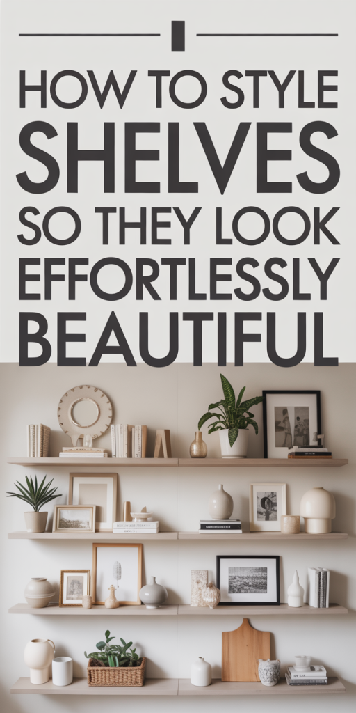
Shelves are one of the most powerful, yet underused, design tools in any home. With a few thoughtful decisions, about color, scale, and composition, we can turn ordinary shelves into displays that feel curated, calm, and effortlessly beautiful. In this guide we’ll walk through a systematic approach to styling shelves: from planning and picking objects, to composition techniques and maintenance. Our goal is practical: to give you clear steps and visual rules so you can style shelves that look intentional, not staged.
Start With A Simple Plan
Define Your Purpose And Visual Goal
Before we touch a single object, we decide what the shelf needs to do. Is it primarily storage, a decorative focal point, or a mix of both? A kitchen shelf might be about accessibility and display, frequently used plates beside pantry jars, while a living room built-in becomes an opportunity for personal storytelling with photos, books, and sculptural pieces.
Ask a few quick questions: Who uses this shelf and how often? What mood do we want, cozy, modern, eclectic, calm? What will viewers see first when they enter the room? Answering those gives us a visual goal that informs color choices, object selection, and how tightly we style.
Measure, Map, And Consider Sight Lines
Good styling begins with accurate measurements. We measure shelf width, height between shelves, and total depth. These dimensions determine which objects will fit and how we layer items front-to-back.
Next, we sketch a quick map, either on paper or mentally, placing potential anchor pieces (a tall vase, a stack of books) where they’ll balance compositionally and visually. Consider sight lines: a shelf seen from the sofa will need a different arrangement than one visible only when you enter the hallway. Lighting and how often the shelf will be viewed also influence choices. By measuring and mapping first, we avoid last-minute overcrowding or awkward negative space.
Choose A Cohesive Color Palette And Material Mix
Pick Anchor Colors And Neutrals
A cohesive palette is the fastest way to make shelves read as intentional. We start with one or two anchor colors, these might be the room’s accent shades or colors drawn from artwork or textiles. Anchor colors give shelves identity without shouting.
Next, we select neutrals to carry the visual weight: warm woods, creams, greys, or black. Neutrals connect disparate objects and let anchor colors pop. For example, if our anchor is forest green, pairing it with cream ceramics, natural wood, and brass accents creates depth without chaos.
We avoid using too many saturated hues. A general formula we like: 60% neutrals, 30% mid-tones (woods, terracotta, muted blues), and 10% accent color. That ratio helps shelves feel layered and composed, not cluttered.
Mix Textures And Finishes For Depth
Texture is how shelves stay interesting when colors are restful. We mix matte ceramics with glossy glass, rough basketry with smooth stone, and soft textiles with hardback books. These contrasts catch the eye and add tactility.
Think beyond color: a rough-woven basket next to a glazed vase creates a satisfying tension. Metallic finishes, brass, aged nickel, or blackened steel, act as punctuation marks: small, deliberate flashes that guide the eye. But we use metals sparingly: too many shiny objects can feel busy.
Aim for variety: at least three material families (wood, ceramic, textile: or glass, metal, paper) across a shelf run. That variety builds richness while your palette keeps things unified.
Build Layers: Scale, Height, And Negative Space
Layering Principles: Tall, Medium, Low
Layering is the backbone of shelf styling. We work vertically and horizontally, arranging tall, medium, and low elements so the eye moves comfortably.
Start with a tall anchor, lamp, sculpture, or stack of tall books, placed to one side or slightly off-center. Add medium items nearby: a pair of vases, a framed print, or a small plant. Fill gaps with low items like a short bowl, stacked books, or small objects. This three-tier system creates depth and a sense of hierarchy.
When placing objects, we often position taller elements at the back and shorter ones in front. This front-to-back layering gives the display dimensionality without obstructing key pieces.
Use Repetition, Rhythm, And Breathable Negative Space
We intentionally repeat elements, colors, materials, or shapes, to create rhythm. Repetition can be subtle: the same wood tone or recurring ceramic glaze across multiple shelves. Rhythm helps separate the visual noise from what we want to highlight.
Equally important is negative space. Shelves that breathe feel curated: overcrowded ones read cluttered. We leave at least 20–30% of each shelf empty or simply occupied by a single object. That visual breathing room lets the eye rest and elevates the pieces that remain.
Think of rhythm as music: repeated notes create melody: pauses (negative space) provide meaning. When styling, we alternate clusters and emptiness to maintain a pleasing tempo.
Select The Right Objects To Style With Intention
Functional Versus Decorative Items
Shelves often need to be both useful and pretty. We separate our objects into functional (baskets, frequently used books, kitchenware) and decorative (sculpture, framed photos). Functional items should be attractive and accessible: decorative objects should support the room’s narrative.
If storage is necessary, we use stylish containers, wicker baskets, lidded boxes, or woven bins, that match the palette. This keeps essentials handy while preserving visual calm. Resist hiding everything: a couple of visible functional pieces (a stack of favorite books, a ceramic pitcher) remind the display is lived-in, not museum-like.
Best Object Types: Books, Art, Ceramics, Greenery, Baskets
Certain object types consistently perform well on shelves.
- Books: Provide height, color variation, and texture. Use a mix of vertical and horizontal stacks. Dust-jacket colors can be coordinated or removed for a uniform look.
- Art & Frames: Lean small-to-medium framed prints against the back of the shelf for depth. Rotate pieces seasonally.
- Ceramics & Sculptures: Offer tactile interest and form variation. Group in odd numbers for visual appeal.
- Greenery: Plants bring life and soften hard lines. Choose species that match light conditions, pothos or snake plants for low light, succulents for sunny spots.
- Baskets & Boxes: Great for concealing clutter and adding warmth. Use consistent textures to unify a run of shelves.
Practical Tips For Styling Books And Small Objects
Books are the most versatile shelf tool. We mix vertical rows with horizontal stacks: horizontal stacks double as pedestals for small objects. For a chic look, place books with their spines facing out on one side and stacked with the spines hidden on another, this balances color and texture while avoiding visual monotony.
For small objects, we abide by grouping rules: cluster three to five related items together and give each cluster breathing room. Use trays to corral tiny items, they keep things orderly and add another material layer. When placing small objects next to taller pieces, slightly offset them so the taller piece remains prominent without dominating the composition.
Composition Techniques For Balanced Shelves
Triangular Groupings And Odd-Number Clusters
We rely heavily on triangular groupings and odd-number clusters because they feel balanced and natural. Arrange three objects so their heights form an implied triangle, this creates a pleasing diagonal line that guides the eye.
Odd numbers (3, 5, 7) are typically more dynamic than even-numbered pairs. For example, three vases of varying heights placed close together feel intentional: four can look forced. Within odd groupings, vary scale and material to add interest.
Anchoring Corners And Creating Visual Focal Points
Corners and ends of a shelving run are natural anchors. We place slightly heavier or taller objects at these points, a lamp, a tall plant, or a framed print. These anchors stabilize the composition and prevent the eye from wandering off the shelf awkwardly.
A visual focal point, often an object with strong color, texture, or personal meaning, gives the shelf a center. Build other objects around it so the focal piece reads as intentional, not accidental. If the shelf lacks a clear focal point, introduce one: a striking ceramic, a bold print, or a cluster of green plants usually does the trick.
Using Mirrors, Art, And Backdrops To Add Interest
Mirrors and reflective surfaces increase depth and brightness. A small mirror leaning on the back of a shelf can make the space feel larger and bounce light into darker corners. Art and prints, propped or hung, provide narrative and scale: larger pieces behind smaller objects create dimension.
Backdrops, painted panels, wallpaper, or removable decals, can unify a shelf run and add dramatic contrast. If we paint the back of shelving a darker color, objects pop forward: a patterned wallpaper backdrop can create a lively stage for simpler objects. We use backdrops sparingly: they should support, not compete with, the items displayed.
Color, Pattern, And Scale Strategies
How To Use Accent Colors Without Overdoing It
Accent colors should punctuate, not dominate. We use accent tones in small doses, throw in a ceramic bowl, a stack of books, or a single framed print, to draw the eye without overwhelming the neutral base.
A simple method: choose one accent color per shelving run and repeat it two to three times at varying intensities. If our accent is terracotta, incorporate a pot, a small vase, and a book with a similar tone. This repetition creates cohesion and balance.
When introducing a bold color, counterbalance with neutrals nearby to avoid visual fatigue. We also watch saturation: matte and muted finishes usually sit more peacefully than glossy neon hues.
Working With Patterned Objects And Prints
Patterned objects add personality but can quickly look busy. We limit patterned pieces to one or two per shelf and space them out so the eye has time to rest. If we use patterned pottery, we often pair it with plain ceramics that echo one of the pattern’s colors.
Prints and textiles can be layered, small framed prints behind a neutral object or folded textiles at the base of a stack, so patterns become accents rather than focal points. For graphic prints, we leave more negative space around them: the eye needs room to appreciate bold patterns.
Practical Styling Exercises And Layout Examples
Five Ready-Made Shelf Layouts (Living Room, Bedroom, Kitchen, Bathroom, Office)
We find templates help when starting from a blank shelf. Here are five layouts tailored to common rooms:
- Living Room: Left, tall plant: Center, stacked books with a small sculpture on top: Right, leaning framed art with a low ceramic bowl. Repeat accent color across pieces.
- Bedroom: Left, pair of framed photos: Center, stack of soft textiles and a small vase: Right, lamp or candle and a low tray for jewelry. Keep palette soft and personal.
- Kitchen: Left, open jars and pantry essentials: Center, cookbooks stacked horizontally with a mortar and pestle: Right, a display of plates on stands and a small potted herb. Prioritize utility with style.
- Bathroom: Left, rolled towels in a woven basket: Center, stacked ceramics for soaps and lotions: Right, small plant and a tray with daily essentials. Use moisture-resistant materials.
- Office: Left, reference books arranged vertically: Center, file boxes and a small sculptural object: Right, pen cup and a framed motivational print. Balance functionality with decorative touches.
These layouts are starting points. We tweak based on scale, available objects, and the room’s light.
Quick Swaps For Seasonal Or Mood Changes
We love quick swaps to refresh shelves without a full restyle. Switch textiles (throws, small pillows) and plant pots for autumn tones, add lighter ceramics and shells for summer, or rotate artwork for a holiday theme.
Swap-in rule: change 20–30% of objects for noticeable impact. Replace small accessories, swap one print, or rotate plant varieties. Seasonal swaps are also an excellent opportunity to reassess clutter and keep the display lively.
Common Styling Mistakes And How To Fix Them
Overcrowding, Too Much Matching, And Poor Proportions
The most common mistake is overcrowding. When every inch is filled, nothing stands out. We fix this by editing: remove one or two objects from each shelf and reassess. If you can slide your hand between clusters, you likely have enough breathing room.
Too much matching, identical vases or repeated patterns, can flatten a display. We break monotony by introducing a contrasting texture or a different scale item. A rough basket, a soft textile, or a metallic accent immediately adds complexity.
Poor proportions, small objects next to massive ones or low items on deep shelves, can be jarring. If an object feels overwhelmed, create a small pedestal (stacked books or a tray) to raise it, or swap in a piece closer to the shelf’s scale.
When To Edit: A Checklist For Cutting Clutter
We use a simple edit checklist when a shelf feels off:
- Remove an object and step back, does it look better? If yes, keep it removed.
- Are there two items doing the same job (two similar vases)? Remove one.
- Is there enough negative space? If not, remove the smallest item in a cluster.
- Do materials repeat too much? Introduce or swap in a new texture.
- Is the focal point clear? If not, add or emphasize one bold piece.
Editing is iterative. We style, step back, adjust, and repeat until the shelf reads balanced and relaxed.
Maintenance, Lighting, And Final Touches
Cleaning, Styling Frequency, And Practical Care
Shelves need regular attention to stay effortlessly beautiful. We dust or wipe down surfaces at least once a month and check plants for watering needs. For high-traffic areas or open kitchens, a bi-weekly wipe-down keeps everything fresh.
Styling frequency depends on how lived-in the space is. For most homes, a light edit every season (four times a year) and a small refresh, swapping an accessory or adjusting clusters, every month keeps shelves from becoming stale.
Handle practical care: keep fragile items away from high-traffic zones, use felt pads under ceramics to avoid scratches, and rotate books occasionally to prevent sun fading on jackets.
Adding Lighting And Small Plants For Life And Warmth
Lighting transforms shelves. We prefer small, low-heat LED strip lights or puck lights mounted discretely under shelves to illuminate objects without glare. A well-placed lamp on the shelf or nearby floor lamp can also create dramatic, cozy shadows.
Plants add movement and life. Choose plants appropriate to the shelf’s light level: trailing varieties soften edges while upright plants emphasize vertical lines. Even one small plant can make a shelf feel alive and human, avoid overplanting, though: too many greens can look cluttered.
Budget-Friendly Sources And DIY Styling Tricks
Affordable Finds, Thrift Flips, And Repurposing Tips
You don’t need expensive objects to style high-end-looking shelves. Thrift stores, flea markets, and estate sales are gold mines for unique vases, frames, and ceramics. We look for solid forms and classic lines: paint or re-glaze can refresh a thrifted find inexpensively.
Repurpose household items: wooden boxes become risers, old scarves make soft textures when folded, and mason jars function as casual vases or toothbrush holders. Look for consistent materials or colors when mixing thrifted finds so the overall aesthetic remains cohesive.
Check dollar stores for basic trays and baskets, then upgrade them with a layer of paint, leather strap, or brass knobs. Small investments in paint or hardware yield big visual returns.
Easy DIY Projects To Customize Shelves On A Budget
A few low-cost DIYs elevate shelves quickly:
- Paint the back panel: A small can of paint transforms the whole run and provides instant depth.
- Make simple risers: Stack and glue thrifted wooden boxes, then paint to match your palette.
- Create framed art collages: Print photos or inexpensive prints and arrange them in matching frames for a curated look.
- Upcycle jars into planters: Add pebbles and potting soil to mason jars: paint the lids or wrap them with jute for texture.
These projects take an afternoon and personalize the shelves without very costly.
Conclusion
Styling shelves so they look effortlessly beautiful is less about buying new pieces and more about making deliberate choices: set a purpose, pick a cohesive palette, layer thoughtfully, and edit ruthlessly. We’ve shared practical rules, scale, rhythm, repetition, and negative space, that simplify decision-making and deliver results.
Start small: choose one shelf and apply the tall-medium-low principle, add a repeated color, and leave some breathing room. With measured edits and a few lighting or plant additions, your shelves will read as calm, curated, and unmistakably yours. Keep experimenting: the best shelf styling often comes from playful swaps and the occasional happy accident.