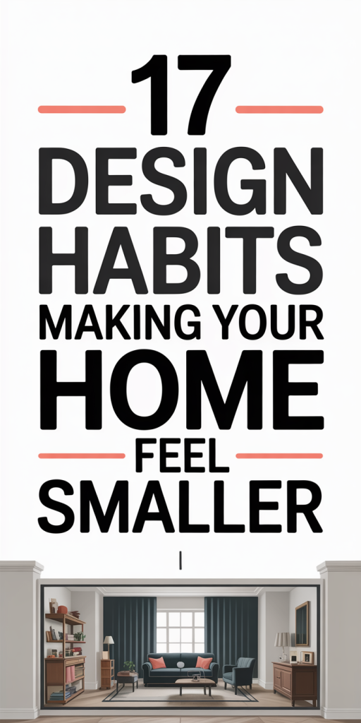
We all want our homes to feel open, comfortable, and effortless, but sometimes the way we design and arrange spaces actually makes them feel cramped. Small rooms can work beautifully, but a few common habits quietly steal visual space and make rooms look smaller than they are. In this text we’ll walk through 17 design mistakes we often see, and give clear, practical fixes you can carry out right away. These are not big-budget renovations: most are styling, layout, and selection choices that change perception. Read on and we’ll help you make your home feel larger without knocking down walls.
Why Perception Matters: How Design Choices Shrink Space
Perception shapes how big a room feels more than its square footage does. Our eyes look for cues, light, contrast, sightlines, and scale, to interpret size. When those cues are confused or working against us, spaces feel smaller even if the footprint is generous. For example, heavy visual contrast between floor and wall or abrupt sightline interruptions give our brain a sense of confinement. Similarly, cluttered focal points and inconsistent lighting create visual “noise” that compresses perceived space.
We should think of rooms as three-dimensional canvases. Width, depth, and height are read through repeated patterns and uninterrupted planes. Long horizontal lines make a room feel wider: vertical emphasis lifts the eye and suggests height. When we break those lines with too many finishes, mismatched scales, or poorly placed furniture, the eye stops and interprets the room as fragmented, and hence smaller.
Understanding perception helps us prioritize fixes that cost little but yield big returns: simplify contrast, restore sightlines, and manage scale. The rest of this article breaks down the most common habits that sabotage perception and gives specific, actionable remedies.
Lighting And Color Mistakes That Close In A Room
Mistake 1, Relying on a single overhead fixture. Rooms lit only from the center create deep shadows near corners and under furniture, visually shrinking the space. Remedy: Layer lighting. Combine ambient (overhead), task (table or floor lamps), and accent (wall sconces or under-cabinet) lighting so the eye moves around the room instead of sinking into dark pockets.
Mistake 2, Using overly dark or high-contrast palettes. Dark walls and contrasting trim make edges read as boundaries. Remedy: Choose lighter, warmer neutrals for small spaces. If you love dark color, use it strategically on a single accent wall or lower portion of cabinetry, and keep ceilings and trims lighter to preserve depth.
Mistake 3, Ignoring natural light. Heavy window coverings or furniture blocking windows cut rooms off from outdoor light, flattening depth. Remedy: Maximize daylight, pull furniture away from windows, use sheer or layered treatments, and keep window frames unobstructed.
Mistake 4, Mismatched temperature of lights. Cool, clinical LEDs mixed with warm incandescents create visual dissonance. Remedy: Use bulbs with consistent color temperature (2700–3000K for living spaces) and dimmers to control mood and perceived size.
Small changes in lighting and color are some of the most effective ways to make rooms feel larger because they directly affect how our eyes and brain read space.
Furniture And Scale Errors That Eat Up Visual Space
Mistake 5, Choosing furniture that’s too large. Oversized sofas, chunky coffee tables, or too many armchairs can block sightlines and create a boxed-in feel. Remedy: Measure before you buy. Opt for furniture with slimmer profiles, exposed legs, and lower backs to keep sightlines open. Floating furniture off walls and using pieces proportionate to the room’s scale is essential.
Mistake 6, Matching every piece. While matching sets can be cohesive, they can also form visual blocks. Remedy: Mix scales and shapes, pair a larger sofa with slim side chairs or a light console table to balance mass without crowding.
Mistake 7, Ignoring negative space. Filling every corner with a piece of furniture gives the impression that the room is smaller than it is. Remedy: Embrace breathing room. Leave intentional gaps (a walkway of at least 30–36 inches where possible) and allow walls to have empty stretches to let the eye travel.
Mistake 8, Overstuffed upholstery and heavy fabrics. Bulky upholstery adds visual weight. Remedy: Choose streamlined silhouettes, tapered legs, and lighter fabrics (linen blends, tight weaves) that read less dense. For occasional seating, think armless chairs or stools that can be tucked away.
Scale matters more than style. When we prioritize proportion and sightlines, rooms feel airier and more comfortable without losing functionality.
Layout, Traffic Flow, And Sightline Problems
Mistake 9, Blocking primary sightlines. Placing a tall bookshelf, TV, or sofa directly in the main line of sight interrupts the perceived depth of a room. Remedy: Arrange seating to maintain clear sightlines from one end of the space to another. If you need a storage piece in a sightline, choose lower-profile alternatives or open shelving.
Mistake 10, Forcing awkward traffic paths. A layout where people must squeeze between furniture creates a cramped experience. Remedy: Plan circulation first. Sketch pathways and ensure main routes are at least 24–36 inches wide. Angle furniture slightly if it improves flow, diagonal lines can widen a room visually.
Mistake 11, Pushing everything to the walls mindlessly. While wall-hugging can work, in some rooms it flattens depth and makes spaces feel like boxes. Remedy: Float key furniture away from walls when possible to create layered depth. A sofa pulled forward with a console table behind improves circulation and sightlines.
Mistake 12, Failing to define zones in open-plan spaces. When every area blends together without visual separation, the eye perceives clutter and compresses scale. Remedy: Use rugs, lighting, and furniture grouping to define zones while keeping visual continuity (consistent palette, repeated materials) so the space reads larger, not fractured.
Flooring, Rugs, Ceilings And Other Horizontal Surfaces That Weigh Rooms Down
Mistake 13, Using multiple competing floor finishes. Abrupt changes in flooring break continuity and make spaces feel smaller. Remedy: Keep flooring consistent across connected spaces or use transitional thresholds that are subtle. In open plans, a single floor finish visually expands the area.
Mistake 14, Choosing small, busy rugs in small rooms. Too-small rugs fragment the floor plane and visually chop up space. Remedy: Size rugs to anchor the furniture group, at minimum, front legs on the rug, and choose low-pile, light-toned rugs to keep the floor reading expansive.
Mistake 15, Low or strongly colored ceilings. Dark or heavily textured ceilings pull the eye down. Remedy: Paint ceilings a shade lighter than the walls or use a reflective off-white to lift the space. If you want ceiling interest, subtle coffers or linear elements that run across the room can lengthen, not shorten, perception.
Mistake 16, Busy or inconsistent horizontal banding. Multiple baseboard heights, heavy trim, or contrasting floor-to-wall edges create visual stops. Remedy: Simplify trim profiles and keep a consistent baseboard height throughout connected rooms to maintain flow.
Small decisions on horizontal planes control the eye. When floors and ceilings read as continuous, rooms feel broader and taller.
Window Treatments, Wall Treatments, And Trim That Cut Spaces Off
Mistake 17, Hanging curtains too low or too narrow. Curtains hung at the top of the window frame or wide beyond the opening visually extend the wall: those hung too low or too tightly framed compress it. Remedy: Hang curtains close to the ceiling (3–6 inches from the ceiling line or higher, depending on proportions) and extend the rod past the window frame to let light in and widen the opening.
Mistake 18, Overly busy wall treatments. Heavy wainscoting, dense wallpaper, or multiple paint bands can compartmentalize a wall. Remedy: Use wall treatments sparingly and at the right scale. Vertical shiplap or tall, narrow panels can amplify height: horizontal bands should be broad and continuous if you want to emphasize width.
Mistake 19, Thick, dark trim that frames rooms like boxes. Bold trim can be dramatic, but in small spaces it creates a boxed effect. Remedy: Consider painting trim a tone close to the wall color or choose a slim profile. Unified trim color through adjacent rooms preserves continuity.
Mistake 20, Covering windows for privacy without alternatives. Heavy blackout options block visual connection to the exterior. Remedy: Layer window treatments, a light-filtering sheer for daytime privacy plus heavier drapes for night, so you can maintain a sense of openness whenever possible.
Thoughtful window and wall treatment choices reconnect interior space with surrounding light and architecture, making rooms feel intentionally larger.
Patterns, Accessories, Art And Styling Habits That Overwhelm
We often try to inject personality with patterns and accessories, but overdoing it shrinks space. Here’s how to keep style without the squeeze.
Mistake 21, Layering too many patterns of similar scale. When prints compete at the same scale, the eye cannot find rest and interprets the space as noisy and small. Remedy: Mix pattern scales, large-scale patterns, medium accents, and small repeat textures, and limit the palette to two or three dominant colors to create cohesion.
Mistake 22, Hanging art at inconsistent heights or in tight clusters. Low or cluttered art arrays break vertical flow. Remedy: Hang art at eye level (about 57–60 inches to the center) and consider one large piece over multiple small ones to create a single, calm focal point.
Mistake 23, Styling surfaces with too many small decorative objects. A mantle or coffee table crowded with knickknacks reads as visual clutter. Remedy: Edit rigorously. Use fewer, larger objects and group items in odd numbers with negative space between groups. Think sculptural over sentimental when styling for spatial perception.
Mistake 24, Using high-contrast patterns on floors or walls. Busy geometric tiles or loud wallpaper can make rooms feel boxed-in. Remedy: If you love bold patterns, reserve them for accent zones (backsplash, an alcove) while keeping major planes quieter.
Styling should guide the eye, not exhaust it. Thoughtful editing and scale-aware curation let our personality shine without compromising perceived space.
Storage, Clutter, And Bad Decluttering Habits (Plus Better Alternatives)
Clutter is one of the quickest ways to make any space feel smaller. It’s not just the volume of items but how they’re organized and displayed.
Mistake 25, Open storage that’s messy. Open shelving and glass-front cabinets look great when curated, but they double visual clutter when overloaded. Remedy: Alternate open and closed storage. Store frequently used items behind closed doors and reserve open shelves for a few display objects and neatly folded textiles.
Mistake 26, Storing things at eye line and above. When we pile items on counters, tables, and visible surfaces, the eye interprets that as limited space. Remedy: Move functional storage to lower cabinets and drawers. Keep counters clear with wall-mounted rails or a single decorative tray for essentials.
Mistake 27, One big junk drawer or catch-all basket. Out-of-sight doesn’t mean organized. Remedy: Create small, labeled zones for daily items, baskets, trays, or drawer dividers, so each thing has a home and the room feels ordered.
Mistake 28, Ignoring vertical storage opportunities. We often think horizontally, which clogs floor space. Remedy: Use tall cabinets, vertical pegboards, and wall-mounted hooks to free up floors and create a sense of height.
Consistent editing habits make a disproportionate difference. We recommend a seasonal purge routine and dedicated landing zones near entryways so clutter doesn’t migrate into living spaces.
Conclusion
Small homes can feel expansive when we align design decisions with how the eye reads space. The 17 habits we covered, from lighting and color to scale, sightlines, floors, and decluttering, are habits, not immutable facts. By layering light, simplifying palettes, choosing the right scale, preserving sightlines, and editing possessions, we can dramatically change perception without major renovations.
Start with one room and make a few targeted changes: lift curtains, edit accessories, swap a rug for the right size, or adjust furniture layout. Over time those choices compound into a home that feels bigger, calmer, and more purposeful. We’ll often find that the simplest fixes give the biggest payoff.