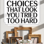
We’ve all walked into a room and felt an odd mix of admiration and exhaustion, admiration for the obvious effort, exhaustion because every surface seems to be competing for attention. Trying to create a stylish, curated home can quickly tip into “overdone” territory. In this text we’ll call out 17 decor choices that make a space look like you tried too hard, explain why they come across as overworked, and give clear, practical fixes so your rooms feel intentional instead of staged. Whether you’re redecorating a living room, staging to sell, or just tired of dusting a thousand objects, these pointers will help you keep the style and lose the strain.
Overstyled Living Rooms: When Every Surface Competes
We love a layered, well-styled living room, but there’s a tipping point when layers become noise. An overstyled living room is easy to spot: a coffee table packed with books, trays, and candles: side tables hosting matching decorative objects: sectional pillows coordinated to the millimeter: and rugs layered for the look rather than function. The problem isn’t effort. It’s hierarchy. When everything is vying for attention simultaneously, the eye has nowhere to rest and the space reads as contrived.
Why this feels “trying too hard”: human perception craves focal points and breathing room. When a room lacks negative space, it feels manufactured. We also overvalue symmetry and matching, which can make a room feel like a showroom rather than a home.
Quick fixes we recommend:
- Pick one focal point (a fireplace, an artwork, or a large plant) and simplify surrounding surfaces.
- Limit tabletop styling to two-to-three items max: vary heights and materials to create interest without clutter.
- Keep textiles functional: rotate cushions seasonally instead of matching every piece to a theme.
These small edits preserve the curated look but make the room feel lived-in and comfortable, and eventually more stylish.
Too Many Trend Pieces Piled Together
Trends are fun: they’re a quick way to freshen a room. But stacking three or four current trends in a single space, say, rattan, neon accent lamps, macramé, and terrazzo, creates visual dissonance. When we pile trends together we signal ‘look at me’ rather than ‘this is thoughtfully crafted.’ The result is a home that dates quickly and feels more like a mood board than a living place.
Why it feels like over-effort: trends shout. A room should whisper a cohesive voice with occasional shouts, not non-stop shouting. Also, trend saturation often sacrifices comfort and longevity for novelty.
How to fix it:
- Choose one or two trends to incorporate: use them as accents rather than the primary vocabulary.
- Pair trends with timeless anchors: a classic sofa shape, neutral flooring, or simple millwork will temper trendiness.
- Commit to inexpensive trend items (throw pillows, small art, hardware) rather than large investments until you’re sure the trend resonates with your long-term taste.
By letting trends play supporting roles, we keep rooms current without letting them scream for attention.
Matchy‑Matchy Everything: The Uninspired Uniform Look
There’s a comfort in matching: a set of six dining chairs, two identical sofas, matching nightstands. But when everything matches too perfectly, the space can feel staged and uninspired, like a furniture showroom or hotel chain. Our homes should reflect layers of life: different eras, finishes, and textures. Too much uniformity removes personality and reads as if we followed a catalog checklist instead of making choices.
Why it reads as trying too hard: exact matching suggests a reliance on retail bundles rather than thoughtful curation. It often signals a lack of editing: instead of blending pieces we love, we recreate a single retailer’s aesthetic.
How to loosen the uniformity:
- Mix finishes: pair a wooden console with metal side tables or an upholstered chair with a leather ottoman.
- Vary styles: a vintage lamp next to a contemporary sofa adds tension and warmth.
- Introduce one deliberate mismatched pair (two different nightstands, for example) to create a collected-over-time feel.
A few mismatches, chosen with intent, can make the difference between a room that looks styled and one that feels lived-in and authentic.
Statement Lighting Overkill: When Lamps Steal The Show
Statement lighting can transform a room. But when every fixture is a ‘look-at-me’ piece, oversized pendants, sculptural floor lamps, glowing neon signs, the effect becomes theatrical instead of tasteful. We’ve seen rooms where the lighting competes with art, furniture, and even each other. Lighting should enhance mood and function: when it dominates, it reveals an attempt to make the room memorable at any cost.
Why statement lighting can mark over-effort: unlike art or textiles, lighting dictates ambience. Too many competing sources confuse both the eye and the purpose of the space. It also signals design bravado rather than restraint.
How we recommend reigning it in:
- Prioritize function: choose fixtures that provide appropriate light levels for the room’s primary use.
- Reserve statement pieces for one area (a bold chandelier over the dining table or a sculptural lamp in the reading nook), and opt for simpler fixtures elsewhere.
- Coordinate scale: ensure large pendants don’t overwhelm low ceilings or nearby furniture.
With the right balance, lighting becomes the secret amplifier of a room’s best features instead of the loudest element.
Gallery Wall Overload: Too Many Frames, Not Enough Focus
Gallery walls offer a great way to display photos and art, but they can quickly become a visual mess when we cram every frame we own into one patch of wall. Overloaded gallery walls often lack hierarchy, everything is the same size, same frame color, and hung too close together. Instead of a meaningful collection, the wall becomes wallpaper: interesting up close, chaotic from a distance.
Why it comes off as trying too hard: a cluttered gallery wall signals we’re trying to show off rather than curate. It also overwhelms the viewer, preventing any single piece from making an impact.
How to repair a saturated gallery wall:
- Edit ruthlessly. Remove pieces until the composition has a clear focal point.
- Mix frame sizes and orientations: introduce one larger statement piece to anchor the arrangement.
- Use consistent matting or a unified frame color to tie diverse works together without making them identical.
- Respect spacing: wider gaps and asymmetry often feel more intentional than tightly packed grids.
A well-edited gallery wall tells a story. An overloaded one tells us only that someone had too many frames and too little patience.
Excessive Accessories And Surface Clutter
Accessories are the finishing touches that make a house feel like ours. But when surfaces, consoles, mantels, and coffee tables, are buried under decorative objects, the home starts to look like a museum diorama. Excessive accessories often fall into patterns: repeating the same color, buying objects because they’re ‘on trend,’ or filling every available flat surface to avoid emptiness.
Why clutter signals over-effort: it suggests we’re staging rather than living. It also reduces the functionality of surfaces and increases maintenance, which undermines the comfort we aim for.
Practical editing steps we like:
- Apply the ‘one in, one out’ rule: for each new decorative object, remove one existing item.
- Group objects in odd numbers (three is classic) and vary heights and textures to keep groupings intentional.
- Prioritize objects with personal meaning, a souvenir, a gift, over anonymous decorative fillers.
- Leave deliberate empty space on key surfaces to let important pieces breathe.
By curbing accessory accumulation, we make the items we keep feel chosen instead of dumped, and the home reads as calm and considered.
Simple Rules To Tone It Down Without Losing Style
We don’t have to choose between being stylish and being restrained. Toning down a space while keeping its personality is mostly about establishing a few simple rules and committing to them. Below we break those rules into actionable habits: how to edit, how to rotate pieces so rooms feel fresh, and how to balance the fleeting with the timeless.
How To Edit: Prioritize, Rotate, And Use Negative Space
Editing is the single most transformative habit. Start by prioritizing what matters: identify one focal element per room, a sofa, a fireplace, an artwork. Everything else should support that focal point, not compete with it. Rotate accessories seasonally: this keeps the room feeling intentional without constant accumulation. We recommend creating a small storage bin for off-rotation items so you can swap pieces rather than buying new ones.
Negative space is not emptiness: it’s a design tool. We aim for pockets of quiet where the eye can rest. On a coffee table, choose two to three meaningful objects and leave the rest. On walls, give art room to breathe rather than crowding every inch.

How To Balance Trends With Timeless Pieces
To avoid the “tried too hard” trap with trends, always pair them with anchors. Think of anchors as your design insurance policy: a well-proportioned sofa, durable wooden floors, or classic molding that won’t date in a season. Use trend pieces as accents, pillows, throws, small art, or hardware, which are inexpensive to replace.
We also recommend testing trends in low-stakes ways before committing. Borrow a bold rug or try a temporary peel-and-stick wallpaper in a guest room. If it still feels right after a few months, elevate the investment. Finally, maintain a limited color palette with one bold accent color: that keeps rooms cohesive even as accessories change.
These editing and balancing strategies let us keep the visual energy we love while avoiding the visual exhaustion that makes a home look like it’s trying too hard.
Conclusion
We’ve pointed out the most common decor choices that can make a home feel overworked, from overstyled living rooms and trend overload to gallery wall chaos and excessive accessories. The throughline is the same: restraint, editing, and intentionality are more powerful than accumulation. Our best tip? Slow down. Make fewer, better choices: rotate rather than add: and leave room for life to happen. That’s how style becomes effortless, and your home stops looking like you tried too hard.