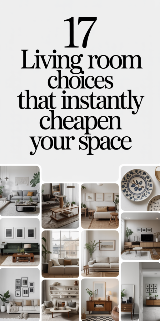
We walk into living rooms every day, our own, friends’, apartments we’re touring, and some feel considered while others read as rushed or cheap. The difference usually isn’t money: it’s decisions. In this guide we break down 17 specific choices that instantly cheapen your space and show practical fixes that make a real visual upgrade without blowing the budget. Expect clear examples, quick swaps, and a few design principles you can apply right away. By the end we’ll have mapped how to move from “meh” to intentional, so your living room looks like it was designed rather than dumped.
Quick Visual Mistakes That Make Any Living Room Look Cheap
We want to start with the low-hanging fruit, those visual mistakes that signal “low budget” even if the pieces aren’t cheap. These are the design sins most guests notice first.
- Overloaded surfaces. When every table, mantel, and shelf is covered in a jumble of small decor, the eye can’t rest. Clutter reads as careless and quickly cheapens a room. We recommend editing to a few purposeful objects and varying heights for visual interest.
- Poor focal point. A room without a clear focal point feels unfurnished and unplanned. If the TV, fireplace, or a large artwork isn’t anchored properly, everything competes and the room looks slapped together.
- Mismatched trim and finishes. When hardware, light fixtures, and door/ window trim clash, brass next to chrome, warm wood next to cool laminate, the space feels inconsistent. Cohesive finishes create a sense of intentionality.
- Wrong scale of accessories. Tiny throw pillows on a large sofa or an undersized coffee table make even expensive furniture look out of place. Scale governs perceived quality.
- Visible wear in high-traffic spots. Scuffed trim, flattened cushions, and sun-faded fabrics shout neglect. A quick refresh, slipcovers, cushion rotation, or a low-cost trim repaint, can lift the room immediately.
These quick visual mistakes are easy to diagnose because they hit the eye immediately. The fixes are mostly editing, anchoring, and choosing consistent finishes, changes that cost little but read as deliberate.
Furniture Choices That Immediately Date Your Room
Furniture shapes the voice of a room. Certain choices lock a living room into a decade or trend that doesn’t age well. We’ll call out the ones to avoid and explain why they date a space.
A few furniture-level red flags we see routinely:
- Overly ornate, carved frames that try to mimic high-end antiques but are made from cheap composites. They read as faux and fake, not vintage.
- Matching living-room sets purchased all at once. When every piece has identical lines and finish, the room looks like a showroom rather than an edited interior.
- Ultra-trendy silhouettes that have a short lifespan. Think extreme mid-century pastiches, if it screams “trend” it will probably scream “outdated” in a few years.
The underlying principle is clarity: furniture should feel intentional and suit the room’s proportions. When it doesn’t, the result is a space that feels dated rather than timeless. In the next sub-sections we’ll unpack scale, materials, and arrangement problems and how to fix them.
Mismatched Scale, Shiny Finishes, And Obvious Faux Materials
Mismatched scale happens when furniture, lighting, or art don’t relate to the room’s volume. A small, delicate coffee table in front of a hulking sectional makes the couch look cheap: conversely, a massive reclaimed-wood table in a compact apartment overwhelms. We recommend measuring before buying and keeping proportional rules in mind: sofas should sit comfortably on or beside the rug, coffee tables should be about two-thirds the length of a sofa, and side tables should be roughly equal in height to the sofa arm.
Shiny finishes, high-gloss metals, overly lacquered furniture, and mirrored everything, tend to read as costume jewelry for the home. They catch the wrong kind of attention and often expose cheap edges. Replace or tone down shiny pieces with matte or subtly brushed finishes. Satin brass, aged nickel, and oiled bronze provide warmth without shouting.
Obvious faux materials (imitation marble, plastic wicker, or vinyl that imitates leather) usually have telltale patterns, seams, and reflections. They sell the illusion of luxury but deliver a flat, hollow look. When we can’t afford the real material, we opt for a well-made alternative: laminate with a subtle matte finish, good-quality faux leather with realistic grain, or woven textiles that read as natural from a few feet away. A few thoughtful upgrades, new knobs, a better lamp, or swapping out a cheap coffee table top, go a long way toward authenticity.
Seen-It-All Sofas, Visible Frames, And Poorly Arranged Seating
Sofas are the anchor of the living room, and the wrong one can make a space feel dated instantly. “Seen-it-all” sofas have predictable silhouettes, cheap bench cushions, or exposed wooden frames that shout budget-constrained manufacturing. Choose a sofa with good proportion, supportive cushions (not pancake-flat), and finishes that suit the room’s tone.
Visible frames, where the frame or structural supports are openly visible, often reveal lower-quality construction. Solid frames with tight upholstery and minimal exposed hardware read as higher quality, even if they’re mid-range in price. If you love a framed look, choose one with honest, well-finished wood and balanced proportions.
Arrangement matters as much as selection. Chaotic layouts, sofas pushed against every wall, chairs floating with no relation to the focal point, or seating that prevents conversation, feel unplanned. We aim for a conversational grouping: anchor an area rug, place seating around it with appropriate spacing (about 18 inches between a sofa and coffee table), and ensure sightlines to the room’s focal point. Even a cheap sofa looks better when it’s placed with intention and balanced by good proportion and a couple of elevated accents.
Fabric, Color, And Pattern Pitfalls That Scream Low Budget
Fabric choices and color palettes have an outsized effect on perceived quality. The wrong textile or palette can make other, better pieces feel cheap.
Cheap-looking upholstery is often shiny, overly smooth, or plasticky. These fabrics show wear quickly and don’t drape well. We prefer textured weaves, linen blends, or brushed cotton for durability and a natural, lived-in look. When buying upholstery, check seams, lining, and cushion fill, cheap cushions flatten fast and ruin the sofa’s silhouette.
Overly busy patterns, clashing florals or multiple competing motifs, create visual chaos. If you want pattern, pick one dominant motif and coordinate with solids or subtle texture for balance. A patterned pillow should play off one of the room’s main colors rather than introduce a fifth competing hue.
Faded palettes, washed-out colors or inconsistent whites, make a room feel tired. Instead of relying on match-everything neutrals, choose a limited palette of two neutrals and one accent color. That way the room reads cohesive. If you’re working with existing faded elements, a fresh coat of paint, new pillow covers, and a few strategic textiles can restore vibrancy without replacing major pieces.
Finally, always test fabrics in the room’s lighting before committing. What looks warm and inviting in a store can read cheap and synthetic at home under your lamps.
Lighting, Hardware, And Fixture Mistakes That Kill Ambiance
We can’t overstate how much lighting affects perceived quality. Bad lighting flattens texture, reveals cheap finishes, and kills ambiance. Here are the usual mistakes and simple corrections.
- One single overhead fixture. Relying solely on a central ceiling light produces stark, museum-like illumination that highlights imperfections. Layer light: ambient (overhead), task (reading lamps), and accent (wall washers or picture lights). Multiple light sources create depth and hide minor flaws.
- Harsh, cool bulbs. LEDs are great, but color temperature matters. Use warm white bulbs (2700K–3000K) in living spaces to create that cozy, high-end glow.
- Cheap hardware and mismatched finishes. Drawer pulls, door knobs, and light switch plates are tiny details with big visual weight. Replacing them with coordinated, well-finished hardware (matte or satin, consistent metal tones) makes the whole room feel pulled together.
- Ignoring dimmers. A dimmer instantly elevates a simple fixture, letting you tune mood and conceal wear. Install dimmers on main circuits and key lamps to control ambiance.
- Poorly placed lamps. A lamp that’s too small for a side table or positioned to create glare undermines comfort. Scale lamps to tables and seating and consider floor lamps with layered shades for softer light.
Addressing these lighting and hardware mistakes is often an affordable way to lift a room’s perceived value. Small investments, new lamps, a curated bulb strategy, and consistent hardware, pay disproportionate dividends.
Clutter, Layout, Flooring, And Rug Errors That Undermine Style
A well-designed floor plan and tidy surfaces make a living room feel curated. Conversely, clutter and poor flooring choices drag the space down.
Clutter: When storage isn’t integrated, items land on every horizontal surface. We recommend a two-step approach: first, purge, if you haven’t used it in a year, let it go. Second, add attractive storage: woven baskets, closed media consoles, or built-in shelving that conceals everyday items. Closed storage dramatically reduces visual noise.
Layout: Avoid squeezing furniture against all walls or letting large pieces float with no anchor. Aim for functional zones: a conversation area, a reading nook, and a media zone if necessary. Use rugs and lighting to define these areas: they guide the eye and create the illusion of a larger, intentional space.
Flooring mistakes include inconsistent materials (linoleum suddenly meeting hardwood) and scratched or sun-damaged surfaces. If new flooring isn’t in the budget, use large-area rugs to create a consistent plane: they mask imperfections and read as a purposeful design layer.
Rug errors: Too-small rugs are one of the fastest ways to make a room feel cheap. A good rule is that front legs of major seating should sit on the rug, or better yet the entire seating group should fit on it. Also, inexpensive thin rugs that slip and bunch signal neglect, invest in rug pads and go slightly larger than you think you need.
Fixing these issues often involves editing, strategic storage, and scale adjustments. Those changes give a living room breathing room and polish that outperforms expensive but poorly arranged decor.
Simple, High-Impact Upgrades To Make The Room Look Intentional
Here are tactical upgrades we use when we want instant improvement without a full redesign. Each is practical, scalable, and focused on perceived quality.
- Repaint trims and doors in a coordinated finish. A fresh coat of paint in a unified color family elevates the whole room and hides scuffs.
- Swap out hardware and switch plates. Choose one metal tone and apply it across visible fixtures to create cohesion.
- Layer lighting. Add a floor lamp, a pair of matching table lamps, and install dimmers to create depth and mood.
- Upgrade textiles strategically. Replace throw pillows with ones in higher-quality fabrics, add a couple of textured throws, and choose curtains that extend to the ceiling to add perceived height.
- Scale the rug correctly. If the rug is too small, either buy a larger one or use two matching rugs anchored together. Correct scale makes furniture feel purposeful.
- Add a statement mirror or art above the mantel or sofa. A well-placed piece creates a focal point and reflects light, making the room feel larger.
- Replace glaring faux finishes with realistic alternatives. Swap a glossy faux-marble table top for a matte engineered surface or add a veneer.
- Edit surfaces. Clear 70% of each shelf or table and group the remaining objects in threes for a curated look.
- Invest in cushion fill or reupholstery for tired seating. New foam and fabric can revive an expensive-looking silhouette at a fraction of replacement cost.
- Introduce greenery. A few well-chosen plants give life and texture, choose sculptural varieties like a fiddle-leaf fig or a snake plant for low maintenance.
These moves are intentionally practical: most can be done over a weekend and many cost far less than replacing major pieces. The point is to work smarter, improving the cues people read when they judge quality.
Conclusion
We’ve laid out 17 common choices that make living rooms look cheap and offered fixes that reclaim style without starting over. The through-line is clear: perceived quality comes from proportion, cohesion, and purposeful editing. Small changes, scaling a rug correctly, layering light, or swapping hardware, add up to a big visual shift. If you tackle a few of the high-impact upgrades first, you’ll be surprised how quickly the space reads as intentional. Design isn’t about spending more: it’s about choosing better.