The Fastest Way To Make A Small Room Feel Rich, Bright, And Massive (Practical Design Tricks That Work In A Weekend)
We’ve all stood in a small room and wished it felt larger, more luminous, and, dare we say, luxurious. The good news: you don’t need a renovation or a huge budget to change the feel of a cramped space. With purposeful choices in light, color, furniture, layout, and finish details, we can make a room read as richer, brighter, and significantly more spacious in the span of a weekend.
In this guide we’ll walk through high-impact, practical design tricks that work fast. These are the techniques interior designers use when they want big visual returns with minimal time and expense, think of them as tactical moves that scale light, create depth, and add texture without clutter. Read on and pick the tweaks that suit your schedule: a handful of changes today, a 30-day plan for momentum, and a few ongoing habits to keep the room feeling open and elevated.
Use Light To Expand Space — Maximize Natural And Artificial Light
Light is the single most transformative element when we want a room to feel larger. It affects perceived depth, color fidelity, and the way textures read. Start by auditing every light source and blocking factor: which windows are obstructed, what bulbs are installed, and where shadows collect? From there, pursue three simultaneous moves: remove blocks, increase output, and layer light.
Remove blocks: Clear anything obstructing window glass, heavy drapes, stacked boxes, plants. If privacy is a concern, swap heavy curtains for sheer panels or for top-down shades that preserve light while limiting sightlines. We find that simply exposing an extra foot of window on each side makes the room feel instantly wider.
Increase output: Replace warm, low-lumen bulbs with bright, high-CRI (90+) LED bulbs in the 3000–4000K range for a clean, natural look. Use bulbs of higher lumens in central fixtures and add task lights for reading and work areas. Don’t be afraid to up the wattage-equivalent, small rooms tolerate and benefit from more lumens because light bounces off nearby surfaces rather than getting lost.
Layer light: Combine ambient (ceiling), task (desk/lamp), and accent (sconces/strips) lighting. A single overhead light creates flatness: layering sculpts the room and reduces deep shadows. Use wall-mounted sconces or picture lights to lift light upward and across walls, this visually expands planes. We also recommend installing dimmers so we can dial mood and perceived spaciousness.
Reflective boost: Add mirrors or other reflective surfaces (mirrored trays, high-gloss side tables) to bounce light deeper into the room. Position a mirror opposite or adjacent to a window to double the perceived daylight. Even small, strategically placed mirrors near corners can significantly increase perceived depth.
Practical checklist for a weekend:
- Clear window obstructions and switch to sheer panels or simple shades.
- Replace bulbs with 3000–4000K, CRI 90+ LEDs and add at least one task light.
- Mount one mirror across from a window and add a wall sconce to lift light.
These moves take little time but yield a dramatic sense of openness and luxury when done correctly.
Color Strategies That Open Up A Room
Color is where perception gets tactical. We want hues and contrast choices that read airy and high-end, not just ‘light’ for light’s sake. The key principles: reduce contrast at eye level, use warm neutrals with cool accents, and extend key colors across boundaries to blur edges.
Low-contrast base: Paint primary walls in a light, warm neutral, think soft greige, warm white, or pale oat. A low-contrast backdrop makes the eye move smoothly across surfaces, reducing the visual pauses that make rooms feel boxed. Avoid stark white if it creates glare: instead aim for a slightly warm white with subtle undertones so it reflects light without feeling hospital-bright.
Monochrome extension: Carry the wall hue into trim and doors, but slightly lighter or darker. Painting doors and trim within the same family removes visual breaks and makes the room feel continuous. For example, pair a warm white wall with trim 5–10% lighter, this keeps edges subtle and the space cohesive.
Vertical emphasis: Use a slightly darker shade on the farthest wall to create depth, or paint a thin band of color up high to draw the eye upward. Vertical stripes on an accent wall or tall, narrow paint blocks can make ceilings feel higher. We prefer tone-on-tone vertical accents because they add height without busy patterns.
Cool accents and limited palettes: Add cool accents, muted blues, soft greens, or slate grays, to provide contrast that reads crisp rather than heavy. Keep the overall palette to three colors: a base, a depth color, and one accent. Too many colors fragments the space and reduces the upscale feel.
Small but strategic choices:
- Use satin or low-sheen paint, matte walls absorb light and hide imperfections, while satin reflects a touch, suggesting quality and cleanliness.
- Paint window frames the same color as the wall to make windows seem larger.
- Use a large single rug that extends under major furniture to unify the floor plane: small rugs chop the room into pieces.
Color done with restraint expands a room visually and reads expensive because it looks intentional, not accidental.
Smart Furniture Choices For Scale And Flow
Furniture in a small room must do three things: fit proportionally, offer storage or purpose, and allow visual breathing room. We often see people crowd rooms with full-scale pieces that overpower circulation: scaling down smartly is the secret to a spacious, rich-looking layout.
Choose scale-first pieces: Opt for furniture that’s scaled to the room, slimmer arms, lower backs, and shallower depths. A sofa with slim arms and a tight back reads more open than a bulky rolled-arm piece. Likewise, select narrow-profile chairs and compact coffee tables. We recommend measuring and sketching a simple plan to ensure pathways of at least 24 to 30 inches where people walk.
Negative space is a feature: Resist filling every inch. A few inches of visible floor between items makes the room feel intentional and calm. When we edit out excess pieces, the remaining furniture reads more curated and expensive.
Choose multi-purpose focal pieces: A console that doubles as storage, an ottoman with hidden storage, or a narrow desk that works as both workspace and console can reduce clutter while improving function. Don’t underestimate the impact of open shelving, glass-front cabinets or open metal shelving amplifies depth compared to bulky closed cabinets.
Material choices matter: Prefer furniture with legs (we’ll expand on leggy frames below) or exposed underframes. Visual lightness is achieved when you can see floor beneath furniture, our eyes interpret that as more space. Also, pick finishes that coordinate with your palette: a consistent metal (brass or black) across lighting and hardware reads like a considered design choice.
Placement tips:
- Float furniture slightly away from walls to create circulation and depth, pull a sofa 3–6 inches from the wall rather than pushing it tight against it.
- Anchor seating with one medium-to-large rug rather than multiple small rugs.
- Keep pathways clear and aim for focal points that are visible from multiple angles.
Smart furniture choices let us create a layout that breathes, functions well, and communicates quality without overspending.
Layout And Traffic Flow Tricks To Create Depth
A well-considered layout creates implied depth even in a small footprint. We want to guide the eye through the room using focal points, layered planes, and clear circulation paths.
Create a clear focal point: Decide on one main focal point, window, artwork, TV, or fireplace, and arrange seating to emphasize that element. A singular focal point prevents the eye from bouncing around, making the room feel cohesive and purposeful.
Layer planes strategically: Introduce foreground, middle ground, and background layers, small console or plant in front, seating in the middle, a statement wall or large mirror in the back. This intentional layering tricks the eye into reading depth where there’s little.
Diagonal lines widen perception: When possible, arrange furniture on a slight angle to the room’s geometry. Diagonal sightlines increase perceived width because the eye travels further along an implied line. We don’t recommend extreme angles: a slight turn of a chair or rug can do the trick.
Keep circulation natural: Maintain at least 24 inches for walkways and 30–36 inches for primary paths. If space is tight, stagger furniture so traffic flows behind seating rather than through it. Floating a sofa away from the wall by a few inches creates a small corridor that visually enlarges both sides.
Use scale to create distance: Place smaller pieces in the foreground and larger visual anchors in the background. For instance, a small console near the door leads into seating and then into a feature wall, this gradation creates perceived depth.
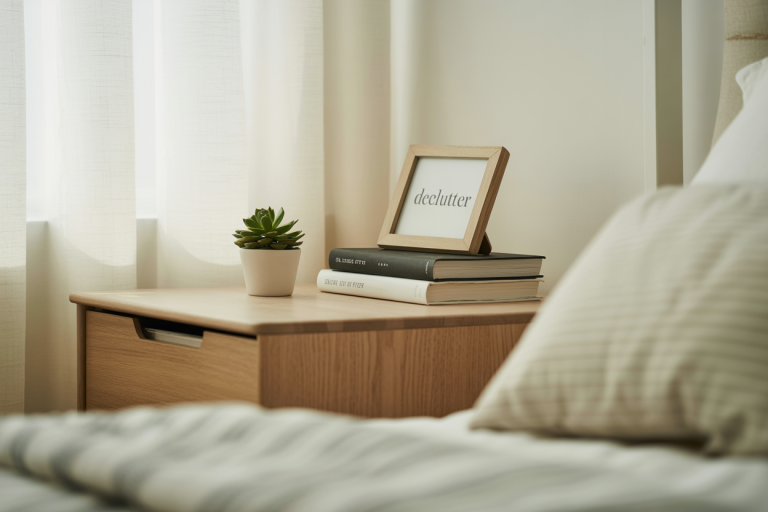
Declutter sightlines: Move or conceal visual clutter, cords, stacks of mail, and visible storage attract the eye and shorten perceived space. Use cord-management clips, paper trays, and closed storage near entry points to protect the room’s visual flow.
These layout tweaks are about intention: when we plan where things sit and why, even a modest room reads like a layered, spacious interior.
Texture, Pattern, And Small Details That Feel Luxurious Without Clutter
Luxury in small rooms is often conveyed through texture and restraint, not through accumulation. When we pick the right textures and patterns, we get richness without visual noise.
Scale patterns appropriately: Use large-scale patterns sparingly and smaller-scale repeats more often. A large-scale pattern on a single throw pillow or one accent wall creates drama: applying large patterns on multiple surfaces overwhelms. Conversely, small geometrics or subtle herringbone rugs add interest without competing.
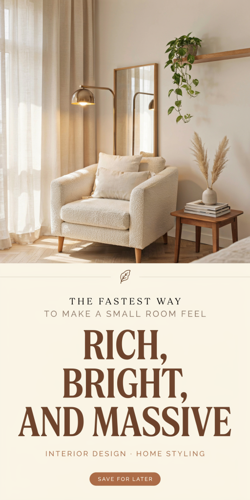
Tactile layers: Mix three or four textures, smooth wood or lacquer, soft knit or boucle, low-sheen metal, and a natural fiber rug. This contrast makes the room feel curated. For instance: a wooden side table, velvet cushion, linen curtains, and a sisal rug feel layered and expensive without overloading the eye.
Metal and trim choices: Introduce one dominant metal finish (e.g., aged brass, matte black) across hardware, lighting, and small decor. Consistency reads intentional. Use metal sparingly as accents on shelving edges, lamp bases, and tiny pulls.
Reduce visual clutter with display rules: Limit tabletop styling to groups of three, and keep surfaces mostly clear. We follow a rule: no more than two small decor clusters in a single visual field. This restraint makes every object feel chosen rather than accumulated.
Plants and natural elements: Add one or two large plants rather than many small ones. A single fiddle leaf fig, rubber plant, or tall palm brings life and verticality without chopping up surfaces. Use simple pots that match the palette, avoid novelty planters that become visual noise.
Textile upgrades for luxury: Swap cheap cushions with higher quality inserts, and pick covers with subtle texture. A well-filled pillow with a natural-feel cover reads better than multiple thin, synthetic cushions.
By being deliberate with texture, pattern, and small details, we can build richness that feels calm and expensive, exactly what a small room needs.
Ceiling And Floor Treatments To Make Height Feel Higher
Vertical perception hinges on how we treat the extremes: ceiling and floor. Raising our perceived ceiling height and extending the floor visually will add instant grandeur.
Paint the ceiling strategically: Painting the ceiling a shade lighter than the walls but still within the same family keeps it from receding. For a more dramatic lift, paint the ceiling a slightly lighter cool tone than the walls, cool colors recede, creating a sense of height. Avoid dark ceilings unless you want a cozy cave effect.
Add vertical lines: Use tall bookcases, vertical paneling, or narrow wall moldings that run floor-to-ceiling to emphasize height. Thin, evenly spaced vertical paneling painted the same color as the wall creates texture without breaking the vertical flow.
Window-to-ceiling curtains: Hang curtains close to the ceiling line, start the rod several inches above the window frame or at the actual ceiling if possible, and let them drop to the floor. This stretches the wall visually and makes the ceiling feel higher. Use lightweight drapery that pools slightly for a tailored, high-end look.
Floor continuity: Run a single floor material through the room or use large-format tiles/long plank flooring to minimize seams and visual breaks. Narrow planks or many small tiles make the floor busier and can make the room feel smaller. If replacing flooring isn’t an option, lay a large rug that spans major furniture and leaves equal borders on all sides to create an anchored, spacious feel.
Trim and baseboard choices: Keep baseboards modest in profile and paint them the same color as the walls for a flush look, or choose a taller baseboard in the same tone to add perceived proportion. Crown molding can add luxury, but to lift height, keep any molding thin so it doesn’t lower the visual plane.
Light on the ceiling: Install uplights or choose fixtures that cast light upward to wash the ceiling. That upward light expands the volume of the room and pairs well with our earlier lighting layers.
Combined, these ceiling and floor treatments lengthen sightlines and create an immediate sense of height and scale.
Fast 1-Day Tweaks And A 30-Day Plan To Transform The Room
We want results fast, but sustainable change comes from a short plan. Below are immediate weekend actions and a 30-day roadmap to fully transform the room without renovation.
One-day power moves (weekend to execute):
- Clear and stage: Remove excess furniture and clutter: store or donate anything that doesn’t serve the layout. (1–3 hours)
- Light overhaul: Swap bulbs, add a mirror across from a window, and install one wall sconce or floor lamp. (1–2 hours)
- Curtains and paint touch: Hang ceiling-to-floor curtains and paint trim to match walls if time allows. Otherwise, swap curtains and window hardware. (2–4 hours)
- Scale swap: Replace the largest offending piece (oversized coffee table, bulky chair) with a leggy, smaller alternative or nesting tables. (1–2 hours)
These changes create immediate visual gains and usually fit into a single weekend.
30-day transformation plan (weekly milestones):
Week 1, Audit and edit: Complete the one-day moves, measure furniture and traffic flow, and choose a cohesive palette. Order any replacement pieces that require shipping.
Week 2, Paint and hardware: Paint smaller areas, trim, an accent wall, or window frames, and replace visible hardware in a single finish (door handles, cabinet pulls). Install any additional lighting and dimmers.
Week 3, Textiles and upholstery: Add a large rug, upgrade cushion inserts, and switch curtains if needed. Introduce one or two high-impact textiles (throw, velvet pillow, or bouclé chair) to elevate texture.
Week 4, Styling and final touches: Add a large mirror or artwork, bring in a statement plant, and style shelves with a restrained edit. Test different lighting scenes and adjust dimmers for optimal brightness.
Budgeting and sourcing tips:
- Thrift and vintage stores are great for leggy frames and affordable mirrors.
- Buy textiles and lighting first: these items shift perception more than furniture.
- Invest in one quality piece (a sofa or a rug) and complement with affordable accents.
This timeline balances speed and care: early wins from weekend edits build momentum, and weekly goals ensure the work feels purposeful and manageable.
Conclusion
Small rooms become rich, bright, and massive when we treat perception as the design brief. By focusing on light, color, scaled furniture, thoughtful layout, and refined details, we can achieve a dramatic shift in how space feels, often in a single weekend and fully within a month.
We recommend starting with light and decluttering for instant impact, then layering in color, leggy furniture, and textured accents. With a few intentional moves, our small rooms won’t just function better, they’ll read as curated, elevated, and wonderfully spacious.