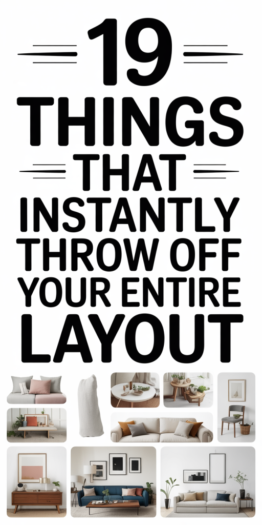
We’ve all opened a page and instantly felt something was ‘‘off”, text that’s hard to read, images that jump, or buttons that disappear on small screens. Layout problems are subtle at first, then they derail usability, harm conversions, and make our design look amateurish. In this guide we break down 19 specific issues that commonly throw layouts out of balance and give concrete, fast fixes you can apply today. Whether you’re polishing a marketing page, auditing a product interface, or debugging responsive quirks, these actionable tips will help you restore clarity and control quickly. We’ll cover typography, spacing, color and hierarchy, media and component pitfalls, and navigation/interaction mistakes, each with hands-on remediation you can carry out without a complete redesign.
Typography Problems That Wreck Readability (Items 1–4)
Typography is the backbone of any layout, get it wrong and everything else struggles. Here are four frequent typography sins and how we fix them fast.
- Too many typefaces: Mixing five fonts because they ‘‘look cool” destroys cohesion. Fix: Limit yourself to two type families (one for headings, one for body). Use font weights and italics for variety. This reduces cognitive load and speeds up page rendering when you choose system or variable fonts.
- Wrong font sizes and scale: Small body text or oversized headings break rhythm. Fix: Establish a modular scale (e.g., 1, 1.25, 1.5) and base body at 16px for web. Use relative units (rem) so typography scales consistently across devices.
- Poor leading (line-height): Tight lines make content cramped: overly loose lines fragment paragraphs. Fix: Aim for 1.4–1.6 line-height for body text, slightly larger for long reads. Adjust heading leading to keep visual blocks compact but readable.
- Inconsistent font weight usage: Using bold everywhere removes emphasis. Fix: Reserve bold for true emphasis (headings, CTAs). For secondary emphasis, use color or small caps sparingly. Audit styles in your CSS (or design token set) and consolidate duplicates, that single pass usually resolves most inconsistencies.
Spacing And Alignment Mistakes That Break Flow (Items 5–8)
Spacing and alignment create the invisible grid that guides eyes. When margins, padding, or alignment drift, the whole layout feels unstable. We tackle the four most common spacing problems below.
- Inconsistent spacing scale: Different components using ad-hoc pixel values (8px here, 17px there) make the page jittery. Fix: Define a spacing scale (4px or 8px base) and convert ad-hoc values to that scale. Replace inline spacing with utility classes or tokens so updates propagate quickly.
- Misaligned content blocks: When grids aren’t aligned, think cards starting at different x positions, users struggle to scan. Fix: Snap elements to a grid (CSS Grid or consistent column math) and add visual checks in your designs: toggle outlines or use browser dev tools to verify alignment.
- Overcrowded elements: Buttons, inputs, and badges packed too tightly cause tappability and readability issues. Fix: Apply minimum touch-friendly spacing (44–48px tap targets) and use consistent internal padding for components.
- Unequal vertical rhythm: Headings, paragraphs, and lists that lack consistent vertical rhythm create stop-and-go reading. Fix: Standardize vertical spacing between element types (e.g., heading-to-paragraph: 0.75–1.25x body line-height: paragraph-to-paragraph: 1x). Use CSS custom properties to keep vertical rhythm predictable and easy to adjust across the site.
Color, Contrast, And Visual Hierarchy Failures (Items 9–12)
Color and contrast are more than aesthetics, they communicate priority. When they’re mishandled, users can’t tell what matters. Here are four issues that kill hierarchy and the fixes we recommend.
- Poor color hierarchy: When everything is high-contrast or saturated, nothing stands out. Fix: Create a three-level color system, primary (CTAs), secondary (links/accents), and neutral (backgrounds/text). Reserve vivid color for primary actions only.
- Misused brand colors: Applying brand hues to low-priority elements dilutes their impact. Fix: Map brand colors to specific functions in your token palette. Use tints or neutrals derived from the brand color for backgrounds so the primary color remains meaningful.
- Inconsistent iconography color: When icons use multiple colors arbitrarily, they compete with content. Fix: Use a single icon color for information hierarchy, and only use different colors to indicate states (success, error, warning).
Insufficient Contrast For Accessibility
- Insufficient contrast for accessibility: Low contrast between text and background frustrates users and fails WCAG checks. Fix: Run automated contrast tests (like axe or Lighthouse) and manually verify critical content meets at least AA (4.5:1 for normal text) or AAA where possible. If brand palettes fail contrast, introduce accessible neutrals or adjust saturation and brightness rather than abandoning the brand entirely. Small color tweaks often solve multiple hierarchy and accessibility problems at once.
Images, Media, And Component Issues That Shift Layouts (Items 13–16)
Media adds richness, but when unrestrained it destabilizes layouts. Below are four media-related pitfalls and fast fixes we use when auditing pages.
- Large unoptimized images: High-resolution files inflate load times and cause reflow when dimensions aren’t set. Fix: Serve responsive images (srcset) and modern formats (WebP/AVIF). Set explicit width/height or aspect-ratio in CSS to reserve layout space and avoid content jump.
- Asynchronous embeds and iframes: Third-party scripts (maps, videos, widgets) often load late and push content. Fix: Use lazy-loading and placeholder boxes sized to the embed’s aspect ratio. Where possible, defer or replace heavy embeds with lightweight previews and load the full embed on interaction.
- Component overflow and clipping: Cards or modals that don’t account for long copy or large media break container constraints. Fix: Carry out sensible max-widths, overflow handling (ellipsis or scroll within moderate limits), and test with edge-case content lengths.
Unoptimized Images Causing Layout Shift
- Unoptimized images causing layout shift: When images load after text, layout jumps and users lose context. Fix: Combine the prior steps: set dimensions or aspect-ratio, add width/height attributes, and preload LCP-critical images. For decorative images consider CSS background-image with appropriate sizing, but remember backgrounds don’t contribute to LCP and need careful handling.
Navigation, Structure, And Interaction Problems (Items 17–19)
Navigation and interaction patterns are the control layer of our layouts. If users can’t find or interact with things reliably, the whole experience collapses. Here are the last three common mistakes and how we remedy them.
- Overcomplicated navigation: Too many top-level items, hidden features, or inconsistent menu behavior confuses users. Fix: Simplify: prioritize primary tasks, collapse secondary links into a logical ‘‘More” menu, and maintain consistent affordances across breakpoints.
- Inconsistent component behavior: Buttons that look clickable but aren’t, or modals that behave differently across pages, erode trust. Fix: Standardize component states in a design system and enforce them with shared CSS classes or components. A single source of truth eliminates accidental variance.
Hidden Or Broken Navigation Elements
- Hidden or broken navigation elements: Off-canvas menus that trap focus, hamburger menus with inaccessible controls, or links that don’t function on touch devices create major usability failures. Fix: Test keyboard and screen-reader navigation, ensure focus management for modals and drawers, and verify tap targets and event handlers on real devices. If a navigation control is hidden, provide an obvious alternative (breadcrumbs, in-page anchors) so users never lose orientation. Small accessibility sweeps plus a few interaction tests usually reveal and fix these issues quickly.
Conclusion
Layout problems are rarely a single bug, they’re an accumulation of small mismatches in type, spacing, color, media, and interaction. We can recover a design’s clarity quickly by: standardizing tokens (spacing, type, colors), enforcing component rules, and prioritizing accessibility and responsive behavior. Start with a short audit using the 19 items above: fix quick wins like image dimensions, spacing tokens, and contrast ratios first, then iterate on system-level issues. With a few disciplined changes, we restore balance, reduce friction, and make our interfaces feel intentional again.