Word Art Decor Should’ve Stayed In The Past: Ditch The Clichés And Refresh Your Home In 2026
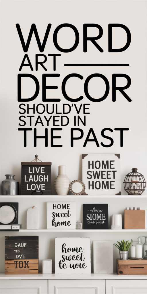
We’ve all seen it: oversized canvases that shout “LIVE LAUGH LOVE,” framed prints listing virtues, block-letter wall decals promising motivation. For a decade, or longer, word art dominated entryways, kitchens, and living rooms. It was easy, inexpensive, and felt like a quick way to inject personality. But in 2026, that once-safe choice looks tired, literal, and often incongruent with the layered, thoughtful interiors people are craving now. In this piece we’ll trace how word art rose to ubiquity, why it’s largely fallen out of favor, the psychology behind words on walls, and concrete strategies to replace those clichés with designs that actually enhance a home’s character. If you’re ready to refresh your space without resorting to platitudes, we’ve got practical direction and inspiration to help you do it right.
The Rise And Fall Of Word Art In Home Decor
Word art’s rise felt inevitable: it was cheap, accessible, and translated easily across trends. In the late 1990s and through the 2000s, mass-market decor brands and big-box stores pushed reproductions of callouts, typographic canvases, and vinyl quotes as the easy answer for filling empty walls. For landlords, first-time homeowners, and anyone on a budget, word art solved a basic problem, how to make a blank wall look intentional overnight. The format also fit the social-media era. Platforms like Pinterest and Instagram rewarded simple, relatable visuals. A framed motivational slogan photographed well and communicated a lifestyle instantly.
But what was once novel became formulaic. As homeowners gained more access to design knowledge, via blogs, reels, and affordable online courses, they began to recognize the limitations of the format. Word art’s ubiquity bred visual sameness: every living room began to look like a curated IKEA display. Meanwhile, design sensibilities evolved toward nuance, layering, texture, and personal storytelling, and word art’s one-note literalness started to jar.
We’ve also seen the industry respond. Boutique studios, galleries, and independent makers began to offer more original, less prescriptive work: abstract canvases, local photography, and hand-crafted pieces with provenance. This shift mirrors a broader cultural hunger for authenticity over empty affirmations. So while word art still appears in retail catalogs and tourist shops, its cultural dominance has waned. It didn’t vanish overnight, but the decline reflects a deeper maturation in how people want to communicate identity through their homes.
Why Word Art Feels Outdated Today
Word art’s outdated feeling is not just nostalgia. It’s a response to changing tastes, increasing design literacy, and a craving for spaces that feel intentional rather than templated. We can break the problem down into two complementary issues: visual clutter and inconsistency, and the ethical/design fatigue caused by overused clichés.
Visual Clutter And Design Inconsistency
At its worst, word art adds visual noise. Large block letters or dense typographic compositions demand attention and then compete with other elements in a room, furniture, textiles, lighting, rather than harmonizing with them. The result is often a fragmented visual field where nothing rests.
Design inconsistency is another recurring issue. Word art tends to carry its own tone, homespun, inspirational, or industrial, regardless of the actual design language of the space. Affixing a rustic “gather” sign above a sleek, midcentury console creates cognitive dissonance. The piece doesn’t bridge styles: it interrupts them.
We’ve seen rooms where word art was the last-minute fix: a quick purchase to cover a blank wall after moving in. Those placements rarely consider scale, sightlines, or the room’s conversational focal points. Word-based pieces demand a different kind of attention than a sculptural object or a layered gallery wall. When they’re forced in without intent, the visual balance of the room suffers.
Overused Clichés And Loss Of Authenticity
Phrases like “home sweet home,” “live laugh love,” or “be happy” became so ubiquitous they stopped meaning anything. They operate like a design placebo: they feel like personalization but offer no actual insight into the household. When a wall says something generic, it can make a space feel performative rather than personal.
There’s also an authenticity problem. In an era where people value provenance and narrative, handmade ceramics, local photography, vintage finds, mass-produced word art signals the opposite. It’s often produced overseas in anonymous factories and sold through global supply chains. For buyers who now prioritize stories and sustainability, a framed cliché sits uneasily among objects chosen for character and memory.
Finally, as society has matured in how it addresses wellness and identity, platitudes feel insufficient. We want nuance and honesty, not slogans. Word art that promises effortless happiness can come across as tone-deaf, especially in households that prefer subtlety and emotional truth.
The Psychology Of Words On Walls
Words impact us. That’s why word art ever had power: language, even short phrases, can prime moods, reinforce values, and create a sense of cohesion. Cognitive science shows that words in our visual environment can act as environmental cues, subtly shaping behavior and feeling. A kitchen that displays “family” may nudge us toward communal meals: a workspace with “hustle” may ramp up an achievement-oriented mindset.
But the effect depends on congruence and authenticity. When words align with lived experience, they can reinforce identity. When they don’t, they feel dissonant. We’ve all experienced that awkward moment when a guest catches a slogan that contradicts the home’s real vibe, like a minimalist apartment plastered with rustic farmhouse phrases.
There’s also the habituation effect: repeated exposure to the same slogan blunts emotional response. What felt meaningful initially becomes wallpaper, literally part of the furniture. Over time, the cognitive priming diminishes, and the words become decorative fixtures rather than active influencers of mood. That explains why a lot of word art stops working: it’s memorable only until it’s not.
How Word Art Clashes With Modern Design Principles
As designers and homeowners pivot toward more considered spaces, several core principles have emerged: minimalism with warmth, layered textures, strong use of negative space, and intelligent typography. Word art often conflicts with these priorities in predictable ways. Below we examine how and why.
Minimalism, Texture, And Negative Space
Modern minimalism isn’t about white walls and absence: it’s about purposeful restraint. It creates breathing room so individual objects can matter. Word art, particularly oversized pieces, fills that breathing room indiscriminately. Instead of accentuating negative space, it consumes it.
Texture and tactility are more important than ever. People gravitate to woven textiles, plastered walls, layered rugs, and sculptural lighting, elements that offer depth and invite touch. Word art tends to be flat and graphic, which reduces textural richness. The result is a missed opportunity: rather than introducing a tactile counterpoint, word art often flattens the sensory palette.
When we think about balance, we prefer one or two focal anchors, not a wall-sized slogan plus a coffee table vignette plus a patterned sofa. Modern rooms thrive on visual hierarchy: a strong object, a supporting secondary piece, subtle accents. Word art has a habit of flattening that hierarchy into a single, loud statement.
Typeface Sensibility And Readability Issues
Typography matters more than most homeowners realize. Typeface carries tone: serif feels timeless, sans-serif reads modern, script suggests domestic warmth or formality depending on execution. Poorly considered type choices turn messaging into kitsch. That’s a big part of why mass-market word art reads as dated.
Readability is another factor. Many word-art pieces use mixed typefaces, heavy drop shadows, or faux-handwritten scripts that look pleasant from a catalog photo but are illegible in situ. The result is an object that’s not only stylistically off but functionally poor: guests can’t read the piece without squinting, and the intended message is lost.
We should also account for scale. Typography designed for print or a phone screen doesn’t translate directly to wall art. Letter spacing, weight, and kerning should be adjusted for distance and viewing angles. Mass-produced word art often ignores these nuances, leaving us with signs that are either too shouty or too busy.
Better Alternatives And Practical Replacement Strategies
If we agree word art is often a misstep, the natural question is: what should we do instead? Here are practical, tasteful alternatives and replacement strategies that preserve personality without falling back on clichés.
- Invest in Original Artwork: Prioritize a single piece with intent. Original paintings, limited-run prints, or local photography bring uniqueness and narrative. When we choose an artist whose work resonates with our life, landscapes from a hometown, abstracts that echo a favorite color, we’re adding a piece that invites conversation and connection.
- Create a Curated Gallery Wall: Ditch the single slogan and build a layered layout with varied scales and mediums. Mix framed photos, small sculptures, and textured pieces like woven art. A well-curated gallery wall feels collected over time rather than purchased in one trip.
- Use Object-Based Anchors: Sculptural elements, wall-mounted ceramics, metalwork, or a mounted instrument, provide a rich focal point without saying anything literal. Objects add shape, shadow, and dimensionality that word art lacks.
- Emphasize Material and Texture: Replace a vinyl quote above the mantel with a plaster relief, a reclaimed wood panel, or a textile wall hanging. These materials read as thoughtful and tactile: they age gracefully and integrate better with layered interiors.
- Commission Custom Typographic Work Done Right: If words mean a lot to us, commission a typographer or letterpress print. A line of poetry set in a carefully chosen typeface, printed on deckled-edge paper and framed with museum glass, feels intentional and crafted, not mass-produced. Custom type allows for proper kerning, scale, and material choices.
- Lean Into Photography and Memory: Framed candid photos, travel images, or a mapped collage of places we’ve lived communicates story more authentically than a slogan ever could. Displaying personal archives transforms walls into memory architecture.
- Adopt Rotating Displays: For renters or those who like change, adopt a rotating art habit. Use simple picture-rail systems or leaning frames so we can swap pieces seasonally. Rotating keeps the space feeling fresh without resorting to throwaway decor.
- Edit Ruthlessly: Sometimes the best solution is removal. If a phrase doesn’t land, take it down. Keep only items that hold emotional or aesthetic value. Editing forces us to live with fewer pieces but ones that matter.
- Use Functional Design: Replace word art in kitchens or entryways with functional beauty, an attractive wall clock, open shelving with curated ceramics, or an oversized mirror. These elements serve daily life while enhancing the room’s look.
- Consider Typography as Texture: If we must use words, treat them as one texture among many. Opt for subdued tones, small-scale type, and integrate them with other materials, etched into wood, embossed on leather, or stitched into textiles, so they feel embedded rather than pasted on.
Implementation tips: Measure the wall and create paper templates before buying anything. Live with a blank wall for a month if you can, that pause often clarifies what the space really needs. When sourcing, look to local makers and small studios: they often offer higher quality and better provenance than mass retailers. Finally, commit to one or two thoughtful statements rather than filling every empty surface with platitudes.
Conclusion
Word art had its moment: accessible and immediate. But as our interiors evolve, we’re choosing nuance over noise, texture over cliché, and authenticity over mass-produced platitudes. We don’t have to swear off words entirely, language can still be powerful in the home when used sparingly and with intention. The key is to replace shorthand slogans with pieces that tell a story, respect proportion, and enrich the sensory life of a room. If you’re ready to refresh your space in 2026, let’s start by editing with purpose: remove the tired phrases, invest in craft, and choose objects that reflect who we truly are, not what a catalog told us to be.