The Weird Mirror Trick Designers Use To Fake Huge Rooms (How To Pull It Off In 2026)
We’ve all walked into a cramped apartment and wished a wall would just…expand. Designers have a nearly 100-year-old secret that still works like magic: strategically placed mirrors. In 2026, with better glass, slimmer frames, and smarter lighting, that trick is easier and cheaper than ever, and it’s not just about slapping a mirror on the wall. In this guide we’ll explain what the mirror trick is, the visual principles that make it believable, exactly how designers install it, materials and seam techniques that keep reflections natural, common mistakes to avoid, and complementary strategies when mirrors alone aren’t enough. Whether you’re updating a studio, staging a home to sell, or trying to make an awkward hallway feel generous, we’ll walk through actionable steps so you can pull off the same illusion with confidence.
What The Mirror Trick Is And Why It Works
The mirror trick is simple in concept and surprisingly nuanced in execution: place reflective surfaces so they extend perceived sightlines, double visible space, or simulate architectural continuation. At its most basic, a mirror reflects everything in front of it, so when placed opposite an open area, it creates a convincing duplicate of that space. But why does our brain accept that duplicate as “more room” rather than a flat image? Several perceptual mechanisms are at play.
First, scale cues: mirrors reproduce objects and distances at the same scale as the real environment, which reinforces depth perception. Second, continuity: a large, uninterrupted reflection gives the visual system a continuous field to process, which reads as extension rather than fragmentation. Third, light amplification: mirrors bounce natural and artificial light back into the room, increasing ambient brightness, which our brains associate with spaciousness. Finally, motion parallax: when we move, the reflected scene moves consistently with our expectations, strengthening the illusion of three-dimensional space.
Designers exploit these principles deliberately. It’s not only about size, it’s about where the mirror sits relative to focal points (doors, windows, architectural lines), how it interfaces with light, and whether its seams and frames betray the trick. When done well, it isn’t obvious that a mirror is creating the effect: the room simply feels larger, airier, and more coherent.
How Designers Use It: Common Installations
Designers choose mirror treatments based on room typology, budget, and desired effect. Below are the installations we see most often, each has a distinct visual payoff and practical considerations.
Full-Length Opposite Wall Mirrors
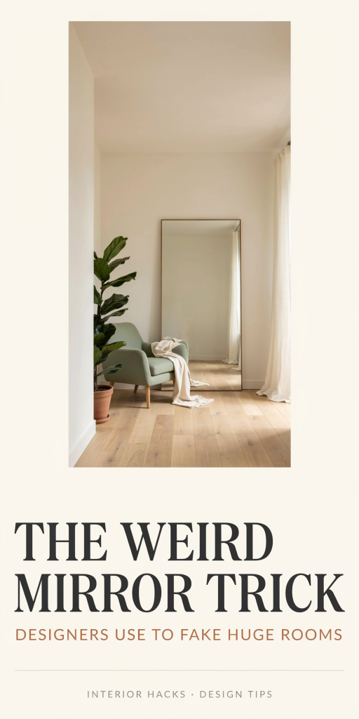
Placing a full-length mirror on the wall opposite a window or doorway is perhaps the oldest staging trick. It doubles the apparent depth by reflecting the primary view. In living rooms and hotel lobbies this creates an immediate sense of symmetry and balance. For best results, the mirror should reach close to ceiling height and span as much horizontal distance as practical. This reduces the visible frame and creates an uninterrupted plane.
We recommend anchoring the mirror to studs and using safety-backed glass to meet modern building codes and reduce bounce. In open-plan spaces, an opposite-wall mirror makes separate zones feel connected rather than boxed in.
Mirrored Panels With Strategic Gaps And Frames
Instead of a single large sheet, designers sometimes use mirrored panels with slim gaps or frames between them. This approach serves practical and aesthetic goals: smaller panels are easier to install, less costly to ship, and can be arranged to mimic paneling or wainscoting. Strategically placed gaps (3–10 mm) create subtle vertical or horizontal lines that echo existing architectural rhythm, columns, windows, or cabinetry, making the reflection feel intentional.
Framed mirrored panels are another tactic for blending reflection into interiors. Thin metal or wood frames provide shadow lines that break up glare and reduce the “wall of mirror” effect that can feel surreal. When panels are aligned with floorboards, ceiling lines, or furniture, the reflection reads as an extension of the room rather than an artifice.
Visual Principles Behind The Illusion: Scale, Continuity, And Light
Visual Principles Behind The Illusion: Scale, Continuity, And Light
To make mirrors sell the idea of extra room, we lean on three core visual principles.
Scale
Mirrors replicate size relationships between objects accurately. That means a mirror will only sell space if the furniture and architectural elements in front of it are scaled properly. A tiny side table reflected opposite a massive sofa doesn’t create balance: it emphasizes imbalance. For convincing scale, mirrors should reflect proportional elements, windows, comparable furniture, or open circulation zones.
Continuity
Human perception favors continuous planes. Large, uninterrupted reflections eliminate visual breaks that cue the brain to “flatness.” Continuity is also about aligning reflected lines (molding, baseboards, window frames) with their real counterparts, so the eye reads them as one extended plane. Designers will often align mirror seams with existing joints to reinforce that continuity.
Light
Light is the most forgiving part of the illusion. Mirrors increase perceived space by redistributing daylight and artificial light deeper into a room. But uncontrolled specular highlights or visible light fixtures in the reflection can betray depth. To manage this, we position mirrors to reflect diffused daylight or indirect lighting sources. LED coves, frosted windows, and shaded lamps reflected in a mirror will read as soft extension, while harsh spotlights can create distracting glare.
Combine these principles, scale, continuity, and light, and the brain completes the missing physical space for you. That’s the designer’s superpower: guiding perception so the room feels larger without knocking down walls.
Practical Steps To Use The Trick In Your Space
We’ll walk through an actionable sequence you can use whether you’re a DIYer or hiring a pro.
- Assess sightlines and focal points
Stand where people enter and where they spend the most time. Identify the primary sightline, the view that should feel larger. Ideally, the mirror will reflect a window, door, or an open part of the room rather than clutter.
2. Choose the right wall
The opposite wall to a window or an adjacent wall that opens into another room are the best candidates. Avoid reflecting small, cluttered corners or busy TV screens.
3. Measure and plan scale
Measure ceiling height and width: plan a mirror that fills as much of the wall as practical while maintaining a margin (we typically leave 2–4 inches from the ceiling and 2–6 inches at the floor to avoid looking forced). For living spaces, aim to cover at least 60–70% of the opposite visual field for a convincing effect.
4. Decide on single sheet vs panels
Single sheets give the cleanest illusion, but panels are workable and often cheaper. If you choose panels, keep seams aligned with architectural lines and minimize their visibility by using narrow vertical gaps or matching frame materials.
5. Select glass and mounting method
Opt for low-iron mirror glass if color fidelity matters, standard mirrors have a slight green cast that can darken reflections. Use safety backing and secure mounting systems rated for the mirror’s weight: professional installation is often worth the peace of mind.
6. Adjust lighting
Add indirect lighting that complements what the mirror will reflect. A dimmable source allows you to fine-tune ambient brightness so the reflection feels natural. Avoid positioning bright, exposed fixtures where they’ll create hard specular highlights in the mirror.
7. Stage the reflected scene
Because the reflection becomes part of your composition, stage it like a second wall. Remove clutter, align furniture visually, and consider placing a plant, artwork, or symmetrical lighting on the side that will be mirrored to create depth cues.
8. Check from multiple angles
Walk around the room and observe the mirror from common positions, seating, entry, and walking paths. If seams, frames, or reflections look discordant from any of those angles, tweak placement or lighting.
Materials, Frames, And Seams: Making The Reflection Look Natural
The kinds of glass, frame profiles, and how seams are handled determine whether the mirror reads as honest or artificial.
Glass Types
- Low-iron (clear) mirror: minimal green tint, truer color, recommended for high-end results.
- Standard silver-backed mirror: less expensive and fine for many rooms, but sometimes adds warmth/green shift.
- Antiqued or fogged mirror: decorative, but reduces clarity and the spaciousness effect.
Frames and Edge Treatments
Thin frames (6–20 mm) in metal or painted wood create a modern, seamless look. Bulky or ornate frames can read as picture frames that contain an image, this can undermine the illusion. For tight visual continuity, consider recessed or flush-mounted frames so reflections align with adjacent planes.
Seam Management
Seams can be the giveaway. To minimize their impact:
- Align seams with existing architectural lines (door casings, panel joints).
- Use micro-gaps (3–5 mm) filled with shadow-line trim instead of wide grout-like joints.
- For very high-end installations, use optical bonding (adhesive joins) to create near-seamless reflections.
Mounting Systems
Choose mounting hardware that keeps the glass flat and stable. French cleats, structural silicone (for full sheets), and mechanical clamps are common. For safety and longevity, also ensure a proper backing and silicone seal at the edges to prevent moisture ingress, this avoids blackened spots over time.
Finishing Touches
A final coat of waxed or painted baseboard continuation, or subtle crown molding aligned with the mirror edge, helps the reflection marry the rest of the room. Small details like matching the mirror’s frame finish to door hardware or light fixtures reinforce cohesion and sell the illusion.
Common Mistakes And How To Avoid An Uncanny Or Cheap Look
Mirrors can go from elegant to eerie quickly. We avoid a few recurring mistakes that ruin the effect.
Overreflecting Clutter
A mirror that doubles a messy space multiplies the problem. Always declutter and stage the reflected view. Consider what you want reflected: greenery and soft fabrics read as generous: tangled cords and mismatched decorations read as chaotic.
Using Mirrors That Are Too Small
Small mirrors create fragmented reflections and draw attention to themselves. If you’re after ample perceived space, go large. Small mirrors work well as accents but won’t create convincing expansion.
Obvious Seams and Misaligned Lines
Poorly aligned panels or visible joints scream “installation.” Align seams with architectural features and use narrow gaps or bonded joins. If gaps are unavoidable, frame them as a design feature, use uniform, intentional mullions rather than random spacing.
Reflecting Screens or Bright Fixtures
Mirrors that reflect TVs, glowing monitors, or harsh pendant bulbs look fake or annoying. Position the mirror to avoid these elements or dim the reflected fixtures. If a TV must be in the reflected field, consider a mirrored TV panel or artwork that conceals it when off.
Using High-Gloss Finishes Nearby
Adjacent surfaces with high gloss can create competing reflections and confusing visual layers. Balance finishes: pair mirrors with matte walls and subtle textures so the reflection remains the visual anchor.
Ignoring Safety and Building Codes
Large mirrors are heavy and can cause injury if they fall. Use proper anchors, safety backing, and, when required, tempered glass. Check local codes for glass installations in rental units and stairways.
By anticipating these pitfalls and treating the mirror as an active design element rather than a decorative afterthought, we keep the result believable and high-quality.
Alternatives And Complements To Mirrors (Glass, Lighting, And Layout Tricks)
Mirrors are powerful, but they’re not the only way to enlarge a space visually. We often combine them with other strategies for a layered, convincing effect.
Glass and Translucent Partitions
Clear glass doors or internal glazing between rooms preserve visual connections without losing acoustic separation. Frosted or textured glass offers privacy while allowing light to pass, this keeps spaces bright and visually linked, which makes them feel larger.
Reflective Finishes (Subtle)
Instead of full mirrors, consider reflective surfaces like high-gloss cabinetry, metallic tiles, or lacquered panels. These provide smaller scale reflections and can brighten corners without the full-on mirror effect.
Layered Lighting
Lighting is one of the highest ROI interventions for perceived space. We use a three-layer approach:
- Ambient: soft, overall illumination (recessed cans, large diffused pendants).
- Task: focused light where activities happen (under-cabinet LEDs, reading lamps).
- Accent: directional or wall-wash lighting to highlight vertical surfaces.
When mirrors are combined with layered lighting, they multiply the ambient layer and create depth through shadow and gradient, which the eye interprets as space.
Color and Texture
Light, cool colors generally open up spaces, but strategic contrasts, darker floors or an accent wall, can anchor the room and create perceived depth. Vertical stripes or long horizontal planks elongate dimensions visually. Textures like woven rugs, linen curtains, and matte stone prevent a mirrored surface from feeling clinical.
Furniture Layout Tricks
Open-legged furniture, raised sofas, and clear acrylic pieces preserve sightlines so the eye can travel across the room uninterrupted. Floating furniture away from the mirror by a small margin (6–12 inches) prevents immediate duplication that reads as staged and instead creates a believable extension of the zone.
Architectural Continuity
If remodeling is an option, extending the same floor material into adjacent rooms or aligning door and window heights provides physical continuity that mirrors then amplify. This is why we often combine modest architectural changes with mirrored strategies for maximum effect.
Conclusion
Mirrors are still one of the most effective tools designers use to make rooms feel bigger, when used deliberately. In 2026 we have better glass, smarter mounting options, and more nuanced lighting choices, which means the trick is both more convincing and more accessible. Our approach is simple: pick the right wall, prioritize continuity and scale, manage seams and lighting, and stage the reflected scene. When mirrors are combined with glass partitions, layered lighting, and thoughtful furniture placement, the result is a space that truly feels larger without demolition. Try one of the installations above in a hallway, living room, or bedroom and watch how quickly perception changes, just remember: subtlety and staging are what keep the outcome natural rather than uncanny.