We’ve all scrolled past a manicure photo and felt something off, bright, busy, or badly applied nails that scream low-budget instead of luxe. In this guide we’ll break down the 13 nail designs that instantly look cheap, why they read that way, and how to rescue them quickly whether you’re at home or in the salon. Our goal is practical: spot the red flags, learn fixes you can do in five minutes, and know what to ask a technician so your next manicure looks intentional, polished, and expensive. We’ll also cover the overused colors, application mistakes, and product shortcuts that sabotage a look. This isn’t about snobbery, it’s about clarity. With a few tweaks in color choice, placement, texture, and maintenance, we can transform a tired design into something that feels elevated and cohesive. Ready? Let’s start by listing the specific nail designs that most often come off cheap, and then walk through fixes and smarter alternatives.
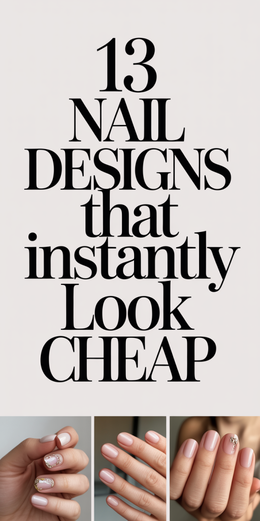
The 13 Nail Designs That Instantly Look Cheap
Not every bold or sparkly manicure is low-end, but certain motifs and executions regularly read as cheap. Here are the 13 culprits we see most often, and what usually makes them fail.
- Chunky, uneven glitter packed to the cuticle. It looks clumpy and rushed.
- Overloaded rhinestone beds on every nail. Too much bling loses impact.
- Neon colors with visible brush strokes. Harsh pigments reveal sloppy application.
- ‘Broken glass’ foils applied haphazardly. Jagged pieces without structure feel accidental.
- Cheap-looking sticker decals placed off-center. They lift, bubble, or look pasted on.
- Thick, uneven French tips or smile lines. Inconsistent curves make nails look amateur.
- Heavy chrome powder with finger prints and streaks. Chrome screams “attempted shortcut” when uneven.
- Busy pattern overload, animal print, florals, and stripes competing on every nail. It becomes noisy, not artistic.
- Mismatched lengths and shapes on the same hand. Balance is everything: mismatch reads careless.
- Matte topcoat over poor polish work, shows every imperfection.
- Tacky color combos (neon + gold foil, lime + magenta). Clashing low-contrast palettes age a manicure.
- Thick builder gel lumps and ridges. Texture should be intentional, not accidental.
- Heavy gradients with visible demarcations. Poor blends look like band-aids instead of ombré.
Later sections explain how to fix each problem quickly and how to ask for salon-friendly alternatives.
How To Tell Cheap From Trendy: 5 Visual Red Flags
We can usually tell at a glance whether a design is high-fashion or low-effort. Here are five visual red flags to watch for.
- Lack of negative space or balance, Too much going on at once makes the design shout instead of whisper. Trendy nails often use negative space intentionally: cheap ones just cram decoration everywhere.
- Inconsistency in shape and length, Luxury manicures have symmetry. If two nails are clearly different lengths or shapes, it pulls attention to the flaws, not the art.
- Visible application errors, brush strokes, uneven polish edges, and ridged gels are immediate giveaways. High-end work hides technique with smooth finishes.
- Overuse of accessories, a few well-placed crystals or a single glitter accent reads luxe: covering every nail reads costume-y.
- Poor color coordination, trendy palettes are cohesive and often restrained. Clashing or garish pairings look dated or cheap.
Spotting these signs helps us decide whether a design is fixable in minutes or if it needs a redo. In many cases, a simple topcoat, trimming of excess embellishment, or reshaping will change perception dramatically. We’ll give specific fixes in the “Easy Fixes” section, but for now keep these five red flags in mind next time you’re tempted by a dramatic pic on social.
Overused Color Combos That Age Your Manicure
Certain color combinations have been overused so often that they now feel dated or cheap. Recognizing these can help us choose hues that read modern and elevated.
- Nude + Orange undertone: A beige with a strong orange base can make nails and skin look washed out. Instead, reach for true neutral with a balanced undertone (greige, cool pink-beige).
- Neon + Metallic: Neon shades paired with bright gold or chrome can look gimmicky. If we want brightness, we modernize it with matte finishes or muted metallic accents.
- Hot Pink + Lime: Extremely high-contrast, saturated pairings often read juvenile. Use one vivid color and pair it with a dark neutral or soft gradient to ground it.
- Chocolate Brown + Low-Sheen Topcoat: This combo can look like old polish residue. Go for deep brown with glossy finish or add a subtle shimmer.
- Pale Pink + Chunky Glitter: When a delicate base meets aggressive glitter, the effect is unbalanced. Opt for fine shimmer or a single glitter accent nail.
We recommend thinking in palettes rather than single-lipstick shades: pick a dominant color, one grounding neutral, and one accent. That trio approach keeps even bold looks cohesive and expensive-feeling.
Excess Glitter, Chrome, And Rhinestones Gone Wrong
Embellishments can elevate a manicure, when used sparingly and placed intentionally. Here’s how excess sparkles, chrome, and rhinestones tend to cheapen the look and how to avoid that trap.
Why they fail:
- Visual noise: Too many reflective elements create chaos and hide polish quality.
- Poor placement: Crowding the cuticle or piling stones in the center makes nails look like costume jewelry.
- Low-quality materials: Thin foils and small, poorly faceted rhinestones dull quickly and can look plasticky.
Simple rules we follow:
- Less is more: Choose one focal nail, or limit stones to the ring finger.
- Size matters: Use one medium-sized crystal instead of five micro-crystals clustered together.
- Quality over quantity: Invest in multi-faceted crystals and fine cosmetic-grade glitter or powder.
- Placement logic: Place embellishments along the free edge or the smile line for intentionality.
If you already have overloaded nails, remove or reduce elements with tweezers and a thin layer of clear gel or topcoat to secure the remaining pieces. That quick edit often converts a tacky look into something elegantly sparkly.
Poor Application And Shape Mistakes That Kill The Look
A gorgeous color can be instantly ruined by uneven application or a mismatched shape. We look at the most common application and shaping mistakes and what to do instead.
Common culprits:
- Uneven edges and flooded cuticles: If polish reaches the skin or is missing near the cuticle, it feels amateur.
- Blobbed product and ridges: Too much product or lazy brushwork leaves bumps that are impossible to smooth out later.
- Wrong shape for the nail bed: Extremely sharp points or squoval on short nail beds can make hands look stubby or unbalanced.
- Inconsistent thickness: Thick builder gel on some nails and thin on others reads rushed.
Fixes we rely on:
- Rebalance the shape: File to a consistent length and angle before polishing. For short nail beds, soft square or rounded tips are the most flattering.
- Clean the cuticle line: Use a fine brush dipped in acetone to crisp the polish edge for a salon finish.
- Thin coats rule: Apply two thin coats rather than one heavy one: they dry smoother and last longer.
- Buff and prime: Lightly buff the natural nail surface and use a proper base coat to improve adhesion and finish.
Application technique is the backbone of a high-end manicure, invest five extra minutes in prep and you’ll see the difference.
DIY Shortcuts And Products That Cheapen Your Nails
Trying to save time or money is sensible, but certain DIY shortcuts and bargain products reliably degrade the final look. We’ll call out the usual suspects and suggest smart alternatives.
Problematic shortcuts:
- Skipping base coat: Leads to staining and uneven texture.
- Using non-cosmetic glitter or craft rhinestones: They don’t adhere properly and look fake.
- Rushing cure times with LED/UV: Incomplete curing causes tacky, soft finishes that attract dust.
- Cheap peel-off base coats: They make polish lift and chip in a day.
- Single thick coat instead of layered application: Looks lumpy and peels sooner.
Better options we recommend:
- Affordable, reliable base and top coats, look for names with consistent reviews rather than the absolute cheapest bottle.
- Cosmetic-grade glitters and crystals sold for nails, they’re cut to reflect light like real gems.
- Slow but thorough curing: Follow time guidelines for full set and avoid shortcuts.
- Use nail glue only for true repairs: otherwise, encapsulate with clear gel for longevity.
A few modest investments in tools and materials (fine nail brush, good base coat, quality topcoat) will upgrade every manicure and last through dozens of applications.
Easy Fixes To Make These Designs Look Expensive
Not every manicure needs a full redo. Often a handful of quick, inexpensive fixes will make a cheap-looking design read luxe. Here are the go-to edits we use.
- Trim and uniform the shape, 5 minutes with a good file creates immediate polish.
- Clean the cuticle line, dip a small brush in acetone and pull the polish away from skin. This gives crisp edges.
- Tone down accessories, remove excess rhinestones or glitter clusters, then seal remaining pieces with a glossy gel topcoat.
- Add a thin glossy or satin topcoat, a proper finish hides brush strokes and calibrates shine.
- Neutralize loud colors, if a shade is screaming, balance by painting one or two nails a grounding neutral (greige, soft taupe).
- Blend harsh ombrés, sponge a thin veil of translucent white or the base tone to soften banding.
- Replace cheap decals with hand-painted, simplified motifs, a single minimal stripe or dot looks intentional.
- Re-cure and rebuff chrome, lightly buff and reapply chrome powder for an even mirror finish.
We keep a small repair kit at home (acetone, brush, fine file, glossy topcoat, tweezers) so we can make these changes quickly. Usually, a 10–15 minute intervention will shift perception from cheap to chic.
What To Ask For At The Salon Instead (Phrases That Work)
Knowing the right phrases to use at the salon saves time and gets the result we want. Here are clear, polite ways to request a higher-end finish without sounding picky.
- “Could you clean and shape my cuticle line for a crisp edge?”, asks for precision rather than general filing.
- “I’d like a thin, even application with two coats, please.”, prevents heavy, blobbed polish.
- “Please place any crystals sparingly, one accent nail only.”, communicates restraint.
- “Can we use a glossy/satin topcoat rather than matte?”, matte hides flaws: request it only if the technician confirms a flawless base.
- “I prefer a soft square/rounded tip that flatters short nail beds.”, avoids extreme shapes that can look amateur.
- “Could you tone the color with a muted neutral accent?”, this helps ground neon or very bright colors.
- “Please cure fully between coats and the topcoat for the best durability.”, ensures longevity.
We’ve found that technicians appreciate concise, specific directions. If possible, show a reference photo and say what you like (e.g., “I like the balance in this photo, same amount of sparkle but cleaner lines”). That sets expectations and gets us a high-end finish.
Maintenance Tips To Keep Nails Looking High‑End
A luxe manicure isn’t a one-time achievement, maintenance extends the polished look. These habits keep nails looking salon-fresh longer.
Daily care:
- Apply a thin layer of cuticle oil each night to prevent dryness and lifting.
- Use a non-acetone polish remover to patch chips gently without damaging the entire manicure.
- Wear gloves for cleaning and dishwashing to avoid chemical degradation.
Weekly and monthly habits:
- Lightly buff and reapply a glossy topcoat every 7–10 days to refresh shine and hide small scratches.
- For gel and dip nails, schedule fills before the growth gap exceeds 2–3 millimeters, waiting too long makes the nails look unkempt.
- Replace degraded rhinestones or resecure them with a small drop of nail glue and seal with topcoat.
When to get a redo:
- If you see lifting, thick ridges, or large chips, it’s time for a professional redo. Trying to patch severe issues at home often makes them worse.
By combining daily oiling, mindful chores, and periodic refreshes, we preserve that high-end look and make salon visits count.
Conclusion
Cheap-looking nails are usually the result of choices, color, placement, application, or maintenance, that can be corrected without dramatic expense. We’ve outlined the 13 common designs that trip people up, five visual red flags, color combos to avoid, and practical fixes to rescue a manicure fast. The biggest wins come from small investments: better base/top coats, a few quality embellishments, and mindful salon communication. Keep a tiny repair kit on hand and use targeted phrases at the salon: those two habits alone will lift most looks from tacky to tasteful. Eventually, intent matters: when we choose restraint, consistency, and quality materials, our nails read as polished and purposeful instead of cheap. Try one of the quick fixes after your next appointment, you’ll be surprised how much difference five thoughtful minutes can make.