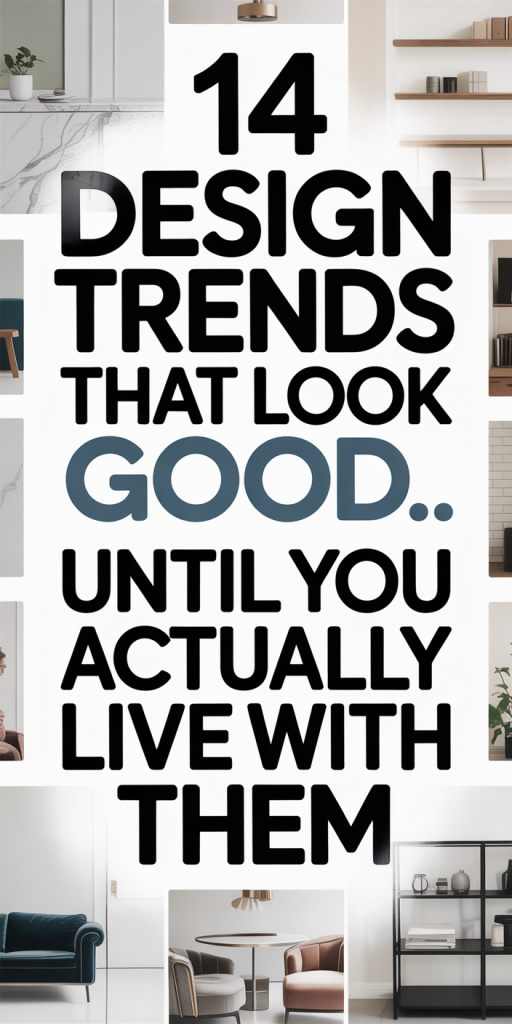
We love fresh design ideas as much as anyone, trends promise instant style and the thrill of something new. But after the paint dries and the welcome mats wear, a surprising number of these trends show a gap between aspirational photos and daily life. In this guide we walk through 14 popular looks that photograph beautifully but can create friction in real homes: aesthetics that complicate cleaning, maintenance, comfort, or function. We’ll explain why these choices trip people up, share concrete examples we’ve seen in real projects, and suggest practical alternatives or adjustments so you can keep the parts you love without inheriting regret. Think of this as realistic design triage: keep the charm, lose the headaches.
Open-Plan Living And Floating Shelves: Why They Fail Everyday Life
Open-plan living and floating shelves are staples of glossy interiors: they make a space feel airy, social, and modern. But the very qualities that look effortless in photos, visual openness and exposed storage, can exacerbate noise, clutter, and maintenance in everyday use.
Open plans remove the acoustic and visual buffers that separate activities. We love hosting, but in an open layout the smell of dinner, the sound of the TV, and a child’s assignments all compete within the same airspace. That constant sensory overlap wears on concentration and relaxation. In multi-person households, open plans often force implicit scheduling: someone needs to keep the volume down, others curtail cooking projects, or communal areas become less useful for lone tasks. Adding rugs, acoustic panels, or strategic shelving can help, but those are retrofits for a problem that layout alone creates.
Floating shelves deliver a light, modern silhouette, but they also demand constant curation. Unlike closed cabinetry, they show every dust particle, crooked frame, or mismatched object. We’ve walked into projects where beautifully styled floating shelves were abandoned after a few months because keeping them photogenic became a low-priority chore. They also aren’t great for heavy or irregularly shaped items: wall anchors fail, shelves sag, and repairs become frequent.
Practical tweaks: keep open-plan layouts in larger homes where sightlines don’t force constant interaction, or design partial partitions, a low console, glass divider, or tall planter, to preserve light while defining zones. For shelving, mix closed and open units: a bank of lower cabinets with a few floating shelves at eye level gives display space while hiding the everyday mess. Choose thicker floating shelf profiles and heavy-duty anchors if you must go all-in, and accept that fewer objects, rotated seasonally, will reduce maintenance.
The takeaway: open plans and floating shelves look contemporary, but they amplify daily life’s noise and clutter. With small design safeguards we can retain the aesthetic while reducing the day-to-day friction.
All-White Monochrome And Bleached Wood: Pretty And Quickly Tiring
An all-white palette paired with bleached wood finishes is the visual shorthand for calm minimalism. It photographs like a spa, bright, reflective, visually uncluttered. Yet living in a high-key, desaturated environment exposes practical problems quickly.
White surfaces are unforgiving. Smudges, fingerprints, and crumbs jump out against pale backgrounds. Families with kids or pets discover that the constant upkeep required to maintain that pristine look becomes exhausting. Even tiny color transfers from denim or fruit stains show up on light upholstery and rugs. Bleached wood finishes, while warm and contemporary, can look tired after sunlight exposure: UV fading, yellowing in adjacent areas, or inconsistent wear patterns can betray the carefully edited look.
There’s also a psychological effect. An entirely pale environment can feel sterile or one-note over time, especially in climates with long winters. We’ve seen clients initially euphoric about the bright, minimalist vibe later request richer accents because the space felt emotionally flat.
If you adore the all-white aesthetic but want longevity, consider the following adjustments. Introduce tactile, darker accents, a woven throw, a walnut side table, or matte black hardware, to provide visual anchors and hide wear. Choose high-performance textiles treated for stain resistance and select washable slipcovers for sofas. For bleached wood, opt for lower-gloss sealants that resist UV yellowing and allow you to refresh color with less noticeable touch-ups. Finally, plan for seasonal color shifts: adding plants, rugs, or art that change with the year keeps the palette feeling intentional rather than punitive.
In short: monochrome white is beautiful, but it demands a maintenance budget, both in time and in textiles, to remain livable and lively.
Seamless Indoor–Outdoor Glass Walls And Floor-Level Thresholds: Beauty Vs. Practicality
We love the idea of dissolving the boundary between inside and out: sliding glass walls and floor-level thresholds create dramatic continuity and flood interiors with light. Yet bridging two environments brings performance challenges that aren’t obvious in vacation-house photography.
Thermal comfort and humidity control are the biggest concerns. Glass walls, even when double- or triple-glazed, can create significant heat gain in summer and heat loss in winter unless shading and HVAC are calibrated precisely. Floor-level thresholds that sit nearly flush offer a seamless look but can become conduits for dust, leaves, standing water, and insect ingress. In rainy climates they are maintenance liabilities: in hotter climates they increase cooling loads. Owners frequently tell us they underestimated how often they’d need to clear tracks, reseal thresholds, or dry out the floor after storms.
Security and privacy are other practical considerations. Expansive glass can feel vulnerable at night without carefully planned blinds or smart glass. And while sightlines are lovely during the day, neighbors, pathways, and wind-driven rain become more intrusive when the barrier between worlds is minimal.
Practical mitigations we recommend: design overhangs and exterior shading to reduce solar gain, and integrate high-performance screens or retractable weatherproof barriers that preserve the visual openness while protecting against the elements. Pick threshold systems with drainage channels and durable, easy-to-clean tracks. For privacy, consider automated shading that tucks away neatly when not in use. Also, plan HVAC capacity and zoning with the glass expanse in mind: a one-size-fits-all system won’t cut it.
The bottom line: we adore the cinematic appeal of indoor–outdoor glass walls, but they require systems thinking, drainage, shading, security, and HVAC, to be functional year-round.
Hidden Minimalist Storage And Flush Integrated Appliances: The Cost Of Concealment
Concealed cabinetry and integrated appliances are the minimalist’s dream: nothing distracts from clean lines and uninterrupted surfaces. But concealment trades visible clutter for hidden compromise, and that trade-off becomes apparent fast.
Hidden storage often means shallow drawers, bespoke fittings, or oddly sized compartments tailored to a picture-perfect assortment of belongings. In real life, our things come in all shapes and sizes: bulky backpacks, awkward exercise gear, and odd foreign kitchen gadgets. We’ve found that bespoke interiors can make those items awkward to store: owners end up leaving things out, defeating the minimalist intent. Integrated appliances like panel-ready dishwashers and fridges streamline a kitchen’s look, but they complicate service access. Repair technicians sometimes need to remove cabinetry panels to reach connections, and replacement appliances with matching panels are harder to source a few years later.
There’s also the matter of cost and longevity. Flush fronts use specialized hardware and hinges that add expense and potential points of failure. Soft-close mechanisms and push-to-open systems are delightful until they break and parts aren’t available locally.
We recommend a hybrid approach: prioritize open, shallow storage for frequently used items and reserve concealed units for truly unsightly necessities. Build flexible storage with adjustable shelving and drawers sized for real-world objects, measured during the design phase, not estimated from mood boards. For appliances, choose standard-sized units when longevity and ease of service matter most: if panel-ready is essential, maintain a detailed file with panel dimensions and vendor contacts so replacements are straightforward.
Concealment can create calm, but only when the hidden systems are designed around the messiness of life, not an idealized image of it.
Concrete Countertops And Large-Format Porcelain Tiles: Durable Looks, Daily Drawbacks
Concrete countertops and large-format porcelain tiles deliver a concrete, contemporary aesthetic that signals permanence. They’re on-trend because of their materiality and industrial chic. But, their real-world performance can disappoint when used without pragmatic detailing.
Concrete is porous by nature. Even with sealers, countertops can stain, chip, or develop hairline cracks from thermal stress or impact, especially if the mix wasn’t designed for bench use. Repairs are visible unless we anticipate distress and make it part of the finish. Also, concrete surfaces can be heavy, requiring reinforced cabinets or substrates that add to the cost and complexity of installation.
Large-format porcelain tiles minimize grout lines and create expansive, seamless floors or walls. But we’ve seen installation issues: subfloor tolerances must be tighter, and flatness becomes critical. Without a perfectly leveled substrate, large tiles can crack or lippage becomes apparent. In kitchens, large tiles can be slippery when wet unless a textured finish is chosen, and replacing a damaged tile later can be a challenge if the manufacturer no longer stocks the size or batch.
Maintenance is another gray area. People expect these materials to be “set-and-forget,” but they benefit from regular care: resealing concrete surfaces periodically, using non-abrasive cleaners, and monitoring grout joints. For homeowners who want the industrial look with lower maintenance, we often suggest engineered stone with honed finishes or porcelain slabs that mimic concrete but offer improved stain resistance and thinner profiles for easier installation.
If you insist on concrete or large-format tiles, invest in reputable installers, specify appropriate mixes and underlays, and plan for maintenance. A beautiful material won’t stay beautiful without thoughtful detailing.
Statement Wallpaper Everywhere And Heavy Pattern Layering: From Bold To Overwhelming
Wallpaper with bold patterns and maximalist layering have made a strong comeback. A statement wall can be glorious, a room-defining backdrop that injects character. But when pattern is applied indiscriminately across every surface, the effect quickly shifts from curated to claustrophobic.
Our experience shows that pattern fatigue is real. Busy wallpapers compete with furnishings and art: in smaller rooms they can reduce perceived space and increase visual chaos. Heavy pattern layering, multiple competing prints on upholstery, rugs, and window treatments, can make a home feel constantly over-stimulating. That’s tolerable for short-term excitement, but for daily living people often crave a visual hierarchy instead of continuous sensory input.
There are also practical concerns: wallpaper in high-traffic or humid areas can peel, stain, or trap odors. Patterned wallpapers hide scuffs well, but they also make wall repairs more noticeable if matching rolls aren’t available. And bold prints have an emotional shelf life, what feels adventurous now can feel dated in a few years.
Our pragmatic approach is to use statement patterns selectively. Reserve wallpaper for a focal wall, a powder room, or an alcove where it can be enjoyed at a distance. Balance pattern with calm, neutral planes and repeat colors from the wallpaper in pillows or small accessories to create cohesion without exhaustion. For long-term satisfaction, choose patterns with scale appropriate to the room and opt for removable or washable wallpapers in kitchens and hallways.
Boldness is great in small doses. When we treat pattern as seasoning rather than the main course, the space remains lively, without overwhelming residents every day.
Matte Black Hardware And Industrial Raw Finishes: Trendy Now, Tricky Later
Matte black hardware and raw industrial finishes are unmistakably fashionable: they read modern, tactile, and chic. But they’re high-visibility finishes that reveal fingerprints, wear, and cleaning habits quickly.
Matte black, for example, tends to show oil from hands as darker, shinier patches if the finish isn’t robust. We see doorknobs and tap handles that look pristine in showrooms but develop uneven sheen in real homes. Industrial raw metals, unsealed brass, unfinished steel, patinate over time, which some homeowners adore but others find unpredictable and difficult to control. Outdoor or coastal environments accelerate corrosion and require protective coatings or frequent maintenance.
Another practical snag: these finishes are often offered by niche manufacturers. When a hinge, pull, or leg goes out of stock, matching replacements can be hard to find. That complicates repairs and renovations down the line. Also, matte black coatings differ widely in their manufacturing: lower-cost finishes can chip or flake, revealing metallic or different colored bases beneath.
We recommend assessing finishes by feel and backing warranty claims with supplier documentation. For high-touch items like kitchen pulls and faucets, choose finishes rated for heavy use and check supplier replacement policies. For industrial raw elements we either accept the living finish and plan for visible aging, or we specify sealed/patinaed versions that deliver the look without the maintenance burden. Finally, consider mixing finishes deliberately: a few matte black accents can read intentional without requiring every single piece to match.
Trendy finishes can elevate a design, but they require honest maintenance planning and a contingency for future repairs.
Conclusion
Design trends are how we explore new identities for our homes, but trend adoption without pragmatic planning creates avoidable pain. We haven’t argued against style, rather, we suggest coupling aesthetic ambition with honest life-testing: ask how a surface will age, how a layout will cope with noise, or how a finish will handle fingerprints and repairs. Small design decisions, a mix of open and closed storage, textured accent colors, or serviceable materials that mimic high-maintenance looks, let us keep the parts we love and sidestep the headaches.
Eventually, the best rooms are the ones that look good and live well. If we make choices that respect both, we’ll enjoy trends today and still be glad we did next year.