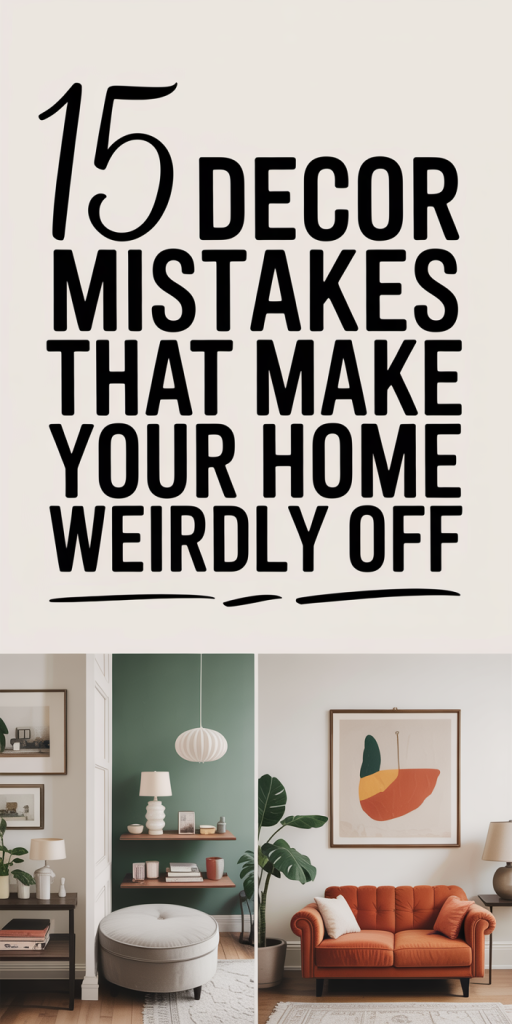
We’ve all walked into a room that looks fine on paper, good furniture, nice paint, but somehow it feels off. That vague unease isn’t imaginary: design mistakes add up and throw your home’s balance, flow, and mood out of whack. In this text, we’ll walk through 15 decor mistakes that make your home feel weirdly off, explain the psychology behind why these issues bother us, and give fast, practical fixes you can apply this weekend. Whether you’re decorating a starter apartment or refreshing a long-loved house, our goal is to help you spot the subtle problems and correct them with confidence.
Why Your Home Feels ‘Off’: The Psychology Behind Decor
There’s a reason we react emotionally to spaces: human brains evolved to read environments for safety, comfort, and social signaling. When a room violates those subconscious cues, poor balance, confusing circulation, or conflicting visual signals, we sense tension even if we can’t name it. Here are the psychological triggers behind that “off” feeling and why correcting them matters.
- Cognitive load and visual noise: Too many competing patterns, mismatched finishes, or cluttered surfaces increase cognitive effort. Our brains prefer a few clear focal points over a scattered visual field: when decor demands constant processing, we feel fatigued.
- Scale and proportion mismatch: Objects that are too small or too large for the space disrupt perceived harmony. Small furniture in a big room makes a space feel empty and insecure. Oversized pieces in a modest room feel oppressive. Proportion anchors our sense of comfort.
- Poor circulation and blocked sightlines: Humans favor clear paths and predictable layouts. When traffic routes are awkward or sightlines to windows and focal points are blocked, tension builds. We’re subtly checking exits and paths, just like animals do.
- Conflicting atmospheres: When design signals contradict, like ultra-modern furniture in a cluttered, traditional room, the mismatch confuses our emotional response. The space sends mixed messages and we respond with unease.
- Lighting incongruities: Light is a major mood driver. Flat, uniform lighting flattens depth: harsh single-source lighting creates shadows and unease. Our circadian rhythms also respond to color temperature: overly cool or warm light at the wrong time feels unnatural.
Understanding these mechanisms lets us prioritize fixes that reduce friction. The rest of this article breaks down the 15 mistakes into actionable categories, scale/layout, color/pattern/lighting, furniture/flow/function, and accessories/textures, so we can restore balance quickly and intentionally.
Scale, Proportion, And Layout Mistakes That Throw Off The Room
Mistake 1, Furniture that’s too small or too big: When we put a tiny sofa in a big living room, the space reads as unfinished and awkward. Conversely, an oversized sectional in a small room crushes breathing room and circulation. Fix: Measure twice. Aim for about 60–70% of the seating area as usable furniture footprint in living rooms. Use area rugs to anchor scale, rugs that are too small make the space fragment: a larger rug brings cohesion.
Mistake 2, Floating furniture against walls only: Pushing everything to the perimeter creates a cavernous middle that disconnects conversation areas. Fix: Pull furniture inward to create a purposeful seating group. Even 12–18 inches from the wall can change intimacy and flow.
Mistake 3, Ignoring focal points and sightlines: Rooms without a clear focal point feel scattershot. Fix: Identify or create a focal point, a fireplace, a large artwork, or a media wall, and arrange seating to face or engage with it. Maintain clear sightlines to windows so natural light can do its work.
Mistake 4, Bad traffic patterns: Placing furniture where people naturally walk causes awkward navigation and visual tension. Fix: Map the paths people take and ensure 30–36 inches of walkway. If a coffee table blocks flow, swap for a smaller option or remove it.
Mistake 5, Overemphasis on symmetry: Symmetry is calming but can become stale or rigid if overused. A perfectly mirrored layout in every room reads formal and uninviting. Fix: Use near-symmetry, pair similar items but vary scale or texture on one side to keep things lively.
Mistake 6, Too many competing focal points: When a room has several elements shouting for attention, bold rug, dramatic light fixture, oversized artwork, you get noise not harmony. Fix: Re-establish hierarchy. Choose one dominant element and subdue others with neutral tones or simpler lines.
Practical checklist for layout fixes:
- Measure room dimensions and furniture footprints before moving.
- Anchor seating with an appropriately sized rug (ideally all front legs on the rug in living rooms).
- Keep 18–24 inches between coffee table and sofa: 30–36 inches for main walkways.
- Create conversation zones: avoid a single long line of seating unless the room is meant for viewing only.
Correcting scale and layout quickly often requires little money, just a tape measure, an edit of pieces, and some strategic pulls and pushes. We recommend starting with rug and furniture placement: those changes usually yield the biggest perceptual improvement.
Color, Pattern, And Lighting Errors That Create Unease
Mistake 7, Choosing paint by swatch alone: Small swatches lie. A color can read soothing in the store and harsh at home under your light. Fix: Always test large swatches on multiple walls and observe them at different times of day. Pay attention to undertones, greenish or pinkish casts can react oddly with furnishings.
Mistake 8, Overly busy pattern mixing: Patterns add personality, but when too many clash in scale and direction, the room feels chaotic. Fix: Limit yourself to a 60/30/10 rule for patterns, one dominant pattern, one supporting pattern, and one accent. Vary scale: pair a large-scale pattern with a small, tonal print and a solid.
Mistake 9, Wrong lighting layers: Relying only on overhead fixtures or a single lamp flattens the room. Fix: Build three layers: ambient (overhead), task (reading, cooking), and accent (art, architectural features). Dimmers are cheap mood-savers, install them where possible.
Mistake 10, Mismatched color temperatures: When bulbs of different kelvin ratings share a room, surfaces take on strange casts and skin tones look off. Fix: Standardize bulb temperature per room, 2700K–3000K for warm living spaces: 3500K–4100K for work-oriented areas. Replace mismatched bulbs to unify the atmosphere.
Mistake 11, Forgetting contrast and depth: Using a single mid-tone everywhere results in a flat, bland space. Fix: Introduce contrast with trim, one darker accent wall, or layered textiles. Contrasts create depth and make a room feel intentional rather than washed out.
Quick visual rules we use:
- Test paint and textiles under morning and evening light.
- Limit primary pattern types to two, vary scale and direction.
- Aim for 2–3 lighting sources visible from seating areas.
- Keep one warm or cool anchor to set emotional tone.
These color and lighting changes often transform mood more dramatically than swapping furniture. They’re inexpensive and impactful if you prioritize coherent temperature, scale, and layered illumination.
Furniture, Flow, And Function Mistakes People Make All The Time
Mistake 12, Choosing aesthetics over ergonomics: A beautiful chair is useless if nobody wants to sit in it. We see this in living rooms full of stylish-but-awkward seating. Fix: Prioritize comfort for frequently used pieces. Test seating depth, cushion resilience, and arm height before committing, especially for sofas and dining chairs.
Mistake 13, Multipurpose misuse: Expecting one piece to do everything often leads to compromise. A desk that doubles as a dining table will frustrate both work and meals. Fix: Define primary function per zone. When space is tight, choose modular or fold-away solutions designed for the intent (e.g., a wall bed with integrated storage, a console desk that expands).
Mistake 14, Poor storage strategy: Visible clutter or having nowhere to put everyday items creates constant low-level stress. Fix: Add concealed storage where possible, benches with lids, ottomans, built-in shelving with doors. Make frequently used items easy to return to their place with labeled baskets or trays.
Mistake 15, Ignoring task-specific lighting and surfaces: We often treat kitchens and home offices like regular rooms, but they need task-specific ergonomics. Fix: In kitchens, ensure prep areas have clear light and at least 36 inches of counter clearance near the sink when possible. For home offices, align the monitor to minimize glare and set desk height to 25–30 inches depending on your chair.
Flow tips that help immediately:
- Walk the room carrying a cup: if you spill, the layout needs adjustment.
- Create zones with rugs, lighting, and furniture orientation.
- Keep frequently used items within 1–2 steps of their primary use area.
Function-first design doesn’t mean ugly design. We can make functional pieces beautiful by choosing finishes and textures that fit the room’s style while keeping ergonomics top of mind.
Accessory, Texture, And Surface Mistakes (Clutter, Mirrors, Art)
Accessories, textures, and surfaces provide personality, but they’re also the easiest place to go wrong.
Mistake 16, Over-accessorizing and visual clutter: Layering personal items is one thing: piling them without rhythm is another. Too many small accessories create visual static. Fix: Edit ruthlessly. Group like objects into vignettes of 3–5 items with varied heights and negative space. Keep surfaces functionally clear, entry consoles and kitchen counters should have 1–2 essential items only.
Mistake 17, Misplaced mirrors: Mirrors are powerful for light and scale, but a mirror that reflects clutter, the wrong view, or hangs at the wrong height can amplify problems. Fix: Hang mirrors to reflect a positive view, natural light, a piece of art, or architecture. Eye-level mounting is critical: generally center the mirror 56–60 inches off the floor unless you’re tailoring to a household average height.
Mistake 18, Art hung too high or too low: Art that floats too close to the ceiling or is crammed to the floor disrupts visual flow. Fix: Aim for art centers at roughly 57–60 inches above the floor (gallery standard). For groupings, treat the whole arrangement as one piece and center accordingly. Keep scale proportional, large walls need large art or thoughtfully composed clusters.
Mistake 19, Lack of tactile variety: Rooms that rely on one surface type, too much gloss, all flat linens, or excessively hard finishes, feel sterile. Fix: Layer textures: a woven rug, a velvet pillow, a matte ceramic, and a brass accent add depth. Texture controls perceived warmth and approachability.
Mistake 20, Neglecting maintenance surfaces: Choosing materials that show wear or are hard to clean for high-use zones leads to a perpetually tired look. Fix: For high-traffic areas, pick durable finishes: performance fabrics, sealed wood, and washable rugs. We can still pick beautiful materials, just prioritize longevity where it matters.
Accessory editing ritual we recommend:
- Remove everything from a surface.
- Reintroduce only the pieces that serve beauty, function, or memory, max 4–6 items per surface.
- Arrange with height variety and negative space.
Small changes, re-hanging art at the right height, swapping a mirror location, or editing surfaces, often cure that intangible “off” feeling faster than a full redesign.
Quick Budget Fixes For The Most Common Decor Problems
We want results fast and within budget. Here are practical, low-cost interventions that fix multiple issues at once.
- Rehang artwork and mirrors: Use the 57–60 inch center rule. A dozen nail holes later you’ll likely notice an immediate lift.
- Standardize bulbs: Swap mismatched bulbs for a single color temperature per room, this costs only a few dollars per bulb and harmonizes everything.
- Edit accessories: Put half your decorative objects in storage for a week. If the room breathes, rotate items seasonally rather than displaying everything at once.
- Reposition furniture: Pull seating away from walls, angle chairs toward conversation, and ensure 30–36 inch clear paths. No purchases required, just effort.
- Layer textiles: Add a textured throw, two pillows with different scales, and a rug that ties colors together. Thrift stores and discount home outlets have great finds.
- Use peel-and-stick solutions: Removable wallpaper, temporary backsplashes, and peel-and-stick tiles let us experiment with color and scale without contractor costs.
- Invest in one statement light fixture: Swapping an uninspired pendant for a sculptural option instantly gives the room a focal point.
These fixes typically take a few hours to a weekend and cost from $0–$300 depending on what you choose. The point: targeted edits beat full overhauls when you want quick, measurable improvement.
When To Call A Designer Or Contractor Instead Of DIYing
We support DIY energy, but some problems benefit from professional expertise.
Call a designer when:
- You can’t decide on a cohesive direction: If style choices conflict and feel irreconcilable, a designer will set the visual rules and create a plan.
- You’re renovating multiple rooms or an open-plan space: Designers think holistically about flow, color palette, and lighting across zones.
- You need custom solutions: Built-ins, custom upholstery, or tricky furniture layouts are where a designer’s resources and vendor relationships pay off.
Call a contractor when:
- Structural changes are required: Moving walls, changing electrical or plumbing, or installing permanent cabinetry needs licensed pros for safety and permits.
- You need specialized trades: High-end lighting, plaster repairs, or custom millwork are better handled by skilled contractors.
Hybrid approach: We often recommend starting with a short designer consultation, many firms offer hourly coaching. A designer can create a plan and shopping list, then you DIY the sourcing while hiring contractors only for technical tasks. This saves money while ensuring the end result reads cohesive and intentional.
Budget tip: Use a designer for critical decisions (layout, lighting scheme, palette) and execute other elements in phases. That way the foundation is right and you avoid expensive mistakes later.
Conclusion
Small decor missteps often combine into that vague sense that something is off. By focusing on psychology, scale, proportion, lighting, ergonomics, and purposeful accessories, we can quickly move a room from uneasy to inviting. Start with measuring and editing, standardize lighting, and carry out a few high-impact fixes like re-hanging art or anchoring seating with the right rug. If the problems run deeper, a short designer consultation prevents costly missteps. We’ll feel the difference not just visually but emotionally: our homes should support us, not tire us. Let’s fix the little things, they add up to comfort, clarity, and a home that finally feels right.