We’ve all scrolled through glossy feeds, saved manicures that looked incredible in photos, and walked out of the salon convinced we’d discovered a winner, only to leave with nails that read nothing like the inspiration. In 2026 the nail world is more adventurous than ever, but that freedom brings more ways to miss the mark. In this text we look at 14 nail designs and trends that frequently fail in execution or concept, why they fall short, and how to make smarter choices next time. Our goal isn’t to police creativity: it’s to help you spend time and money on manicures that flatter your hands, match your lifestyle, and photograph well. We’ll break down common mistakes, bad color choices, awkward shapes, misplaced gems, and give practical fixes so you can keep experimenting without the regret. If you’re ready to upgrade your mani IQ and avoid the most common stylish fails of 2026, let’s dig in.
Why These Nail Designs Often Miss The Mark
Trends evolve fast, and what looks chic on a runway or in a magazine doesn’t always translate to everyday wear. We see three big reasons a nail design will miss the mark: concept vs. execution, mismatched proportions, and lifestyle mismatch.
Concept vs. execution: A clever idea, like a tiny painted landscape or intricate micro-lace, can become muddled when painted on a curved, tiny canvas. If the tech or artist lacks the right tools or time, the end result looks amateur rather than artisanal.
Mismatched proportions: Many designs are created with long, almond-shaped nails in mind. When copied onto short squoval nails, they lose balance and can appear cramped or overly busy.
Lifestyle mismatch: A design that requires delicate upkeep or protruding elements may look amazing for a shoot but is impractical for someone typing, cooking, or parenting. We should choose designs that fit how we use our hands.
Understanding these failure modes helps us avoid costly mistakes and pick manicures that truly flatter.
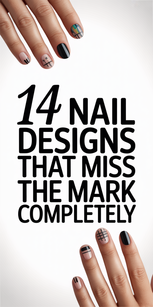
Overly Complicated ‘More Is More’ Nail Art
There’s a prevailing belief that more detail equals more artistry. But when every nail becomes a tiny canvas packed with lines, colors, decals, and gems, the result can be chaotic rather than elevated. Overly complicated nail art often suffers from a few predictable problems: busy composition, loss of focal point, and poor scalability.
Busy composition: Our eyes need a place to rest. If every nail has five competing elements, nothing reads clearly from a distance. Simplicity is a design tool, negative space, repeat motifs, and consistent palettes help the eye make sense of ornamentation.
Loss of focal point: Strong designs usually have one focal element per hand or per nail. When we pile on features, there’s no hierarchy and the manicure feels like visual noise.
Poor scalability: A look that requires micro-detailing is hard to replicate across ten nails consistently. Unless you’re working with an experienced nail tech who uses fine brushes, stamping, or decals made for small canvases, the intricacy falls apart.
When we love detail, we should pick where it counts, one statement nail or a repeating, simplified motif, so the artistry reads at a glance and lasts through daily life.
Theme Mashups That Just Don’t Work
Combining themes can be playful, think disco florals or goth pastels, but some mashups feel forced or confusing. A successful theme merge follows a unifying thread: color, texture, or a single conceptual pivot. Failures happen when we stack unrelated ideas without a bridge.
Common mismatches: seasonal vs. seasonal (pumpkins and snowflakes in the same set), aesthetic vs. aesthetic (cottagecore florals paired with hyper-gloss metallic chrome), and micro-culture signals (mixing Eastern motifs with Western holiday icons without sensitivity).
Why it fails: The brain looks for cohesion. When we present opposing visual cues, the manicure reads as indecisive rather than eclectic. Also, theme mashups can unintentionally communicate something insensitive if cultural elements are mixed superficially.
How to fix it: Choose one unifying element, like a shared color story, a repeated texture, or an overarching shape, that ties the disparate ideas together. For example, pairing vintage toile prints with neon accents can work if you repeat the neon as fine outlines across all nails. Otherwise, less is more: pick one theme and execute it well.
Clashing Color Combos And Poor Contrast Choices
Color is everything in nail design. The wrong hue pairing or poor contrast can make even expert nail art look unattractive. We often see two types of color mistakes: clashing palettes and insufficient contrast.
Clashing palettes: These are combinations that fight for attention, neon lime with deep maroon, or mustard with certain blues. They can be jarring unless intentionally balanced. Pairing colors that sit far apart in temperature (one icy, one muddy) without a neutralizer usually results in visual friction.
Insufficient contrast: Delicate line work, text, or tiny decals require contrast to be legible. Pale gray on beige, pastel lavender script on muted pink, these choices look lost, especially in photos or low light.
Practical tips: Use a color wheel, complimentary and analogous schemes are our friends. Introduce tie-in shades (a thin black outline, a white highlight, or a metallic neutral) to help disparate tones coexist. Test your palette under natural light and on a sample nail before committing to the full set. If a color reads muddy on your skin tone, it’s better to swap for a cleaner version.
Distracting Embellishments And Bad Placement
Embellishments, rhinestones, pearls, studs, can elevate a manicure, but they’re easy to overuse. The worst designs stick gems in places that disrupt nail ergonomics or create an unbalanced silhouette.
Distracting positions: A large rhinestone at the tip of the nail catches every swipe and can snag fabrics. Placing heavy embellishments near the cuticle on short nails makes them look top-heavy. We should consider both the visual balance and the tactile experience.
Quantity vs. quality: Ten tiny crystals per nail cheapen the look. A few carefully chosen accents, one statement gem per hand or a line of microstuds along the free edge, reads chic and intentional.
Attachment methods: Poorly affixed gems fall off fast. We recommend high-quality resin or gel settings and a sealed top coat. If maintenance is an issue, consider painted faux gems or chrome accents that mimic 3D without the hassle.
Placement rule of thumb: aim for rhythm and restraint. Repeat an element across a finger or two instead of across the whole hand to create a visual cadence without overwhelming the design.
Awkward Negative Space, Asymmetry, And Strange Layouts
Negative space and asymmetry are modern tools, we love their minimal sophistication when used deliberately. But they can look accidental, sloppy, or ill-fitting when proportions are off or the layout ignores nail geometry.
Why awkward negative space happens: Designers sometimes copy a look meant for longer nails, leaving large patches of bare nail on shorter ones that read as unfinished. Or they place negative space too close to the cuticle, which can make nails look narrow and unbalanced.
Asymmetry gone wrong: Asymmetry should feel curated. Random placement of lines, dots, or shapes without rhythm tends to look like an unfinished test sheet rather than considered design.
Layout solutions: We think in thirds. Visually divide the nail into base, center, and tip and use those zones to plan negative space. If you’re working with short nails, reduce scale, smaller gaps and simplified lines read intentional. For asymmetry, repeat one motif across different nails but alter scale or orientation to create cohesion rather than chaos.
The core idea: negative space should feel like a confident choice, not lazy execution.
Unflattering Shapes, Lengths, And Proportions
A design’s success depends heavily on nail shape and length. We see many manicures sabotaged by a shape that clashes with finger proportions or a length that’s impractical for the wearer.
Shape mismatches: Squoval, almond, coffin, stiletto, each shape communicates something different. Very long coffin or stiletto nails can look aggressive on shorter fingers, making hands appear shorter. Conversely, overly rounded tips on long fingers can make them look gangly.
Length problems: Extremely long nails are trendy, but they don’t suit everyone. They can distort the visual balance of polish designs (tiny florals become unreadable) and limit daily function. Shorter nails often offer a more flattering, practical canvas for detailed art.
Proportion guidance: Consider the length of your nail bed and the width of your fingers, if your nail beds are short, extend length carefully rather than jumping to extreme shapes. For first-timers trying a bold color or heavy embellishment, choose a moderate length to see how it reads.
We advise consulting with your nail tech about proportions: a small tweak in length or a softened tip can transform a design from awkward to flattering.
How To Avoid These Mistakes In Your Next Mani
Avoiding these common pitfalls starts with intention. Before you book an appointment or attempt a DIY, ask yourself a few simple questions: What’s my daily routine? Which colors flatter my skin tone? How much maintenance am I willing to do? Answering these helps narrow choices and prevent regret.
Bring references, not replicas: Photos help, but bring close-ups and a note about what you like, color, shape, negative space, so your tech can adapt the concept to your nail canvas. Expect some interpretation: insist on proportion adjustments rather than a literal copy that won’t suit your nails.
Start small with novelty: If you want to try a bold trend, 3D pearls, extreme almond length, or neon gradients, test it on an accent nail or for a short period. This reduces risk and helps you learn what you actually enjoy wearing.
Trust the tech’s judgment: A skilled nail artist will advise on shape, scale, and placement. We should treat the consultation as a collaborative design session, not just a transaction.
Finally, think about upkeep: choose top coats and setting methods that match your lifestyle. A gorgeous set that lasts two weeks and looks fresh is worth more than a dramatic set that chips immediately.
Quick Fix Checklist For Salvaging A Bad Design
Quick Fix Checklist For Salvaging A Bad Design
- Assess the main issue first: color, proportion, placement, or hardware. Fixing the root problem prevents cosmetic band-aids.
- Neutralize with a thin outline: Add a contrasting border (black, white, or metallic) to define shapes and increase legibility.
- Scale back embellishments: Remove excess gems and reseal remaining accents with gel to improve adhesion and reduce snagging.
- Add negative space strategically: If a design feels too busy, repaint alternate nails with a neutral or sheer to create balance.
- Shorten or reshape: If length or shape is the problem, ask your tech to file down a millimeter or two, small changes make a big difference.
- Top coat refresh: A meticulous re-top coat can unify texture and make faded details pop again.
- When in doubt, simplify: It’s better to cover with a single, flattering color than to force a failing design to work.
We recommend carrying a quick-fix kit (mini top coat, fine brush, polish remover pen) for on-the-go corrections between salon visits.
When It’s Okay To Break The Rules (And How To Do It Right)
Rules are guidelines, not laws. We love boundary-pushing mani choices when they’re thoughtful and intentional. Breaking the rules works when you understand the principles and bend them with purpose.
Choose your reason: Are you making a fashion statement, celebrating an event, or experimenting with art? Purposeful rule-breaking feels expressive rather than accidental.
Control one variable: If you’re combining clashing colors, keep shape minimal. If you’re adding many embellishments, limit vibrant hues. This controlled imbalance keeps the design readable.
Respect ergonomics: Even if you opt for 3D elements or extreme lengths, consider how your hands function. Place bulky items where they won’t snag, and keep a maintenance plan in mind.
Own the look: Confidence sells a risky manicure. If you’ve chosen a bold design deliberately, wear it proudly and pair it with complementary clothing or accessories so the manicure reads as part of a cohesive aesthetic.
Finally, treat experimentation as iterative. Try a bold idea on an accent nail or for a short window before committing fully. That way we can break rules thoughtfully, and return to fundamentals when the novelty wears off.