Trends come and go, but some nail looks keep circling back until they feel less chic and more predictable. We’ve watched manicures evolve from minimalist statements to maximalist spectacles, and somewhere along the way a handful of designs tipped from stylish to overdone. In this piece we’ll explain why certain nail trends keep resurfacing, share practical signals that a design is past its peak, and break down 15 specific looks that often feel exhausted on the street, grouped so you can scan quickly and decide what to skip at your next appointment. Think of this as our friendly, opinionated cheat sheet: we want you to feel confident about committing to a manicure that truly suits you, not one you’ll regret the moment you post a photo.
Why ‘Overdone’ Nail Trends Keep Returning
Fashion is cyclical, and nails are no exception. There are three big reasons the same tired nail looks keep popping back up. First: familiarity sells. Salons, influencers, and brands lean into what’s proven to get attention, it’s safer commercially to reproduce a known winner than to invent something risky. Second: the social media feedback loop. When a design racks up likes, creators replicate it across platforms and geographies. What begins as a niche or haute-couture look quickly becomes ubiquitous. Third: the low barrier to copy. Many overdone styles aren’t technically complex to replicate, a few well-placed stickers, a generic glitter topcoat, or a stencil does the job, so they spread fast.
That repetition has consequences. A look that was once surprising or boundary-pushing becomes background noise, and its original intent, elegance, rebellion, whimsy, is diluted. We also see variations where people combine multiple trending elements into one manicure (think chrome + ombré + gems), which creates visual confusion rather than innovation. Finally, some trends persist because they serve cultural or aspirational signals: logo nails and brand-led designs telegraph wealth or affiliation. When enough people adopt that shorthand, it becomes a hollow signifier.
Understanding these dynamics helps us spot when something is trending because it’s genuinely fresh versus when it’s trending only because it’s safe and replicable. That distinction matters when we want our nails to express us rather than a viral algorithm.
How To Tell If A Nail Design Has Become Overdone (Not Just Popular)
Popularity doesn’t equal overdone. We can appreciate a flattering classic, but there are signs a design has crossed the line from beloved to overplayed. Here are practical criteria we use to judge whether a look is overdone:
- Saturation vs originality: If you see the exact same pattern, color palette, or placement across influencers, salon windows, and retail press photos in a single month, that’s saturation. Originality is absent when every variation reads like a copy.
- Context collapse: When a design once reserved for special occasions shows up daily, office meetings, grocery runs, school drop-offs, it’s lost its specialness. Overuse flattens context.
- Ease of duplication: When trends require minimal skill or are reproduced with store-bought kits and stickers, they spread quickly. A design that’s easy to fake often becomes overused.
- Visual noise vs intent: Overdone nails often pile on elements without a clear aesthetic reason: glitter, decals, stripes, and foils all clashing. If the manicure looks busy for busyness’ sake, that’s a red flag.
- Brand or logo saturation: When logos, slogans, or overt brand marks dominate, the nails start to read as advertisements rather than style choices.
- Trend mutation fatigue: We notice fatigue when new variations are just small tweaks, a slightly different glitter size, a micro change in French tip angle, rather than genuine reinvention.
Using these filters helps us distinguish a strong, timeless choice (like a clean neutral or a refined single accent nail) from a design that’s simply everywhere. When in doubt, we ask: will this still feel intentional in six months?
15 Overdone Nail Designs (Grouped For Faster Scanning)
Below are 15 designs we regularly see pushed past their useful life. We grouped them by the type of problem each presents, repeat offenders, excessive embellishment, chaotic mixes, and motif overload, so you can jump to the category that matters most to you.
Classic Overused Staples: French Variations, Matchy Tips, And Repeats
- Classic French With Micro Variations
The French manicure is timeless, when it’s done with restraint. The issue arises when salons and influencers produce endless micro-variations (neon tips, double white lines, inverted minifrans) that all read like the same idea stretched thin. The novelty wears off quickly, and the subtle differences become meaningless.
Why it’s overdone: Over-saturation of minor tweaks removes the charm of the original.
How to avoid it: Pick a single, well-executed twist (a soft beige base with clean, thin white tips) instead of a maximalist menu of changes.
- Matchy Tips for Every Outfit
We get the appeal of color coordination, but when every celebrity and content creator posts weekly “outfit-matching manicure” reels, the concept loses impact. Matchy-matchy nails look curated for photos rather than real life.
Why it’s overdone: It becomes more about staging than style.
How to avoid it: Use an accent nail or subtle color echo instead of matching head-to-toe.
- Repetitive Accent Nails (All The Same Each Finger)
Accent nails were originally meant to be a focal point. Now some manicures feature identical “accent” nails on every finger, which defeats the purpose and reads like a pattern-repeat exercise.
Why it’s overdone: The surprise vanishes when every nail tells the same small story.
How to avoid it: Reserve the accent for one or two nails and let the rest be simple.
Glitter, Foil, And All-Over Sparkle That Crossed The Line
- Edge-to-Edge Glitter
Sparkle is celebratory, but wall-to-wall chunky glitter on every nail can feel heavy and juvenile. When glitter’s the only design choice, it reads as effortless and unrefined rather than glamorous.
Why it’s overdone: It removes nuance and makes the manicure one-note.
How to avoid it: Use glitter as an accent or gradient, or choose a fine holo topcoat for subtlety.
- Random Foil Patches Everywhere
Foil is a great textural tool. The problem is when foil is applied like confetti: uneven flakes on each nail without rhythm or cohesion. The result looks messy rather than artful.
Why it’s overdone: It sacrifices composition for flash.
How to avoid it: Plan foil placement, one nail, the cuticle area, or a mirrored pair, and keep the rest quiet.
- Glitter Layers + Chrome + Stickers (The “Everything” Manicure)
This is the classic overdo: layer glitter, chrome powders, and stickers until you can’t tell what the base idea was. It’s a sign of indecision and a recipe for quickly dated nails.
Why it’s overdone: It signals trying too many trends at once instead of committing to a single creative direction.
How to avoid it: Commit to one textured effect per manicure and simplify supporting elements.
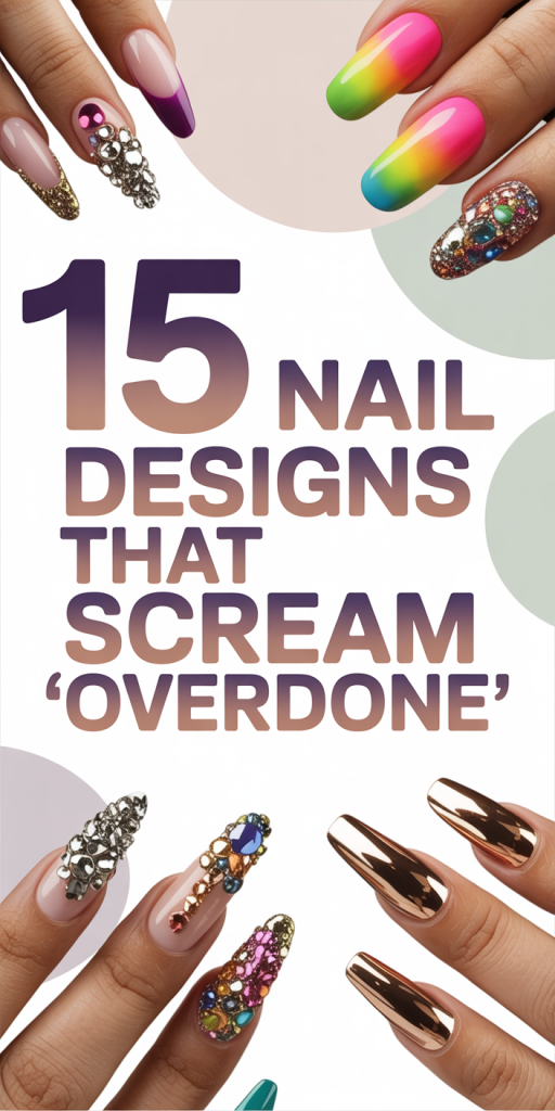
Oversized Gems, 3D Embellishments, And Bedazzled Chaos
- Oversized Rhinestones on Every Nail
There was a moment when bedazzled, jewelry-like nails were aspirational. But placing oversized rhinestones across every nail quickly tips into impracticality and visual overload.
Why it’s overdone: It prioritizes bling over wearability and longevity.
How to avoid it: Reserve large gems for statement events or a single accent nail.
2. 3D Sculptural Madness
3D acrylics and sculpted forms can be incredible when used sparingly. When technicolor sculptural elements multiply across the hand, they become gaudy rather than avant-garde.
Why it’s overdone: It turns nails into costume pieces rather than wearable design.
How to avoid it: Treat sculptural elements like jewelry, gallery pieces, not default choices.
3. Bedazzled Tips That Catch Everything
If you can’t type, button a sleeve, or zip a bag without dislodging decorations, the manicure is over-engineered. Practicality matters: nails are tools as well as accessories.
Why it’s overdone: Utility is lost for the sake of spectacle.
How to avoid it: Choose low-profile embellishments or secure gems for short-term wear only.
Sticker Collages, Excessive Negative Space Patterns, And Busy Mixes
- Sticker Collages That Look Like Scrapbooks
Nail stickers made styling accessible, but slapping multiple sticker types on neighboring nails without whitespace creates a collage effect that’s visually exhausting.
Why it’s overdone: Too many focal points: no breathing room.
How to avoid it: Use a single sticker style with intentional placement and neutral backgrounds.
2. Excessive Negative Space Patterns
Negative space was a refreshing minimalist move. It becomes overdone when designers carve out complicated cut-outs on every nail in an attempt to be clever, the look becomes fussy instead of airy.
Why it’s overdone: Complexity undermines the original minimalist idea.
How to avoid it: Keep negative space simple, a stripe, dot, or crescent, and let it breathe.
3. Busy Mix-and-Match Sets
Mix-and-match was supposed to be playful. But when every nail has a different texture, color, and focal element, the hand reads chaotic rather than curated.
Why it’s overdone: Variety without cohesion looks like indecision.
How to avoid it: Limit palette and motif: let patterns repeat intentionally rather than randomly.
Animal Print Overload And Repetitive Motifs
- Animal Prints on Every Surface
Leopard, zebra, snake, these patterns can be stunning in small doses. Slather them across every nail or combine multiple prints in one set, though, and the effect is garish.
Why it’s overdone: Pattern fatigue and lack of visual rest.
How to avoid it: Pair an animal-print accent with neutrals or a single complementary color.
2. Repetitive Themed Motifs (Hearts, Stars, Clouds, Repeated)
A motif can feel fresh when used sparingly. But repeating the same tiny hearts or clouds on every nail for months becomes predictable and juvenile.
Why it’s overdone: The motif loses meaning and surprise.
How to avoid it: Rotate motifs seasonally or combine them with contrasting textures.
Ombré, Holographic Chrome, And Logo/Brand Nails That Feel Tired
- Ombré + Holographic Chrome + Logo Nails (The Instagram Staple)
A lot of viral nail content features a predictable formula: ombré base, chrome powder, and a small brand logo or monogram. Individually, each element can be chic. Together, especially in the hands of creators chasing the same viral aesthetic, they feel homogenized.
Why it’s overdone: The combination became a visual shorthand, fashionable but empty.
How to avoid it: If you love ombré or chrome, pick one and personalize it with unexpected color choices or hand-painted details. Avoid logos unless they mean something to you personally.
Why some of these remain popular anyway
We should acknowledge that a few of the overdone looks persist because they’re flexible, flattering, and photograph well. Chromes and ombrés catch light: small logos signal a status play: foils and glitters are party-ready. Our goal isn’t to shame anyone who enjoys these styles, rather, we want to point out when repetition dilutes impact so you can choose intentionally.
Conclusion
We’ve outlined 15 nail designs that often feel overdone and given quick, practical ways to avoid joining the chorus. At the end of the day, the best manicure is one that fits your life and makes you feel like yourself, not one that checks every trending box. When we’re tempted by a viral look, it helps to ask: does this serve a stylistic purpose, can I wear it comfortably, and will I still like it in a month? If the answer is yes, go for it. If not, tweak the idea into something more personal. A little restraint can turn a tired trend into a timeless signature.