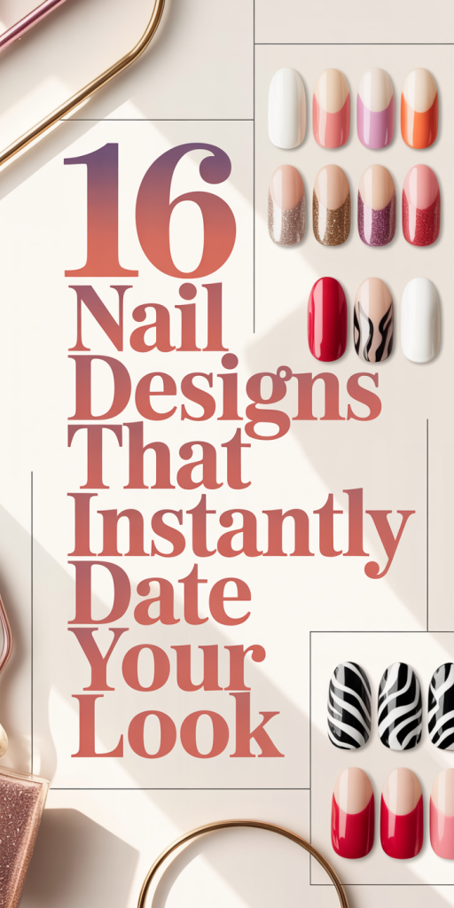
16 Nail Designs That Instantly Date Your Look — What To Stop Wearing In 2026
Trends come and go, but some nail looks have a way of locking a style to a specific era. As we head further into 2026, we’ve noticed recurring nail designs that shout “outdated” rather than “on-trend.” In this guide we’ll walk through 16 specific design types (grouped by style) that tend to age your overall aesthetic, explain why they read as dated, and offer practical, modern alternatives you can ask your nail tech for instead. Whether you love dramatic nails or prefer something minimalist, we’ll help you keep your manicures looking fresh, elevated, and current.
Why Certain Nail Trends Age Your Style
Fashion and beauty cues age for two main reasons: they become visually tied to a narrow period, and they overpower the wearer rather than complementing them. When nails are overly literal, think performance-level embellishment or silhouettes that read as costume, they anchor a look to a specific moment. We also see aging happen when trends emphasize flash over proportion: extremely long tips, clunky shapes, or heavy ornamentation that distract from natural hand lines.
Beyond aesthetics, cultural context matters. Some designs carry associations (social media microtrends, celebrity moments, or mass-produced kits) that signal “that era” even to people who aren’t nail-obsessed. Material choices contribute too: cheap-looking glitters, thick acrylic edges, visible glue around gemstones, all of these telegraph a DIY or dated salon approach.
Finally, maintenance plays a role. Nails that chip, have lifting, or show regrowth loudly read as neglected: conversely, a contemporary manicure reads polished because it respects hand proportions and finishes. We’ll be specific below: for each cluster of dated looks we’ll explain the problems and propose cleaner, modern swaps you can actually wear day-to-day.
Extreme-Length Stilettos, Sharp Points, And Over-Extended Tips (Designs 1–3)
The sky-high stiletto and razor-point tip have been emblematic of statement nails for years. While dramatic, they often read theatrical rather than tasteful, especially when length exceeds functional limits. Over-extended tips change how the hand moves, create an exaggerated silhouette, and tend to overshadow outfits rather than complement them. The ultra-long point also increases breakage risk and often requires heavy, layered acrylic that looks bulky at the cuticle.
Another problem is proportion: very long tips can make fingers appear shorter or clumsy in photos and daily life. They’re also associated with older social media cycles (early-to-mid 2010s glam) and so can feel time-stamped. Sharp points paired with overly saturated or gimmicky finishes, think matte black stilettos with flame decals, compound the dated feel.
If we’re honest, these nails still have a place for editorial shoots or a night out, but for everyday style they tend to age us faster than they flatter. They’re rarely the subtle finishing touch a modern wardrobe needs.
Why they age your look:
- Disproportionate to natural hand shape
- Bulky at the base, visible weight from acrylic
- Strong cultural association with older trends
What to avoid in salon requests:
- “Max-length” or “as long as possible” requests
- Thin razor tips combined with heavy acrylic layering
- Solely point-focused shapes without attention to balance
Over-Sculpted Coffins, Thick Acrylic Blocks, And Uneven Shapes (Designs 4–6)
The coffin (or ballerina) shape was a mainstay for a reason: it elongates the finger when done correctly. Problems arise when it’s over-sculpted into a blocky, thick form with straight, unforgiving edges. Thick acrylic blocks and exaggerated coffin widths create a weighty silhouette that reads artificial. Uneven shaping, where some nails are dramatically different lengths or edges are asymmetrical, adds to a DIY, rushed-salon impression.
We also see a specific era association: the “big coffin” aesthetic dominated mainstream nail feeds in the 2010s and early 2020s, often paired with heavy gloss and oversized decals. When that volume isn’t intentional or balanced with refined finishing, it dates the manicure. The tactile feel matters too, dense, chunky acrylic lacks the lightness of modern gel or thinner overlays, and that tactile perception translates visually.
How this impacts styling: bulky coffins compete with jewelry and sleeves: they can make rings look disproportionate and make hands appear less graceful. For clients who want drama without costume, suggesting a sleeker silhouette preserves interest without the blocky effect.
Signs you’ve crossed into dated territory:
- Visible acrylic thickness at the free edge or near cuticles
- Overly wide profiles that hide finger length
- Irregular lengths across the hand
Rhinestone Overload, 3D Embellishments, And Textured Clutter (Designs 7–9)
Rhinestones, studs, pearls, and 3D appliqués were once a quick way to elevate a basic mani. Now, they can feel like visual noise when overused. Rhinestone overload, think every nail crowded with mixed-size gems, reads tacky rather than luxe. 3D embellishments that protrude significantly create practical problems (snagging, catching on fabrics) and produce a busy silhouette that draws attention away from the wearer.
Texture-heavy designs, crushed stone gels, heavy flocking, or multi-layered acrylic filigree, also risk dating a look, because they often reflect short-lived craft trends and can show wear unevenly. Those details look best when used sparingly: spread too widely, they scream “trend trap.”
There’s a subtle cultural association here: bulk rhinestones were a hallmark of certain celebrity-led moments and mass-market kits. When everyone copies that look, it loses the sense of individuality and becomes a dated uniform rather than a curated choice.
Problems to watch for:
- Embellishments applied without clear placement or rhythm
- Large, protruding pieces that affect functionality
- Mixed finishes (gloss, matte, metallic) with no cohesion
When we consult with clients who want sparkle, we recommend restrained placements or single-accents that read intentional rather than cluttered.
Overcomplicated French Variations, Double Tips, And Neon Edges (Designs 10–11)
The French manicure has been endlessly reinterpreted, and that’s part of its strength. The problem comes when the reinterpretation gets overcomplicated: double tips (two distinctly separated tip colors), busy geometric additions, or vivid neon edges can all read more novelty than sophistication. When a French variation relies heavily on contrasting lines or intense neon, it tends to date quickly because such colorways cycle fast.
We see neon borders and double-tip experiments often mimicking a microtrend cycle visible on social platforms, bright, unexpected colors applied as an accent for maximum shock value. Those approaches are fun but rarely timeless. A neon edge that contrasts sharply with a muted base will look very epoch-specific within a few seasons.
Another issue is execution. Crisp French lines require careful proportioning: when lines are too thick, too thin, or uneven, the design loses any intended modernity and instead appears amateurish.
When to avoid these looks:
- If you want a manicure that reads high-end and enduring
- If your daily life requires subtlety (workplaces with conservative dress codes)
We encourage playing with the French, but in ways that honor balance: softer contrasts, thinner lines, or negative-space versions often look more contemporary than bold, neon experiments.
Chunky Glitter, Foil Sheets, Heavy Chrome, And Tacky Gradients (Designs 12–13)
Glitter and foil have lasting appeal, but chunky or poorly applied versions can quickly look dated. Thick, large-particle glitter catches light in an uncontrolled way and can appear cheap, especially when it flakes or lifts. Foil sheets applied haphazardly or across entire nails create a collage-like effect that reads mass-market rather than curated. Heavy chrome finishes that are over-applied can also become mirrors for imperfections, scratches, fingerprints, and chips show up loudly on reflective surfaces.
Tacky gradients (harsh ombré with obvious color layering or uneven blending) exacerbate that dated feel. Gradients should feel seamless: when the transition is abrupt or the palette feels overly saturated, the result belongs to an earlier trend cycle.
We should mention that texture and shine are powerful tools when used deliberately. The issue isn’t glitter or chrome per se, it’s the scale and finish. Smaller, fine-milled glitter, micro-foils, and soft metallic sheens read refined: giant glitter chunks and full-foil fronting lean costume-y.
How to tell if a glitter/foil/chrome manicure is dated:
- Visible particle edges or flaking
- Uneven or abrupt transitional blending
- Reflective surfaces that highlight wear and tear
Our recommendation: choose subtle metallics and microglitters, and ask for blended ombrés instead of banded, chunky gradients.
Gimmicky Stickers, Cartoon Art, Logo Nails, And Neglected Finish (Designs 14–16)
Nail stickers, cartoon motifs, and prominent brand logos are fun and playful, but they can date a manicure faster than many other design choices. Gimmicky stickers, especially inexpensive, mass-produced designs, often peel, crack, or yellow over time, signaling a quick or neglectful application. Cartoon or character art tends to anchor a look to pop-culture moments and can read juvenile depending on execution.
Logo nails, where brand emblems or monograms dominate multiple nails, can feel forced and overly on-the-nose. They’re also heavily tied to specific brand moments and influencer cycles: what was “in” last season can look like a relic now. The core issue across these looks is finish: a neglected topcoat, visible lifting, or patchy gloss makes even the most well-intentioned design look amateurish.
Practical concerns add up: stickers and heavy decals can lift at the edges, catch on hair or clothing, and reveal glue residue. We find that well-done nail art prioritizes proportion and durability: gimmicky elements rarely pass that test.
How to spot a dated sticker/logo/character mani:
- Edges lifting or yellowing around stickers
- Inconsistent topcoat or bubbled finish
- Art scaled too large for the nail’s shape
If you love character art or branding, we suggest scaled, tasteful placements and a professional application method (hand-painting or thin decals sealed under gel) to avoid a cheap look.
Quick Modern Alternatives To Replace Each Dated Design
We don’t want to strip personality, only to swap dated cues for contemporary ones. Here are quick alternative ideas that keep impact without aging your look:
- Replace extreme stilettos with refined almond or medium-length squoval shapes for a flattering silhouette that’s still chic.
- Swap over-sculpted coffins for a tapered coffin with thinner walls or a soft square to keep drama with better proportion.
- Trade rhinestone overload for single-stone accents or a thin, strategic line of microcrystals across one or two nails.
- Simplify complicated French variants by opting for a negative-space French, thin micro-line tips, or a monochrome reverse French.
- Exchange chunky glitter or foil for micro-glitter accents, a soft metallic beadline, or a subtle shimmer topcoat.
- Move from sticker-heavy art to single, hand-painted motifs or tiny decals sealed beneath gel for longevity and a bespoke feel.
These swaps aim to preserve individuality while aligning with current aesthetics. Each alternative emphasizes balance, proportion, and wearability, principles that keep a manicure stylish beyond a single season.
How To Describe A Contemporary Look To Your Nail Tech And Maintain It
Communicating clearly with your nail tech is the fastest way to avoid dated results. Use these practical prompts when booking or in the chair:
- Shape & Proportion: “I want a medium-length almond with a narrow profile, not a razor point.” Show a photo with a similar hand proportion if possible.
- Finish & Scale: “Please use micro-glitter/soft chrome and keep embellishments small, one accent nail max.” Point out whether you prefer high-gloss or satin topcoat.
- Placement & Longevity: “Hand-paint the motif or use thin decals sealed under gel.” Ask for gel overlays rather than surface stickers for durability.
- Maintenance Plan: “What topcoat and home-care do you recommend to avoid lifting and chipping?” Ask for a recommended refill schedule, usually every 2–3 weeks for gel and acrylic upkeep depending on growth and activity.
- Color Palette: “Keep the base neutral or muted and use one pop color.” Muted foundations make accents feel intentional rather than trendy.
We also recommend bringing images of hands with proportions similar to yours. That helps avoid requesting extremes that won’t flatter your fingers. Finally, ask your tech for a brief aftercare rundown, file direction, oils, and gentle cleaning help maintain a crisp finish. With clear direction and a small maintenance commitment, contemporary nails are absolutely achievable and long-lasting.
Conclusion
We’ve called out 16 specific design types that tend to date a look, extreme lengths, blocky shapes, over-busy embellishments, and gimmicky finishes among them. The unifying fix is simple: prioritize proportion, restraint, and execution. Choosing refined shapes (almond, soft squoval), micro-accents instead of overload, and professional application methods will keep your manicure feeling current well into 2026 and beyond.
If you’re attached to a bolder style, translate the idea into a scaled-back version, one strong accent or an elevated material rather than a full-hand commitment. When in doubt, we recommend asking your nail tech for “modern minimal” or “timeless elevated” references. Those phrases guide toward balance, and balance is the quickest route from dated to decidedly now.