Choosing the right color palette is one of the most powerful moves we can make when updating a home. The colors we pick set mood, influence perceived space, and tie together finishes, furniture, and lighting. Yet many of us feel overwhelmed by paint chips, online inspiration, and the risk of making a costly mistake. In this guide we walk through practical, room-by-room steps and tested strategies so you can choose a palette that looks cohesive, feels right, and stands the test of time. We’ll cover color basics and psychology, how to assess your space and light, palette-building techniques, testing methods, coordination with materials, budget considerations, and common pitfalls to avoid. By the end, you’ll have a clear process for selecting colors with confidence, and a framework you can repeat whenever you refresh a room.
Understand Color Basics and Psychology
How Color Works: Hue, Value, and Saturation
To choose wisely we need to understand three fundamental properties of color: hue, value, and saturation. Hue is what we usually call “color”, red, blue, green. Value describes how light or dark a hue is: it’s what gives contrast and defines form. Saturation measures intensity: a highly saturated color looks vivid and pure, while a desaturated color appears muted or grayish. When we mix these properties intentionally, we can create palettes that read calm and sophisticated or bold and energetic.
A practical tip: when sampling paint, compare both value and saturation across swatches. Two blues with similar hue may look completely different if one has a much lighter value or lower saturation.
How Colors Affect Mood and Perception
Colors carry psychological associations that shape how we feel in a room. We should treat these associations as useful guidelines rather than hard rules. For example, blues and greens generally evoke calm and stability, great for bedrooms and offices, while yellows and warm oranges often feel cheerful and energizing, working well in kitchens or social spaces. Neutral grays and beiges can create a restful backdrop that lets textures and artwork take the lead.
Beyond emotion, color alters perception of size and temperature. Dark, saturated colors make walls feel closer, adding coziness: light, low-saturation tones open a space up. Warm colors advance visually, making surfaces feel nearer: cool colors recede, which can visually expand a room.
Warm vs. Cool Colors: When to Use Each
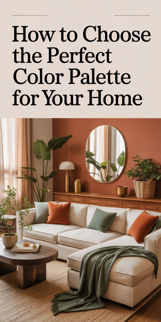
Deciding between warm and cool colors comes down to desired mood, daylight, and the materials already in the room. Use warm colors (reds, warm yellows, terracotta) when you want an inviting, intimate atmosphere, dining rooms and cozy reading nooks are good candidates. Choose cool colors (blues, greens, lavenders) to promote calmness, focus, and a feeling of spaciousness, ideal for bedrooms, bathrooms, and many home offices.
A balanced home often mixes both: warm tones in social spaces and cool tones in private or restful zones. We recommend starting with function and light, then selecting a temperature that supports the room’s role and feels harmonious with adjoining spaces.
Assess Your Space and Lighting Conditions
Evaluate Natural and Artificial Light
Lighting is arguably the single biggest variable that changes a paint color. Natural light shifts throughout the day, north-facing rooms receive cool, indirect light, making colors look bluer, while south-facing rooms get warmer, brighter light that pushes colors toward yellow. East-facing rooms glow warm in morning light and cooler in the afternoon: west-facing rooms warm up toward sunset. We should observe a room at different times to see how colors read.
Artificial lighting adds another layer. Incandescent and warm LED bulbs emphasize reds and warm hues: cool LEDs or fluorescent light can make colors seem ghastly or grayer. When testing swatches, turn on every type of light you’ll typically use and view samples both day and night.
Consider Room Size, Ceiling Height, and Orientation
Scale matters. Small rooms benefit from lighter values that reflect light and feel more spacious. Low ceilings often work better with lighter ceilings and slightly darker walls to avoid the “boxed-in” effect. Conversely, high ceilings allow for richer wall colors without feeling overwhelming. Orientation plays into our earlier point about natural light: pair room orientation with color temperature to reinforce mood, cooler hues for north-facing rooms, warmer choices for south- or west-facing ones.
Measure Existing Fixed Elements and Architectural Features
Before committing, inventory the fixed elements you can’t easily change: flooring, countertops, built-ins, large rugs, and exposed beams. Their undertones will interact with paint. For example, a warm-toned oak floor can clash with a cool gray that has blue undertones, even if both looked good on paper. We always bring large swatches or photos of fixed elements when shopping for paint and fabric. Also note trim and molding, do you prefer them white, matching the wall, or a contrasting shade? These decisions affect visual hierarchy and cohesion.
Define Your Style, Function, and Desired Mood
Identify Your Design Style and Color Preferences
Start from the life you already have. Are we drawn to minimal Scandinavian palettes, moody maximalist schemes, midcentury jewel tones, or rustic, earth-based hues? Our design style influences color choices: modern minimalism often favors restrained neutrals and high-contrast accents, while bohemian or eclectic tastes tolerate richer saturation and unexpected combinations.
We should also be honest about preferences: if we never wear bright colors, a neon kitchen will likely feel wrong. Collect images, photos of rooms we love, and note recurring color themes. Over time a pattern emerges that points toward palettes compatible with our taste.
Match Palette to Room Function and Desired Atmosphere
Function dictates many choices. High-traffic kitchens need forgiving, easy-to-clean surfaces and colors that hide fingerprints and splashes: we might favor mid-tones over pure white. Bedrooms demand restful hues that promote sleep: think softer values and lower saturation. Living rooms, which host varied activities, can accommodate flexible palettes, neutral walls with accent colors that shift with textiles and art.
Ask: do we want an energetic backdrop for gatherings, or a neutral canvas that lets furniture and art be the focus? The answer steers saturation and contrast decisions.
Create a Mood Board or Color Inspiration File
We recommend assembling a mood board, physical or digital. Save images of rooms, paint swatches, fabric samples, photos of flooring and cabinetry, and even paint chips snapped in real rooms. Tools like Pinterest, Canva, or a simple folder on our phone work well. A mood board helps us test whether disparate elements harmonize before spending money. It also becomes a reference for contractors, designers, and family members, keeping everyone aligned.
Practical Palette Strategies and Color Schemes
Monochromatic, Analogous, and Complementary Approaches
There are classic color-building strategies that reliably produce pleasing results. Monochromatic schemes use one hue in varying values and saturations, very safe and elegant, particularly for modern interiors where texture and form supply interest. Analogous palettes pick neighboring hues on the color wheel (for example, blue-green to blue to blue-purple) and create serene, cohesive rooms.
Complementary schemes pair colors opposite each other on the wheel, think blue and orange. These deliver dynamic contrast and can be wonderful for accent pieces, art, or a single accent wall. We use complementary colors sparingly so they energize without overwhelming.
Using Neutrals, Accent Colors, and Pop Hues
Neutrals are the glue that holds a home together. Greige, warm gray, soft white, and muted taupe serve as reliable field colors that let us rotate accent colors through accessories. When choosing a neutral, note its undertone, green, pink, yellow, or blue, and match it with materials in the room.
Accent colors add personality: an upholstered chair, a painted door, or a backsplash tile. Pop hues, vibrant turquoise, chartreuse, or cherry red, work best in limited doses where they don’t compete with large fixed elements.
Developing a Cohesive Homewide Palette (Flow and Contrast)
To avoid a jarring house-to-house feel, we recommend creating a homewide palette: a set of three to five colors (including neutrals) that recur across rooms in different combinations. Choose a primary neutral for most walls, a secondary neutral or mid-tone, and one or two accent colors. Use contrast intentionally, vary values between adjacent rooms to create definition while maintaining an underlying thread (a shared neutral or repeated accent).
For example, a warm greige used throughout common areas, paired with a deep navy accent in the living room and a muted terracotta in the dining room, creates variety while feeling curated. Repeating small elements, trim color, metal finish, or a patterned textile, reinforces flow.
Room-by-Room Color Guidance
Living Room and Dining Areas: Social and Flexible Palettes
Living and dining rooms need to be flexible, places for conversation, dinner, work, and rest. We favor neutral walls with layered accents: a deeper tonal wall behind a fireplace, patterned curtains, and artwork that introduces complementary colors. Softer neutrals create an inviting backdrop: if we want drama, a dark accent wall or moody ceiling can make the space feel intimate without closing it off.
Consider furniture permanence: if large pieces are neutral, we can switch accent colors seasonally through pillows, rugs, and art.
Kitchens and Bathrooms: Durable, Bright, and Cleanable Choices
Kitchens and bathrooms demand durability and brightness. Light-reflective surfaces help: glossy backsplashes, semi-gloss trim, and lighter wall colors make these rooms feel clean and spacious. For kitchens, white or warm-neutral cabinets pair well with either cool or warm wall colors, choose based on countertop undertone. In bathrooms, soft blues, seafoam greens, and warm grays are perennial favorites for their spa-like qualities.
Because these rooms see moisture and daily wear, choose paints with mildew-resistant formulations and finishes that clean easily (eggshell to semi-gloss for walls and trim).
Bedrooms: Restful and Personal Color Solutions
Bedrooms are where we should prioritize rest. Lower-saturation colors and mid-range values work best: dusty blues, muted greens, warm grays, and soft mauves. We might choose a slightly darker headboard wall to ground the bed, while keeping the rest of the room airy. Personal touches, favorite colors in soft furnishings, help the space feel uniquely ours without overpowering.
If sleeping patterns are irregular, consider very dark or cooler tones that help promote melatonin production: but balance them with lighter textiles so the room doesn’t feel oppressive.
Home Office and Multiuse Spaces: Focus and Versatility
For home offices, color choices should support concentration. Studies suggest mid-tone blues and greens enhance focus, while overly bright or saturated hues can be distracting. In multiuse rooms, design for adaptability: paint in a neutral field color and use modular furniture and accent pieces to change the room’s purpose. If video calls are common, test wall colors on camera to ensure realistic skin tones and avoid reflective finishes that glare.
Test, Adjust, and Finalize Your Palette
How to Sample Paints and Test Swatches Properly
Sampling is non-negotiable. Buy sample pots and paint 2–3 large rectangles (at least 2′ x 3′) on multiple walls in each room. Small chips lie: larger painted areas reveal subtle undertones, how a color reads beside trim, and interactions with textures. Keep samples up for several days.
We also test with actual materials: hold fabric swatches, rugs, and photos of fixed elements next to the painted rectangles. Take photos at different times, but rely more on in-person observation.
Assessing Color at Different Times of Day and Light Conditions
Check samples in morning, afternoon, and evening, with and without artificial lights. Colors often “flip” in different lighting, what reads warm in midday sun can look flat under cool evening light. We prefer to evaluate under the lighting conditions most common for that room: living rooms in evening, kitchens in daytime.
Scale, Accent Walls, and Trim Decisions
Decide how color will read at scale. Accent walls can work well to highlight architectural features, but avoid using them to hide awkward layouts, color won’t fix proportion issues. For trim, white or lightly tinted trim can make colors pop and look fresh, while matching trim to walls produces a more seamless, contemporary aesthetic. Ceilings are often overlooked: painting ceilings a soft tint of the wall color or a bright white can influence perceived height and warmth.
Coordinate Colors With Materials, Textiles, and Finishes
Matching Paint to Flooring, Cabinets, and Countertops
We must ensure paint undertones harmonize with major materials. For example, if countertops have warm veining, avoid cool gray walls that clash. Bring paint samples to the showroom or bring material samples to home when selecting paint. Natural stone often contains multiple hues, pick a paint that complements a dominant undertone rather than every single tone.
Choosing Complementary Fabrics, Artwork, and Accessories
Use textiles and artwork to reinforce or shift the palette. A rug with multiple colors can serve as the palette anchor for a room. We like to pull one color from a patterned fabric for accent paint, which creates cohesion. When mixing metals and finishes, consider color temperature, brass and bronze pair well with warm palettes: chrome and nickel feel modern with cool schemes.
Consider Texture and Finish (Matte, Eggshell, Satin, Gloss)
Finish affects both look and durability. Flat or matte finishes hide imperfections and suit textured walls: eggshell and satin offer moderate sheen and cleanability for living areas. Semi-gloss and gloss are best for trim, doors, and high-moisture zones. The finish also influences color perception: higher sheen can intensify a hue, while matte tones it down.
Budget, Timing, and Practical Considerations
Cost Factors and Where to Splurge or Save
Paint quality matters: higher-quality paints provide better coverage, truer color, and greater durability. We typically splurge on paint for high-traffic areas and trim where wear is visible, and save on less-used rooms. Labor is often the largest expense, accurate preparation and skilled painting justify the cost. Save by doing demo, light prep, or accent walls yourself if comfortable.
Hiring Professionals vs. DIY: When to Get Help
We recommend hiring professionals for complex finishes, tall ceilings, or when you want a flawless result quickly. DIY is sensible for single rooms, accent walls, or when you enjoy the process. If color decisions feel paralyzing, a short consultation with a color specialist can save time and money in the long run.
Maintenance, Durability, and Long-Term Flexibility
Pick paints with washable finishes for areas prone to smudges. Choose neutral field colors if you anticipate frequent style changes, accents are cheaper and easier to update. Also consider resale: if we plan to sell soon, favor broadly appealing neutrals and reserve bolder choices for easily reversible elements like cabinet doors or trim.
Common Mistakes to Avoid When Choosing Colors
Relying Only on Swatches or Photos
A paint chip or online photo doesn’t represent how color reads in a real space. Small swatches can hide undertones and mislead: photos are influenced by camera settings and filters. Always test large painted samples on site.
Ignoring Lighting or Architectural Context
We’ve seen beautiful colors fail because they were chosen without considering light direction, bulb type, or architectural features. A color that looks fantastic in a showhome can look flat in a shaded, north-facing room. Factor in orientation and fixed elements before committing.
Overcomplicating or Overmatching the Palette
Too many competing hues create visual clutter: too much matching makes a house feel contrived. Aim for balance: a coherent homewide palette with room-level variations. Resist the urge to match every element exactly, texture and scale often matter more than perfect color matching.
Conclusion
Choosing the perfect color palette is both an art and a process. By understanding color fundamentals, assessing light and fixed elements, defining style and function, and testing thoughtfully, we can make confident decisions that enhance our home’s look and livability. Start with a restrained, cohesive home palette, use accents to introduce personality, and always test large samples under real light. With a little planning, and a willingness to adjust as we live in the space, we’ll end up with a home that looks intentional and feels distinctly ours.