We love the power of art to transform a room, but we also know that professionally made pieces can carry a price tag that keeps them out of reach. The good news is that with the right approach, materials, and a few pro techniques, we can create DIY wall art that reads as high-end rather than homemade. In this guide we’ll walk through the core principles designers use, show how to plan and execute refined pieces, and share finishing and styling tricks that elevate any DIY project. Expect actionable tips, material recommendations, and a sprinkle of creative inspiration so your next piece looks gallery-ready.
Why High-End Wall Art Works: Key Principles To Keep In Mind
Creating wall art that feels high-end isn’t about copying expensive pieces, it’s about understanding the visual language of luxury and applying those principles consistently. Here are the core ideas we keep front of mind.
Understand Scale And Proportion
Scale changes everything. A small, precious detail can feel precious on a tiny backing, but the same detail scaled up on a large substrate reads as intentional and confident. We recommend choosing sizes that suit the wall: a single large statement piece for a wide, open wall, or a thoughtfully grouped set for narrower spaces. Negative space matters: high-end pieces breathe. Don’t cram elements to fill every inch.
Choose A Refined Color Palette
Luxury often comes from restraint. We lean toward limited, coordinated palettes, two to four colors at most, and favor muted tones, monochromes, or one strong accent color against neutrals. Subtle variations, like warm-gray underlayers or desaturated blues, bring complexity without clutter.
Prioritize Quality Over Quantity Of Elements
Simpler compositions with fewer, well-executed elements look more intentional. Instead of piling on textures and materials, we pick one or two techniques and execute them cleanly. A single metallic accent or a perfectly masked geometric shape can feel more expensive than a busy collage.
Practical takeaway: before starting, define the “one thing” that will make the piece special, a finish, a material, or a scale, and build around that choice.
Gather Materials, Tools, And Workspace Essentials
Having the right materials and tools makes the difference between a homemade look and a professional finish. We recommend investing selectively, upgrade where it counts.
Recommended Materials And Where To Upgrade
- Substrates: Invest in a solid substrate. A primed stretched canvas, hardwood panel (e.g., birch or poplar), or high-quality cradled board yields better results than cheap poster board. For photo-based or print work, use archival paper or museum-grade rag paper.
- Paints & Mediums: Artist-grade acrylics or oils have richer pigments and better coverage than student-grade alternatives. Metallic paints and glazing mediums are worth the extra cost for a refined sheen.
- Finishing Materials: Varnishes, spray fixatives, and archival adhesives protect your work and give a consistent finish.
Essential Tools For Clean, Professional Results
- Quality brushes (synthetic flats for acrylics, round detail brushes for fine work).
- A small foam roller for smooth undercoats and eliminating brush marks.
- Metal ruler, T-squares, and a sharp hobby knife for precise cuts.
- Masking tape (low-tack) for clean edges: transfer tape for decals.
- A heat gun or hair dryer for controlled drying and texture-setting.
- Sandpaper (220–400 grit) and sanding blocks for smooth surfaces.
Setting Up A Clean, Efficient Workspace
Set up a flat, level surface with adequate lighting, natural light plus a neutral-direction task lamp. Lay down protective covering and keep frequently used tools within arm’s reach. A tidy workspace is a practical step toward cleaner edges and fewer mistakes: no splattered surfaces, clean water containers, and a designated drying rack will speed the process and reduce accidental smudges.
Plan Your Design Like A Pro
Planning is where amateurs and pros diverge. We spend more time in the pre-production stage than many expect because smart planning keeps execution efficient and yields a sophisticated result.
Research And Moodboarding
Start with visual research. Save 10–20 images that capture the feeling we want, gallery photos, fabric swatches, magazine clippings, and color chips. We assemble these into a simple moodboard (digital or physical) to lock in tone, scale, and palette.
Create A Simple Sketch And Mockup
We sketch multiple thumbnail ideas, then create one clean mockup. For wall-scale pieces, tape kraft paper to the wall and mark out sizes to visualize scale. If working with photography or prints, do a low-res mockup to check balance and cropping.
Select The Right Substrate And Size
Match substrate to style: canvas for painterly work, wood panels for crisp edges and structural pieces, and heavyweight paper for prints. Consider the wall where the art will hang: the proportion to furniture and architectural features matters. A classic rule: center of artwork should sit around 57–60 inches from the floor in a typical room, but we’ll adjust based on furniture heights and sightlines.
Painting And Surface Techniques For A Luxurious Finish
Technique makes the difference between ‘craft’ and ‘art.’ We use methods that produce clean lines, subtle depth, and consistent surfaces.
Underpainting And Layering Techniques
Underpainting provides tonal unity. A thin, even wash of a neutral or complementary color unifies subsequent layers and reduces the appearance of blotchy coverage. We often use a warm gray or diluted burnt umber to block in shadows and major shapes.
Layering is about restraint. Thin glazes (diluted paint with glazing medium) produce translucent depth, while opaque layers create bold shapes. Build in three to five layers at most: too many can look muddled.
Creating Clean Edges And Crisp Lines
Masking tape is our best friend for geometric shapes. Apply tape to a fully dry base, press edges firmly with a burnishing tool or the dull side of a spoon, and paint with a small roller or brush away from the tape edge to avoid seepage. Remove tape slowly at a 45-degree angle when the paint is tacky but not wet to prevent peeling.
Using Metallics, Glazes, And Sheens Tastefully
Metallics read as expensive when used as accents rather than the focal point. We apply metallic leaf or metallic paint sparingly, a thin band, a small shape, or a textured highlight. Glazes can mute or warm a metallic application so it reads cohesive rather than brash. Finish sheen matters: satin or matte varnish often feels more sophisticated than high-gloss, unless we’re intentionally aiming for a lacquered finish.
Mixed Media, Textures, And Unexpected Materials
Texture and mixed media can elevate a piece from flat to tactilely interesting, but execution must be deliberate.
Building Depth With Collage, Fabric, And Plaster
We use collage for layering imagery and subtle relief. Choose archival adhesives and press elements flat for a polished look. For sculptural depth, a thin coat of modeling paste or flexible plaster creates raised areas that catch light. Apply with a palette knife and sand gently after curing to refine edges.
Fabric can add richness, a cut of silk, linen, or hand-dyed cloth adhered to a panel adds sheen and softness. Keep fabric edges hidden under seams or trim to maintain a finished appearance.
Incorporating Found Objects And Sculptural Elements
Found objects (metal hardware, vintage watch faces, stones) should feel intentional. We group small objects in a logical composition, secure them with epoxy or conservation-grade adhesives, and consider their weight when choosing a backing and hanging hardware.
Using High-Quality Prints And Photo Transfers
For photo-based pieces, print at high resolution on archival paper and consider mounting the print to a rigid back for longevity. Photo transfers to wood or canvas can look high-end when done carefully: sand the surface smooth, apply transfer medium evenly, and remove paper gently to avoid patchy areas. Finish with a protective varnish to unify the surface sheen.
Typography, Minimal Graphics, And Photo-Based Pieces
Minimal graphics and typographic works can look strikingly high-end when composed with restraint and precision.
Creating Balanced, Minimal Typographic Art
We choose typefaces with personality but avoid novelty fonts. Sans-serifs with good spacing (think Helvetica Neue, Avenir, or custom letterforms) work well. Use kerning and leading deliberately: a little extra letter spacing often reads more refined. Limit typography to a single word or short phrase and balance it with generous margins.
Working With Stencils And Masking For Precision
Precision is critical for typographic pieces. Cut custom stencils using a craft cutter or order laser-cut masks. Use spray primers to get even paint applications or dab with a dense foam applicator for textured lettering. Test masks on scrap material to dial in paint thickness and prevent bleed.
Using High-Quality Prints And Photo Transfers
(Repeated intentionally to emphasize method) When working with photos, opt for archival inks and paper. For a luxe presentation, mount prints on gatorboard or dibond and consider adding a small gap between print and frame (float-mount) to suggest gallery framing. Black-and-white images with subtle contrast often feel more timeless.
Finishings, Framing, And Presentation Tricks
How a piece is finished and framed determines much of its perceived value. Clean, cohesive presentation turns a good piece into a gallery-ready object.
Matting, Floating, And Custom Frames
Matting creates breathing room: a wide mat elevates a smaller piece. For canvases, a floated frame creates a shadow gap that reads contemporary and expensive. Custom framing is worth it for special pieces, but we can replicate that look with ready-made float frames or by building simple wooden frames stained to complement the artwork.
Edge Treatments, Gallery-Wrapped Canvases, And Trim
Gallery-wrapped canvases with painted or finished edges look polished without frames. If using raw edges, add thin trim or metal corner brackets for a refined finish. Consistent edge color across a series creates cohesion if you’re making multiple pieces.
Varnishes, Sealants, And Protective Coatings
Choose the right varnish: UV-protective, non-yellowing varnishes preserve color over time. For mixed-media pieces, test adhesives and coatings together to ensure compatibility (some solvents can cause inks to run). A final satin varnish often provides that elevated museum-like finish without the glare of gloss.
How To Style And Hang Your DIY Art For Maximum Impact
Even the best artwork can underperform if it’s hung poorly. Styling and placement are part of the creative process.
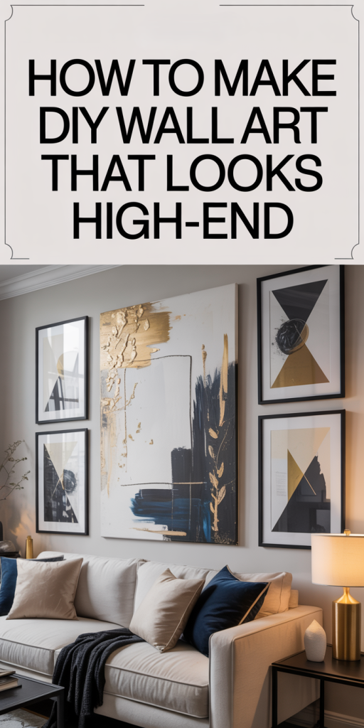
Groupings, Gallery Walls, And Single Statement Pieces
We decide early whether the piece will stand alone or be part of a grouping. Single statement pieces work well above sofas or mantels, while groupings should share a unifying element: consistent frames, a repeated color, or a common scale. Lay out potential arrangements on the floor or use paper templates on the wall before committing to nails.
Optimal Hanging Heights, Spacing, And Anchor Types
The center of most art should be about 57–60 inches from the floor, but adjust for seating and sightlines. For groupings, keep spacing consistent, typically 2–3 inches for frames in a tight cluster, and 3–6 inches for larger, more airy arrangements. Use anchors appropriate to weight: plastic anchors for medium weight, molly bolts for heavier panels, and toggles or screws into studs for very heavy or long-term installations.
Lighting, Layering, And Complementary Decor
Good lighting elevates texture and color. We favor directional LED track or picture lights with adjustable heads and a CRI of 90+ for accurate color rendering. Complement art with nearby objects that echo a material or tone from the piece, a brass vase that picks up a metallic accent, or a textured throw that echoes the artwork’s palette. Leave negative space nearby so the eye can rest.
Care, Maintenance, And Longevity Tips
Creating durable artwork means thinking beyond completion. We plan for maintenance to keep pieces looking fresh for years.
Cleaning Different Surfaces Safely
Dust regularly with a soft, dry microfiber cloth. For textured surfaces, use a soft-bristled brush to remove dirt from crevices. Avoid household cleaners, ammonia, or alcohol-based products. For protected prints behind glass, use a gentle glass cleaner sprayed onto cloth (not directly on the glass).
Repairing Scuffs, Chips, And Fading Over Time
Small scuffs on painted edges can often be touched up with mixed paint matched to the original. Keep a small sample pot of the final mixed paint for future touch-ups. For chips in wood or panel substrates, wood filler and careful sanding followed by touch-up stain or paint will restore the edge. If colors fade due to light exposure, consider reapplying a glaze or limiting direct sunlight with UV-filtering window film or curtains.
Preventative care: use UV-protective varnishes and keep original artwork away from direct sunlight and fluctuating humidity whenever possible.
Conclusion
We’ve covered the full process of making DIY wall art that looks high-end, from the design principles that set the tone to the finishing touches that sell professionalism. The difference between a piece that looks handmade and one that looks gallery-worthy often comes down to decisions made before the first stroke: scale, material choices, and a commitment to clean execution. Below are targeted reminders and practical tips to carry forward into your next project.
Understand Scale And Proportion
When in doubt, go slightly larger. A well-sized piece relates to its wall and surrounding furniture: it anchors a space. Use mockups and templates to confirm scale before committing to final materials.
Choose A Refined Color Palette
Limit your palette and use subtle variations rather than many contrasting hues. A refined palette allows texture and technique to shine without visual clutter.
Prioritize Quality Over Quantity Of Elements
Select a few elements and execute them well. One perfect metallic accent or a clean geometric composition will read as intentional and sophisticated.
Recommended Materials And Where To Upgrade
Invest in archival papers, artist-grade paints, and solid substrates like birch panels or stretched canvases. Upgrading these components yields disproportionate returns in perceived quality.
Essential Tools For Clean, Professional Results
A small set of quality brushes, a foam roller, precise cutting tools, and reliable masking tape will immediately improve finish. Don’t skimp on tools that affect edges and surfaces.
Setting Up A Clean, Efficient Workspace
Work clean, lit well, and organized. Drying racks and a place to safely store in-progress pieces prevent accidental damage and speed up production.
Research And Moodboarding
Gather references and build a moodboard. This keeps the concept cohesive and helps make decisions quickly when the momentum is on.
Create A Simple Sketch And Mockup
Sketch thumbnails and make a physical mockup for scale. We avoid committing to large materials without visual confirmation first.
Select The Right Substrate And Size
Match the substrate to the intended technique: canvas for painterly strokes, wood for crisp edges, and archival paper for prints.
Underpainting And Layering Techniques
Use thin washes and controlled glazes to build depth. Avoid overworking layers: less is often more.
Creating Clean Edges And Crisp Lines
Mask carefully, burnish tape edges, and remove tape at a 45-degree angle when paint is tacky to keep edges sharp.
Using Metallics, Glazes, And Sheens Tastefully
Apply metallics in moderation and balance them with matte or satin finishes. A single metallic line or corner can read very luxurious.
Building Depth With Collage, Fabric, And Plaster
Introduce subtle relief with modeling paste or fabric insets. Finish edges meticulously so texture reads intentional rather than accidental.
Incorporating Found Objects And Sculptural Elements
Secure objects with conservation adhesives and make sure hanging hardware supports the added weight.
Using High-Quality Prints And Photo Transfers
Choose archival printing and mount prints to rigid substrates. Finish with a protective varnish to unify sheen and protect color.
Creating Balanced, Minimal Typographic Art
Favor strong letterforms, generous margins, and precise application. Minimal typographic pieces rely on spacing as much as font choice.
Working With Stencils And Masking For Precision
Test your stencil technique on scraps, use low-tack tape, and layer paint thinly to avoid bleed.
Matting, Floating, And Custom Frames
Consider float frames or wide mats to elevate presentation. Even a simple frame with a consistent finish can change perception.
Edge Treatments, Gallery-Wrapped Canvases, And Trim
Decide on edge treatment early. Painted edges or gallery wraps feel intentional and professional.
Varnishes, Sealants, And Protective Coatings
Apply a UV-protective, non-yellowing varnish. Test compatibility on a scrap piece before sealing the final work.
Groupings, Gallery Walls, And Single Statement Pieces
Plan groupings with consistent spacing and a unifying element. Test layouts on the floor first.
Optimal Hanging Heights, Spacing, And Anchor Types
Aim for 57–60 inches eye level and match anchors to weight. Keep spacing consistent for groupings.
Lighting, Layering, And Complementary Decor
Use directional lighting with high CRI to reveal texture and color. Complement art with decor that echoes a material or color.
Cleaning Different Surfaces Safely
Dust with a microfiber cloth and avoid solvents. Use soft brushes for textured work.
Repairing Scuffs, Chips, And Fading Over Time
Keep leftover paint for touch-ups and consider UV protection to reduce fading. Small repairs can often be done in minutes with the right supplies.
If we take one thing away: be deliberate. Every decision, from substrate to varnish, contributes to the final impression. With intention, a few upgraded materials, and patient execution, our DIY wall art can convincingly read as high-end and become a focal point that defines a room.