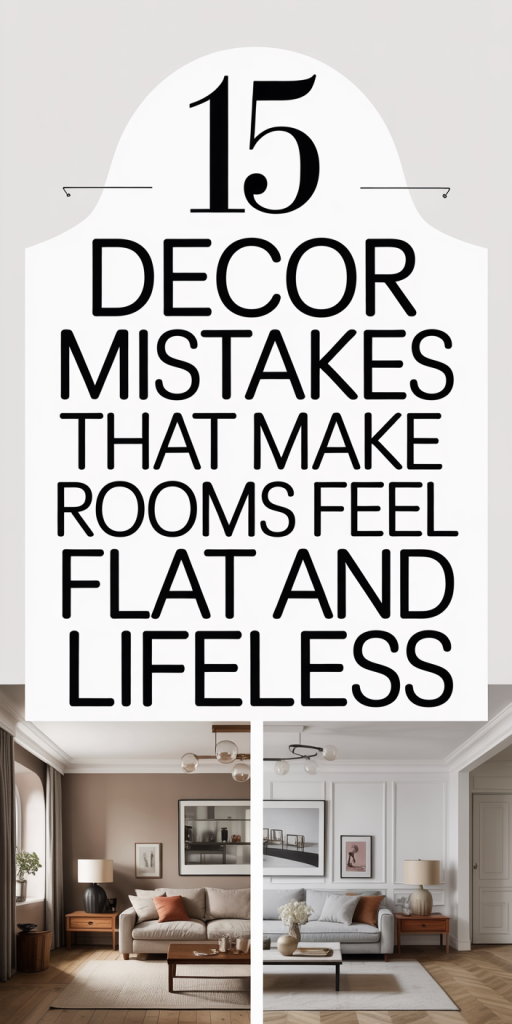
We’ve all walked into a room that looks polished in photos but somehow feels flat, lifeless, or just… uninspiring. In 2026, decorating well means balancing trends with timeless design principles so spaces feel warm, layered, and intentional. In this guide we’ll highlight 15 common decor mistakes that drain a room of energy, from overreliance on neutrals to ignoring scale, and give clear, practical fixes you can carry out this weekend. Think of this as a checklist: identify what’s robbing your room of personality, then apply one or two targeted changes to bring it back to life. We’ll stay focused and actionable: no lofty theory, just solutions that work in real homes.
Overreliance On Neutral Color Palettes Without Contrast
Neutral palettes are safe, elegant, and here to stay, but leaning on them without any contrast is one of the fastest ways to make a room feel flat. When everything sits in a narrow band of beige, gray, and white, surfaces blend together and the eye has nowhere to land. The fix isn’t abandoning neutrals: it’s using contrast strategically.
Start by introducing one or two contrasting values or hues. A mid-tone charcoal throw, a deep blue accent chair, or even a warm wood side table against pale walls immediately creates depth. We like using the 60-30-10 rule: 60% primary neutral, 30% secondary tone (a richer neutral or muted color), and 10% bold accent. That 10% is where personality lives, a saturated pillow, an artwork with punchy colors, or a statement lamp.
Texture also acts as visual contrast. Matte plaster walls paired with glossy ceramics, or a boucle sofa against a sleek leather ottoman, will read as layered even within a neutral palette. Finally, consider layered patterns in the same color family: a striped rug with a floral pillow in complementary neutrals provides complexity without breaking your overall calm aesthetic.
Ignoring Layered Lighting: Relying Solely On Overhead Light
Relying only on a single overhead fixture is a design misstep that flattens any room. Overhead light tends to be uniform and unflattering, it washes out texture, creates harsh shadows, and eliminates the cozy pockets that make spaces inviting. Layered lighting is how we craft mood, emphasize features, and give rooms a sense of dimensionality.
We recommend planning three layers: ambient (general light), task (for reading, cooking, working), and accent (to highlight art, architecture, or objects). Ambient can come from recessed fixtures, a central pendant, or well-placed wall sconces. Task lighting should be purposeful: table lamps by sofas, under-cabinet lights in kitchens, and adjustable sconces at bedside. Accent lighting is where drama happens, picture lights, directional track lights, or LED strips under shelves draw the eye to focal points.
Don’t forget dimmers. Being able to control intensity transforms a room from practical to atmospheric. Warm-color bulbs (2700K–3000K) read as cozier than cool whites: reserve cooler temperatures for workspaces where clarity is essential. With layered lighting, a room stops looking like a snapshot and starts feeling like a lived-in environment.
Skipping Textural Contrast: Flat Fabrics And Smooth Surfaces Everywhere
Texture is the unsung hero of interiors. A room full of smooth, identical surfaces, flat walls, sleek sofas, and glossy floors, might look minimal, but it often reads as sterile. We want touchability: surfaces that invite interaction and create visual interest even when the color palette is restrained.
Introduce a mix of textures at multiple scales. Think large-scale texture like a nubby rug or rough-hewn wood table, medium-scale such as a linen sofa or velvet cushions, and small-scale details like metallic hardware or ceramic vases. Layering textures prevents surfaces from competing and helps the eye travel around the room.
Practical swaps are easy: replace one smooth pillow with a knitted or sheepskin alternative, add a woven basket for magazines, or use a matte-finish coffee table against glossy flooring. Natural materials, jute, wool, rattan, unglazed stone, age beautifully and add authenticity. When we pay attention to texture, rooms feel tactile, comfortable, and alive rather than visually depleted.
Matching All Furniture Finishes And Styles Too Closely
A showroom-perfect match of every wood tone, metal finish, and style can look cohesive in the moment but ends up feeling contrived and flat. When everything matches too closely, there’s no tension, no contrast, and no chance for individual pieces to shine. A more interesting room harmonizes through deliberate variation.
We suggest mixing finishes and styles within a coherent palette. Start with two primary finishes, for example, warm oak and blackened steel, then add one accent finish, like brass or matte white, to lift the composition. Mixing eras (a mid-century coffee table with a contemporary sofa) introduces character. The key is balance: repeat a finish in two or three places to create visual ties without overdoing uniformity.
If you’re nervous about mixing, use textiles to bridge differences. A throw that picks up both the color of a wooden side table and the metal of a lamp can harmonize disparate elements. Or, introduce a unifying motif, a recurring color or pattern, to pull varied finishes into a single story. Done well, variety creates depth: done poorly, it becomes chaotic. We aim for curated variety, not clutter.
Neglecting Scale And Proportion
Scale and proportion determine whether a room feels balanced and purposeful or awkward and flat. When furniture is too small, a space seems empty and disconnected: when pieces are too large, they overpower and squash the room’s flow. We need to think in relation to the room and to each other.
First, measure. There’s no substitute for knowing the dimensions of a room and the pieces you’re considering. Rugs should anchor seating groups, ideally large enough that at least the front legs of furniture rest on them. Coffee tables should be proportional to sofas (about two-thirds the length) and leave adequate circulation space. Ceiling height also matters: low ceilings favor streamlined, lower-profile furniture: high ceilings can handle taller pieces and vertical art.
Consider visual weight as well as physical size. A chunk of dark, dense furniture reads heavier than a lighter-toned piece of the same dimensions. We advise creating balance by pairing heavier elements with airy ones: a robust sofa with slim-legged side chairs or a substantial dining table with lighter pendant fixtures above. Scale is not just measurement: it’s the relationship between objects and the space they inhabit.
Lack Of A Strong Focal Point Or Visual Anchor
Rooms without a focal point feel unsettled, the eye wanders without landing. A focal point gives the room purpose and hierarchy: a fireplace, a large artwork, a dramatic window, or an architectural niche can serve this role. Without one, even well-furnished rooms can come across as flat.
Choose a primary anchor and design around it. If your room already has a natural focal point (mantel, bay window), enhance it with layered framing, flanking sconces, built-in shelving, or a contrasting paint color. In spaces lacking architectural anchors, create one: a gallery wall, a statement mirror, a bold rug, or a sculptural piece of furniture can take center stage.
We also recommend establishing a secondary focal point to create visual movement, a reading nook, a sideboard with curated objects, or a plant corner. This creates depth and prevents monotony. Remember scale and contrast when choosing focal points: something too small won’t register, and something overly dominant will flatten the room by eliminating nuance. A well-chosen anchor makes the entire space feel intentional.
Overusing Symmetry And Predictable Layouts
Symmetry is calming and elegant, but too much predictability can make interiors feel staged and static. When every element mirrors another, identical chairs, matched lamps, evenly spaced art, the room can lose its sense of spontaneity and life. We want balance, yes, but with a dash of asymmetry to keep things interesting.
Introduce deliberate asymmetry: pair a large sofa with two different side tables, or use matching lamps only on one console and balance the other side with stacked books and a plant. Vary heights and groupings in threees, odd numbers read as more natural and dynamic. In gallery walls, mix frame sizes and spacing rather than forcing perfect alignment.
Function should also guide layout. Push symmetrical arrangements in formal rooms where order matters, and favor looser, conversational arrangements in living spaces. The goal is to blend the comfort of symmetry with the vitality of surprise. When we vary rhythm and spacing, rooms feel curated rather than catalog-ready.
Conclusion
Bringing a room back to life is less about wholesale renovation and more about thoughtful edits. We’ve outlined common mistakes, from neutral overload and flat lighting to scale missteps and rigid symmetry, and offered practical, achievable fixes. Start small: swap one lamp for layered lighting, introduce a contrasting accent, or edit accessories into a strong vignette. Over time, these adjustments add up and transform flat, lifeless rooms into layered, welcoming spaces that reflect how we live.
Design in 2026 rewards nuance: mix textures, vary finishes, respect proportion, and create clear anchors. With those principles, any room can feel vibrant and intentional. Try one change this weekend and notice how the space breathes differently, that’s often all it takes to bring a room back to life.