Gallery Walls Are Starting To Feel Forced — How To Make Wall Art Feel Authentic Again (2026 Guide)
Gallery walls were once a go-to way to personalize a room: collected frames, layered prints, a sense of story. Lately, though, we’ve noticed a shift. What began as an expressive, democratic design move has become ubiquitous to the point of looking staged, arrays of perfectly matched frames, templated layouts, and art chosen to “fit” a trend rather than reflect a life. In this 2026 guide we’ll look at why gallery walls often feel forced now, identify common design mistakes that trigger that feeling, and share practical, creative ways to get wall art that actually reads as authentic. If you care about your home feeling lived-in rather than showroom-perfect, we’ll help you bring intention, voice, and restraint back to your walls.
The Rise And Overuse Of Gallery Walls
The gallery wall’s rise is easy to track. In the 2010s, lifestyle bloggers and Instagram creators popularized the concept: small frames arranged in curated grids or organic clusters, posted as evidence of good taste and DIY skill. Retailers, sensing demand, produced matching frame sets, printable art bundles, and pre-mapped templates. Suddenly anyone could assemble a ‘designer’ wall in an afternoon.
That accessibility is part of the story, democratizing decor is a win, but the industrial answer to a personal practice also brought homogeneity. By the mid-2020s, we were seeing the same motifs in flats and staged properties: black-and-white photography, minimal abstract prints, and neutral frames in identical groupings. The gallery wall migrated from a reflection of personal collections to a visual shorthand for “we follow design trends.”
We should also call out social proof and the algorithm. A perfect gallery wall photograph performs well on social platforms: it photographs cleanly, scales in thumbnails, and signals aspirational interiors. So creators reproduced what worked. The result is an echo chamber: the more people copied the look, the more normative it felt: the more normative it felt, the more people copied it.
Finally, commercial influence accelerated the trend. Big-box stores and online marketplaces started selling coordinated multi-frame kits, pre-designed templates, and “instant gallery walls.” Those products promised ease, and delivered uniformity. That convenience changed expectations: instead of hunting for pieces with meaning, it became commonplace to buy a set that matches the sofa.
Why Gallery Walls Now Often Feel Forced
When something popular becomes homogeneous, it can look engineered rather than emergent. Gallery walls feel forced now for a few interrelated reasons.
First, the visual cues that once signaled authenticity, inconsistency, wear, the occasional oddball object, have been smoothed out. Matching frames, identical mat widths, and curated color palettes remove idiosyncrasy. Our eyes register the sameness and interpret it as staged.
Second, there’s role confusion. A gallery wall used to be a display of personal history: photos, travel prints, kids’ drawings. Now it often functions as decor theater: art selected to “go” with furniture colorways or to satisfy an Instagram aesthetic. When art is chosen for its marketability rather than meaning, it loses voice.
Third, scale and placement errors are widespread. We’re seeing tiny arrays on oversized walls, or too many pieces jammed into narrow spaces. Those layout decisions read as checklist-driven: “we need a gallery wall here” rather than “what does this wall need?”
Fourth, we’re influenced by staging logic. Real estate staging teaches that a gallery wall can homogenize a buyer’s reaction and depersonalize a home to increase mass appeal. That very logic leaks into private homes when people emulate decorator setups without adapting them to personal context.
Finally, the trendiness itself breeds skepticism. When everyone has a version of the same display, we start to question authenticity, not always fairly, but intuitively. We want to feel that someone lived these choices, not assembled them to match a mood board.
Common Design Mistakes That Create A Forced Look
Gallery walls don’t have to look contrived, but certain recurring mistakes push them into that territory. Before we get to fixes, we’ll point out the specific design errors we see most often, so you can spot them and avoid doubling down on a staged look.
Scale, Proportion, And Overcrowding
Scale is the quiet determinant of whether a wall feels intentional. A cluster of small frames floating on a large expanse reads unfinished: conversely, a tight cluster covering the whole wall can feel claustrophobic and performative. Overcrowding, adding pieces for the sake of filling space, makes a wall feel like an image collage rather than a composed display.
We also see mismatches between furniture and art scale. A tiny gallery above a long sofa breaks visual logic: our eyes want to trace lines and balances. If wall art is too small for the furniture, the arrangement reads as an afterthought. On the other hand, forcing oversized art into a narrow corridor looks like a prop.
Proportion matters within groupings too. When frames are all the same size and orientation, the composition becomes monotonous. The monotony isn’t inherently bad, but when it’s combined with mass-produced art, the result reads as template-driven. A mix of vertical and horizontal pieces, plus a few different sizes, breaks the pattern and gives the eye places to land.
Finally, spacing is crucial. Tight, uniform gaps look engineered: wildly uneven gaps look accidental. We recommend deliberate but varied spacing, not random, but not rigid either, to create rhythm without perfectionism.
Overcuration And Loss Of Personal Voice
Overcuration is the opposite of serendipity. It happens when every piece on the wall is selected to adhere to a single aesthetic rule: same color palette, same subject matter, same frame. The wall becomes a proof-of-concept rather than a record of a life.
We’ve noticed two patterns of overcuration. One is the “theme-first” approach: choosing works that fit a trending theme, abstract neutrals, botanical prints, mid-century silhouettes, without integrating items that reflect the household’s actual story. The other is the “retail-kit” approach: buying a coordinated set and hanging it as-is. Both approaches deliver a polished surface but strip the wall of specificity.
The antidote is voice. Personal voice can be small, a postcard from a memorable trip, a child’s painting, a thrifted portrait, but its presence changes perception. Even one piece with obvious provenance or an imperfect edge signals that the wall evolved rather than being assembled in one afternoon to photograph.
We also see the performative inclusion of “quirky” objects that actually feel like props, chosen because they look interesting in a photo, not because they’re meaningful. Those items register as curated affectation. To avoid this, we recommend including fewer but more meaningful pieces and allowing negative space to show context.
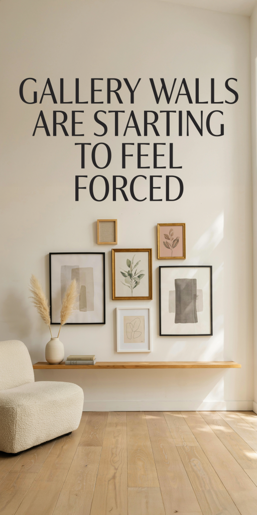
How To Make Wall Displays Feel Authentic
Authenticity isn’t a style, it’s a process. Here are practical strategies we use to make wall art feel lived-in, considered, and true to who we are.
Start with a story. Ask: what story do we want this wall to tell? It can be a place (travel souvenirs and maps), a time (family archives), or a mood (works that evoke a particular light or season). Let story guide selection, not color-matching exercises.
Mix sources. Combine high and low: a museum poster, a thrifted oil study, a family snapshot, a child’s drawing, a pressed flower in a simple frame. The interplay among different origins creates texture that mass-produced sets can’t replicate.
Prioritize provenance. Add labels or tiny notes on the back of frames, or incorporate small captions visible to those who linger. Provenance signals intention. Even a discreet handwritten tag with a year or place adds depth.
Respect scale and negative space. Treat the wall as a composition with foreground, middle ground, and void. Anchor a grouping with one larger piece, then arrange smaller companions. Leave breathing room, negative space makes objects feel chosen, not crammed.
Embrace irregularity. We don’t mean chaos. Instead, vary frame styles, mat widths, and orientations intentionally. A slightly aged frame or a mismatched mat can be a welcome apostrophe in the composition, a reminder that these pieces have histories.
Edit ruthlessly. Authentic arrangements aren’t cluttered. We periodically reassess: if an item doesn’t spark a memory or emotion, consider rotating it out. Rotation is a tactic we like: swapping a couple of pieces seasonally keeps the wall responsive to life rather than frozen in a trend.
Layer three-dimensional objects. Think beyond two-dimensional prints. A shallow shelf with small ceramics, a macramé hanging, or a textile panel can break the flatness of a gallery wall and add tactility.
Avoid “matching” everything. If every frame or mat is identical, the wall reads as a kit. Let some frames contrast. If you love symmetry, limit it to one axis or one section rather than the entire wall.
Make decisions in situ. We find that mockups on the floor or using paper templates taped to the wall yield better results than following an online template blindly. Living with a trial layout for a few days helps reveal whether pieces feel right with the room’s light and furniture.
Finally, let function influence form. A gallery wall above a reading chair might include art that invites contemplation: above a kitchen island, consider playful or food-related imagery. When form follows function, the display feels purposeful rather than decorative for decoration’s sake.
Alternatives To The Traditional Gallery Wall
If the traditional gallery wall feels tired, there are many other ways to display art that read as authentic and contemporary. We suggest several alternatives, depending on the space and the story you want to tell.
Single Large Work
Investing in one well-chosen, larger piece gives a wall presence and avoids the staged look of many small frames. A single painting or photograph becomes a focal point and often reveals more about taste and intention than multiple anonymous prints.
Salon-Style, But Selective
We like a curated salon approach that’s less about filling space and more about relationships between pieces. Instead of covering the wall, create a vertical or horizontal salon cluster with varied materials and clear focal anchors.
Leaned Art
Leaning art against a wall or on a mantel offers a relaxed vibe. It’s a casual, evolving solution, easy to swap and reposition, that signals we live with our art rather than hanging it for show.
Shelves And Ledges
Gallery ledges allow for layering and rotation. We can place framed work alongside objects, books, and plants. This hybrid display feels active and changeable, which communicates lived-in authenticity.
Textiles And Tapestries
A textile, a woven panel, vintage rug, or macramé, adds warmth and a human touch. Textiles carry tactility and often reflect craft traditions, giving a wall a story that mass-printed art rarely offers.
Functional Art Installations
Think beyond frames: a vintage clock, an artisanal mirror, or a sculptural wall piece that also serves a practical purpose can look more organic than a formulaic cluster of prints.
Rotating Micro-Exhibits
Treat a wall like a small exhibition space and rotate works seasonally. We’ve found that creating themed mini-shows (e.g., “summer landscapes” or “prints from our travels”) keeps displays fresh and prevents the compulsion to include everything at once.
Asymmetric Anchors
Instead of centering art over furniture, try offset placement, art grouped to one side of a couch or stairwell. The asymmetry can feel modern and intentional, and it avoids the clichéd “art directly above sofa” composition.
Curated Collections
If we do collect many small items, consider housing them in a cabinet with glass doors or in a shadowbox rather than scattering them across a wall. This approach presents items as a collection with context, not just decorative fodder.
Site-Specific Commissions
One of the most authentic moves is commissioning a piece that’s made for your space. Whether local artists, printmakers, or craft-makers, site-specific work is inherently tied to you and the room. It’s an investment, but its uniqueness resists the “forced” look.
Conclusion
Gallery walls haven’t lost their value, they’ve simply become a trend that’s easy to replicate poorly. To keep wall art feeling authentic in 2026, we recommend slowing down: prioritize story, mix sources, respect scale and negative space, and don’t be afraid to leave blanks. Whether you choose a single commanding piece, a thoughtfully edited salon, or a rotating ledge, approach displays as evolving expressions of life rather than static badges of decor literacy. When we curate with intention, not obligation, our walls will finally stop reading as proof-of-trend and start reading as proof-of-us.


