Your Home Feels Cluttered Because You’re Decorating Like It’s 2016 — How To Refresh For A Cleaner, Timeless Look In 2026
We’ve all been there: we tidy, we donate, we even rent a decluttering app, yet the house still feels busy, visually loud, or somehow “full.” That weight on the nerves often isn’t about the number of items: it’s about the styling language we used a decade ago. Design trends from 2014–2018 promised personality and curated chaos, but in 2026 those same choices can read as clutter. In this text we’ll pinpoint the exact trends that age poorly, give a quick visual-declutter audit you can do in one afternoon, and offer practical swaps so you can modernize without a full overhaul. Think less shopping, more editing: clearer sightlines, calmer palettes, and smarter silhouettes that make a home feel spacious and intentional again.
The Real Reason Your Space Still Feels Cluttered Even After Tidying
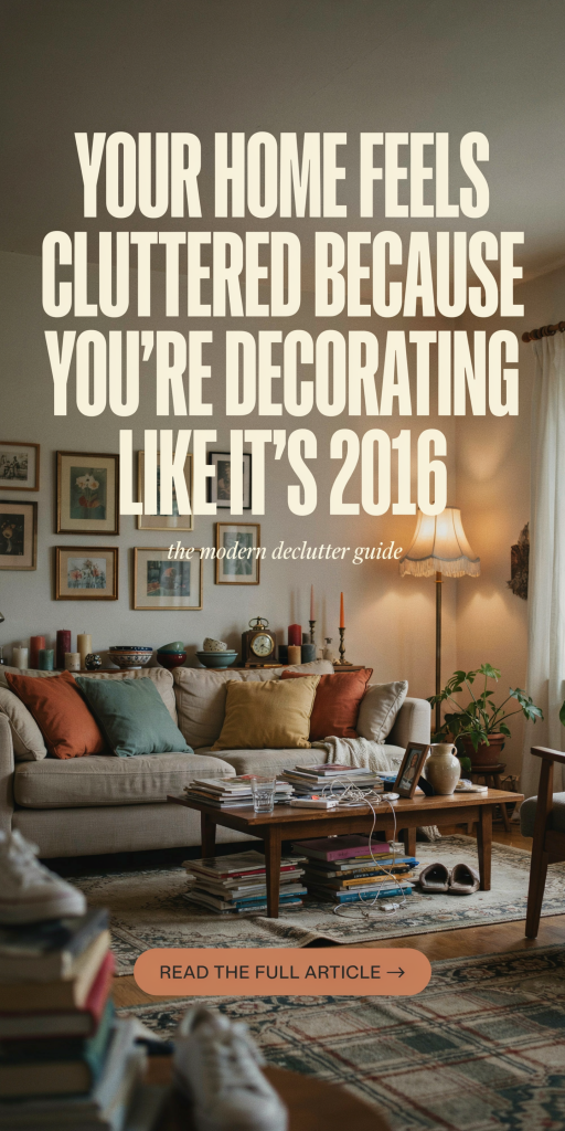
Tidying is about objects: styling is about relationships. We can remove half the stuff and still feel overwhelmed if what’s left competes for attention. In 2016-style decorating we emphasized abundance, gallery walls, layered textiles, and curated knickknack vignettes, that create many focal points. Every focal point asks the eye to stop, examine, and compare. The result: visual fatigue. Another factor is scale mismatch. Small, decorative pieces scattered across surfaces break up negative space and make areas read smaller. Color and finish variety also matter: too many competing hues or shiny surfaces reflect the eye around the room instead of letting it rest. Finally, pattern overload and inconsistent lines create a sense of movement where we want calm. Bottom line: clutter isn’t only physical quantity: it’s competing visual information. Our job is to reduce the number of things demanding attention, simplify materials and lines, and restore a few clear focal points so the room breathes.
2016 Decorating Trends That Add Visual Noise Today
Some trends that felt fresh a decade ago now contribute to a dated, cluttered look. Below we break down the biggest offenders and why they jar in 2026 as we crave cleaner, quieter interiors.
Gallery Walls, Open Shelving, And Overstuffed Display Surfaces
Gallery walls and open shelving were practical and personal: photos, prints, ceramics, and lots of them. The problem is density. When every wall and shelf tells several stories at once, nothing reads as intentional. Open shelving in kitchens amplified this: mismatched dishes, spice jars, and decor created a patchwork that competes with cookware and counters. To the eye, that’s visual clutter. In contrast, modern minimalism favors curated negative space: fewer, larger art pieces and closed storage that keeps everyday items out of sight. The goal is to let a few meaningful objects breathe instead of crowding every shelf with visual stimuli.
Mismatched Mixed Metals, Rose Gold, And Busy Decorative Hardware
Mixing metals was once hailed as a way to add depth and personality. But when every surface introduces a new tone, rose gold lamps, brass pulls, chrome faucets, the result can be sensory fragmentation. Rose gold had a strong moment: today it often reads as an accent gone loud, especially when paired with other statement metals. Hardware that’s overly ornate or fussy (think crystal knobs and hammered pulls in multiple finishes) draws attention to itself and away from cohesive lines. The cleaner approach in 2026 is to choose one primary metal family and use one complementary finish sparingly, this unifies fixtures and reduces visual chatter without feeling sterile.
Small-Scale Furniture, Too Many Accent Pieces, And Layered Patterns
In the mid-2010s we loved poufs, mini side tables, and a forest of accent chairs, pieces meant to be rearranged for staging photos and cocktail parties. But too many small elements fragment the seating arrangement and interrupt sightlines. Likewise, heavy layering of rugs, throws, pillows, and patterned wallpapers creates a visual texture that’s busy rather than cozy. Scale is about proportion: a few well-chosen, larger pieces anchor the room and make it feel purposeful. Patterns still belong in a contemporary palette, but they should be balanced with solids and restful textures so they support, not shout.
How To Audit Your Home: A Simple 3-Step Visual-Declutter Walkthrough
We recommend doing a quick, structured audit rather than wandering room to room aimlessly. This three-step walkthrough takes about 60–90 minutes and gives clear decisions.
Step 1, Establish sightlines: Stand at the primary doorway or seating spot in each room and take a photo. Ask: where does the eye land first? Count competing focal points, art, lamps, stacks of objects, and note anything that interrupts a clear path. If you can’t find a dominant, intentional anchor, that’s your first clue.
Step 2, Remove and reveal: Choose one surface (mantel, console, open shelf) and remove half the objects. Put them in a box. Look again. Often half the items are decorative noise. If the surface improves, those boxed items can stay in storage, be donated, or moved elsewhere.
Step 3, Edit by category: Quickly scan by categories, textiles, table-top decor, frames, small furniture. For each, ask: does it serve a function, hold emotional value, or significantly elevate the room’s look? If not, it’s a candidate to edit. The goal is to reduce competing elements and preserve only items that contribute to a calm visual hierarchy.
Keep, Edit, Replace: A Practical Decision Framework For Updating Pieces
When faced with many objects, we use a three-box framework: Keep, Edit, Replace. It’s fast, repeatable, and stops us from making impulse purchases.
Keep: These are the anchors, furniture and objects that fit the room’s scale, color story, and function. They usually form fewer than 30% of visible items but provide most of the room’s value. Keep items don’t need immediate changes: they may only need new placement.
Edit: Items that are worth keeping but need refinement. That could mean removing excess pieces from a gallery wall, swapping busy frames for simpler ones, or changing throw pillow covers to solid tones. Editing is where we get the biggest visual payoff for the smallest effort.
Replace: Pieces that consistently fight the room, wrong scale, clashing finish, or worn-out patterns, should be replaced with simple, lasting alternatives. But replacement doesn’t mean wholesale buying. We recommend starting with one strategic swap (like a new lamp or a streamlined coffee table) and living with it for a month before buying more.
Apply a simple rule of thumb: if an item isn’t in the Keep box after 30 days of living with it removed or edited, it probably belongs elsewhere.
Refresh Without Rebuying: Styling Swaps That Modernize What You Already Own
We prefer editing over shopping. A few low-cost styling swaps can dramatically shift the room’s language.
Unify finishes: Choose a dominant metal (blackened brass, matte black, or brushed nickel) and spray-paint smaller hardware and accessories to match. A cohesive finish reads intentional and reduces visual clutter.
Scale up focal items: Replace clusters of small frames with one larger art piece or print. You don’t need a gallery to feel curated, one well-placed painting or oversized photo can create a calm focal point.
Simplify textiles: Swap busy pillow covers for two solid colors and one subtle texture. Reduce rugs to one primary layer: if you love layered rugs, keep the top layer neutral and textural.
Edit open shelves: Use matching storage baskets or simple white dinnerware to create rhythm. Group objects in odd numbers and leave negative space, three objects, not seven.
Refresh hardware and lampshades: Changing shades from patterned to linen, or tightening hardware choices, gives an updated look without replacing major pieces. Often these swaps cost under $100 and yield a contemporary feel.
Room-By-Room Update Guide: Living Room, Kitchen, Bedroom, And Entry
We’ll walk through targeted edits for the rooms that matter most.
Living Room: Anchor the space with one larger sofa rather than multiple small loveseats. Reduce side tables to those that serve clear functions. Replace a gallery wall with a single art hero or a simple floating shelf with two curated objects. Opt for a single material palette, wood, stone, or matte metal, and repeat it across two or three surfaces to create cohesion.
Kitchen: Close up open shelving where possible: if keeping shelves, style them with uniform dishes and a couple of plants rather than mixed decor. Clear counter clutter by storing small appliances and keeping a single attractive bowl or cutting board as the countertop vignette. Swap busy cabinet hardware for sleeker pulls in a unified finish for instant cohesion.
Bedroom: Bedrooms should be sanctuaries. Minimize bedside table objects to a lamp, book, and one personal item. Replace multiple patterned pillows with layered solids and a textured throw. Consider swapping heavy patterned bedding for a calm, neutral set and adding one statement piece, like a headboard or large artwork, to focus the eye.
Entry: The entry sets the tone. Keep a single console surface clear: a dish for keys, a lamp, and one framed piece. Use a single basket for shoes or a bench with hidden storage. Ditch the wall of hooks and small decor: fewer, purposeful items read as curated instead of cluttered.
Conclusion: Make Thoughtful Edits To Move From Dated Clutter To Calm
We don’t need to throw out our style history, just evolve it. By understanding which 2016-era habits create visual noise, using a short audit to identify trouble spots, and applying targeted edits (often without buying anything new), we can shift our homes toward calm, timeless clarity. The fastest wins are unified finishes, scaled-up focal points, and fewer competing surfaces. Start with one room and one powerful edit, then live with it for a month. Chances are, once the visual clutter clears, you’ll feel more relaxed and less tempted to fill every surface again.