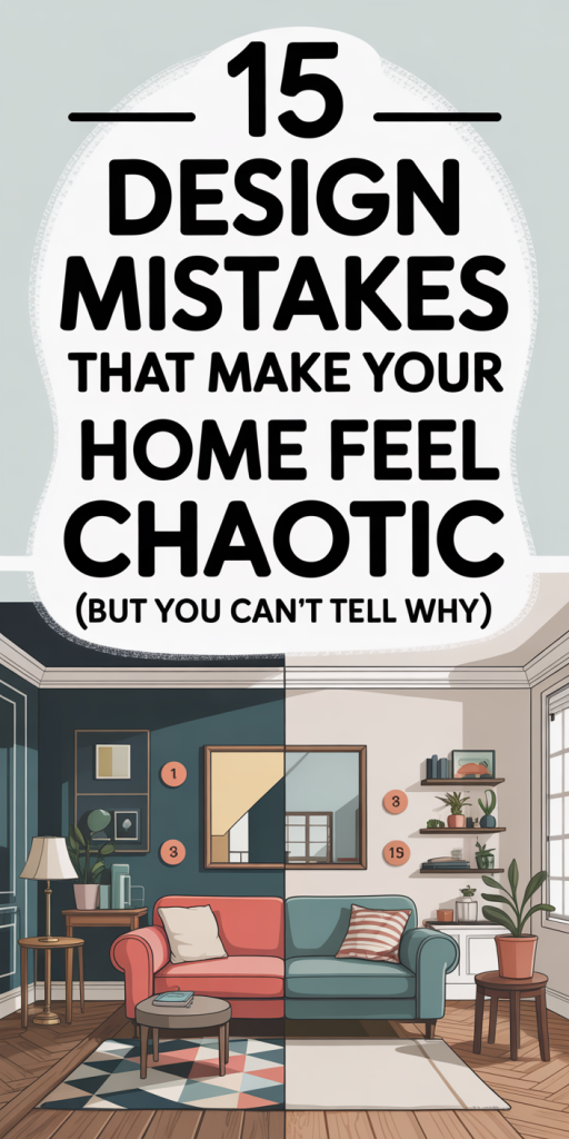
We’ve all walked into a room that looks styled, art on the walls, trendy accessories, matching throw pillows, and still felt unsettled. The problem often isn’t clutter or a missing piece: it’s subtle design mistakes that create visual or sensory friction. In this guide we’ll unpack 15 common errors that make your home feel chaotic (and the practical fixes we can carry out today). This isn’t about trends or buying new things, most solutions are about rearranging, rethinking, and simplifying. By the end you’ll be able to spot which mistakes are sabotaging your calm and prioritize changes that give the biggest payoff. Whether you live in a studio or a three-bedroom, these principles help us create a home that feels intentional, restful, and, yes, actually put together.
Why Your Home Can Feel Chaotic Even When It Looks ‘Put Together’
We often equate pretty with peaceful, but appearances can be deceiving. A room photographed for social media may have perfect styling yet lacks the spatial logic that helps our brains relax. Visual harmony depends on rhythm, balance, and predictable paths for the eye and body. When these are off, conflicting focal points, mismatched scale, inconsistent finishes, our nervous system registers tension even if we can’t name why.
Two common invisible culprits are competing focal points and inconsistent visual weight. When we have a fireplace, a TV, and a large piece of art all commanding attention, our eyes bounce around instead of settling. Likewise, mixing ultra-light furniture with one heavy, ornate piece creates imbalance. Lighting plays a role too: harsh, single-source light produces shadows and glare that read as visual “noise.”
The good news is that diagnosing the source of the discomfort is straightforward: we can observe how we move through the room, where our eyes go first, and which areas feel crowded. Once we name the problem, the fixes, editing, rearranging, adjusting light and scale, are usually low-cost and high-impact.
Layout And Traffic Flow Mistakes That Sabotage Calm
Poor layout is a major reason homes feel chaotic. We tend to push furniture against walls, create dead zones, or block natural pathways without realizing it. The most common traffic-flow mistakes are narrow walkways, seating that turns its back on conversation focal points, and islands of furniture that interrupt natural circulation.
Fixes: First, map traffic flow. We should walk the room and note common routes: front door to kitchen, couch to balcony, etc. Ensure main pathways are at least 30–36 inches wide in living areas and 24–30 inches in tighter spaces. Second, arrange seating to encourage interaction, form a loose rectangle or circle rather than a linear row. Third, avoid forcing a large sofa flush against the wall if it makes the room feel disconnected: floating a sofa creates defined zones and can improve circulation.
If the room is multifunctional, use rugs, lighting, or furniture groupings to define zones. Even small changes, angling a chair, shifting a console, can dramatically improve perceived order because they remove visual friction and make movement intuitive.
Scale, Proportion, And Furniture Mistakes That Create Visual Tension
Scale and proportion are invisible but powerful. Undersized furniture in a large room looks lost: oversized pieces in a small space feel cramped. Mismatched visual scale, like a delicate mid-century chair paired with an overpowering armoire, creates tension.
Start by measuring. We should know ceiling height, room dimensions, and major openings. Use these to choose furniture that fits the space: sofas should occupy about 60–70% of a wall in a living room: coffee tables should be roughly two-thirds the length of the sofa and sit 16–18 inches from it. Side tables should be proportionate to seating height (within 2–4 inches).
Proportion isn’t just size, it’s visual weight. A heavy, dark cabinet balances a room with multiple light pieces. To ease tension, repeat scale cues: if you have a large rug, pair it with a moderately sized sofa and substantial lighting. Conversely, in small rooms pick slimmer silhouettes, legs to lift visual weight, and multi-functional pieces (like an ottoman with storage). These choices prevent the eye from tripping over discordant elements and help the space read as calm and intentional.
Color, Pattern, And Contrast Errors That Overwhelm The Eye
Color and pattern are emotional tools, used well they soothe: overused, they shout. A common mistake is high-contrast chaos: too many saturated hues, competing patterns, or abrupt transitions. This bombards the visual system and prevents the eye from finding a resting place.
We recommend a 60-30-10 rule: 60% dominant color (walls or large furniture), 30% secondary (upholstery, rugs), and 10% accent (pillows, art). Stick to a limited palette, three to five related tones, and vary value (lightness/darkness) rather than hue to create depth without conflict. When mixing patterns, vary scale: pair a large-scale floral with a small geometric and a mid-scale stripe. Always include a neutral anchor to ground the mix.
Contrast deserves nuance. Instead of maximum contrast everywhere, reserve strong contrast for one or two focal points. If you love bold color, use it on a single wall or a statement piece and keep surrounding elements muted. Small shifts, balanced pattern scale, cohesive undertones, and strategic neutrals, turn visual noise into a coherent story.
Lighting Mistakes That Create Mood Confusion And Visual Clutter
Lighting often fails to match a room’s purpose. Overhead fixtures that cast flat light, single lamps that create harsh pools, or glaring recessed lights all contribute to a disjointed mood. We need layered light: ambient, task, and accent.
Ambient light provides general illumination, use dimmable overheads for flexibility. Task lighting (reading lamps, under-cabinet kitchen lights) should be targeted and glare-free. Accent lighting highlights art or architectural details and creates depth. Avoid relying solely on a single bright source: it flattens the space and emphasizes imperfections.
Temperature matters: warm light (2700–3000K) feels cozy in living areas: cooler light (3000–3500K) works for kitchens and workspaces. Consistency across fixtures prevents visual jitter, mixing warm and cool bulbs creates a subtle but perceptible sense of unease. Finally, control is key: dimmers, separate circuits, and smart lighting let us tailor ambiance quickly. Thoughtful layering reduces visual clutter and helps rooms feel intentional and calm.
Storage And Organization Mistakes That Turn Surfaces Into Chaos
Even tidy homes can feel chaotic when surfaces are overloaded. Open shelving, consoles, and countertops become visual catch-alls if storage systems aren’t in place. We underestimate how much visual weight everyday objects have when left out.
Fixes are practical. Start with three piles: keep, store out of sight, and donate. Invest in concealed storage, closed cabinets, baskets, bench-storage, and keep frequently used items accessible. On open shelves, apply the rule of threes: group objects in odd numbers, vary heights, and leave negative space to let items breathe.
Corral small items with trays and boxes so surfaces read as purposeful displays rather than landing zones. Create daily habits: a 10-minute end-of-day reset where we clear surfaces and stash miscellaneous items. For kitchens and bathrooms, add drawer organizers and labeled bins. These simple systems reduce the visual chaos that makes a home feel busy, even when it’s clean.
Material, Finish, And Texture Conflicts That Feel Jarring
Texture and finish add richness, but too many conflicting materials create sensory dissonance. Picture a room with glossy chrome, muddy unfinished wood, and neon acrylics: it’s visually noisy. The problem is often lack of cohesion in material language.
We recommend choosing a primary material family (wood, metal, or stone), a complementary secondary, and then one or two accent finishes. For example: warm oak primary, matte black metal secondary, and soft textiles as accents. Repeat these materials in multiple places to build rhythm, wood trim, oak table, and oak picture frames, for instance.
Balance tactile textures too. If you have a lot of sleek surfaces, add soft rugs and textiles to absorb light and sound. Conversely, if the room is too soft (plush sofas and heavy drapes), introduce harder surfaces for contrast. Aim for contrast with intention: mix matte and sheen, rough and smooth, but keep the palette and undertones consistent so textures feel like variations on a theme rather than competing statements.
Sensory Overload: Sound, Smell, And Tactile Mistakes That Add To Chaos
Design isn’t just visual, sound, smell, and touch influence how calm a space feels. Echoey rooms, strong layered scents, or overly synthetic textiles create a subtle, persistent irritation.
Sound: Hard floors and bare walls produce echoes that make a space feel busy. We can add soft furnishings, acoustic panels, rugs, and heavy curtains to dampen reverberation. Plants also help absorb sound while improving air quality.
Smell: Overpowering scented candles, layered plug-ins, or inconsistent scents from different rooms conflict. Pick a simple scent profile for the home and use it sparingly. Natural ventilation and houseplants reduce stale odors without masking them.
Tactile: Scratchy linens, excessively slick surfaces, or very cold stone underfoot all register negatively. We should mix tactile elements, soft throws, textured cushions, and smooth tabletop surfaces, to create comfort. Prioritizing sensory balance makes spaces feel intentional and reduces the low-level stress that contributes to perceived chaos.
How To Prioritize Fixes: Quick Wins Versus Structural Changes
Not every design issue demands a full renovation. We need a triage system: quick wins (fast, low-cost), medium projects (some investment), and structural changes (walls, windows, major systems).
Quick wins: decluttering surfaces, adjusting furniture layout, swapping light bulbs to a consistent temperature, adding a rug to define a zone, and grouping decor in threes. These often deliver the biggest perceived change for minimal cost.
Medium projects: replacing a sofa to correct scale, reupholstering chairs for cohesive texture, installing additional lighting layers, or adding built-in storage. These require budget and time but are reversible and impactful.
Structural changes: moving walls, changing floor plans, or altering window openings. These are last-resort moves for persistent problems like poor daylight or impossible traffic flow. Before committing, test solutions: use painter’s tape to mock furniture placement, try temporary lighting, or consult a designer for a staged plan.
We recommend tackling quick wins first. They’ll clarify whether deeper changes are necessary and often provide the immediate calm that motivates further investment.
Conclusion: Restore Calm By Fixing The Underlying Design Mistakes
Feeling calm in our homes isn’t about perfection, it’s about reducing friction between how spaces look and how they function. By addressing layout, scale, color, lighting, storage, materials, and sensory balance we remove the invisible stressors that make a room feel chaotic.
Start small: map traffic flows, unify your palette, add layered lighting, and create storage routines. Prioritize quick wins to gain momentum, then plan medium or structural changes only if necessary. With focused edits and a clear plan, we can transform rooms from visually noisy to quietly composed, so our homes support rest, not anxiety. Let’s begin by picking one room and applying two fixes this weekend: measure traffic paths and tame surfaces. That’ll often be enough to notice the difference.