Trends arrive fast and fade faster. We love a fresh look as much as anyone, but when a room leans too hard into what’s “in,” it can start to feel staged, loud, or, worse, dated within a season. In this guide we’ll walk through 16 specific trends and the broader styling habits that accelerate that tired, overdone feeling. More than calling things out, we’ll give practical swaps and principles you can use to keep interiors feeling current, layered, and, most importantly, ours for the long term. Read on if you want to avoid the shortcuts that make a space scream “trendy” and learn how to invest in details that actually age well.
Why Trends Age A Room Faster Than You Think
Trends promise instant identity: a recognizable motif, a hashtag-ready corner, an editorial-worthy shot. But that same recognizability is what dates a room. When plenty of homes copy the same motifs, finishes, and layouts, the result is a sea of interiors that look like clones, fresh for a week, forgettable forever.
Two dynamics accelerate that aging. First is saturation: once a look is everywhere, the eye changes from curiosity to fatigue. Think: everyone in a neighborhood with the same light fixture and woven pendant, suddenly the fixture loses its charm. Second is novelty-driven styling: layering lots of trend-forward pieces (we’ll call this ‘maximal trend pursuit’) produces a short-lived high that doesn’t rest on quality, proportion, or personal context. In other words, the trend does the heavy lifting instead of thoughtful design.
We should also consider cultural and technological cycles. Social platforms push rapid turnover: a style that’s popular on a spring mood board can be passé by fall. That speed rewards immediacy over longevity, which is why so many spaces feel overdone fast: they were designed for the algorithm rather than for everyday living.
The good news is we can still enjoy trends without them taking over. The trick is to borrow selectively, anchor choices with timeless elements, and prioritize quality and restraint. Below we break down specific trends and habits that tip a room from stylish to over-styled, and we offer smarter substitutions so our rooms stay inviting longer.
Excessive Maximalism: When More Becomes Too Much
Maximalism itself isn’t the enemy. When done with considered contrasts and a unifying thread, it can feel rich and intentional. The problem arises when we confuse visual abundance for depth, piling pattern on pattern, object on object, without a clear anchoring principle. That’s what makes a room feel chaotic rather than curated.
We see the same mistakes repeated: texture for the sake of texture, too many focal points, and an absence of negative space. Those impulses are understandable, we want personality. But without restraint, personality becomes noise.
Layered Prints, Clashy Textiles, And Competing Patterns
One of the quickest ways to make a space read as overdone is an unchecked mix of prints. When every textile fights for attention, floral drapes, geometric throw pillows, animal-print rug, the room loses hierarchy. The eye doesn’t rest: everything cries for primacy. Instead, we recommend anchoring with one statement pattern, then supporting it with solids and subtle textures.
A practical approach: choose a dominant print at 60% visual weight, a supporting pattern at 25%, and solids or tone-on-tone textures for the remaining 15%. This rule gives the eye a path and prevents that “busy gallery” feel in soft goods. Also vary scale: pair a large-scale motif with small, unobtrusive repeats rather than three mid-sized patterns that compete.
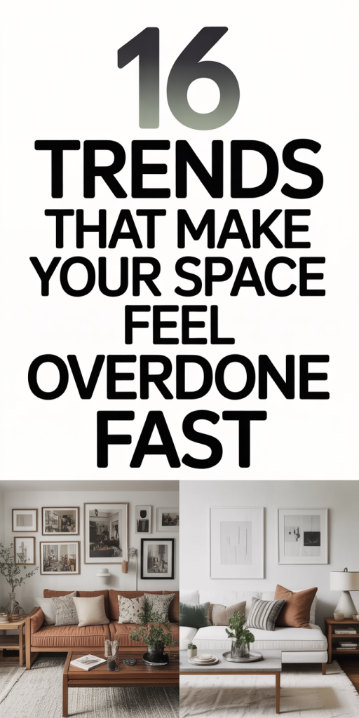
Oversized Gallery Walls, Ceiling-High Decor, And Overstuffed Surfaces
Gallery walls, when thoughtful, are compelling. But when we stack frames to the ceiling or fill every flat surface with objects, the space ceases to breathe. Oversized gallery walls especially push a room into one-note territory: it becomes about the wall rather than the room.
We prefer to let a gallery wall have a margin and be paired with negative space elsewhere: furniture tops should have curated vignettes, not flea-market dumps. To avoid overstuffing, edit down to the essentials and rotate items seasonally. Functionally, keep frequently used surfaces clear and use contained displays (a single tray, a low stack of books, a plant) to convey intentionality without clutter.
Overused Finishes And Materials That Date A Space
Materials carry heavy cultural baggage. Certain finishes become shorthand for a moment in design history, and leaning on them exclusively makes a room feel tied to that moment. We’re not saying avoid popular materials entirely, but treat them like accents, not anchors.
We’ve noticed several finishes that have moved from fresh to overexposed, often because they were promoted heavily by influencers and big-box catalogs. When everyone uses these finishes the same way, their novelty evaporates.
Matte Black, Faux Marble, And Mirrored Everything
Matte black hardware and fixtures enjoyed a long run, and for good reason: they read modern and graphic. The problem appears when matte black is used indiscriminately, plumbing, lighting, cabinet pulls, frames, with no textural contrast. That monochrome approach can flatten a room and make it feel staged.
Faux marble played a similar role. It’s accessible and glamorous, but thin veneers or clearly printed patterns quickly reveal themselves as imitation. When a countertop, side table, and accent wall all shout “marble look,” the space starts to feel theme-parkish. We recommend real stone or a restrained use of engineered stone with honest grout and edge details to maintain credibility.
Mirrored finishes then became the go-to for adding light and glam. But mirrored furniture and mirrored accent walls age fast because they show fingerprints and feel theatrical if overused. Instead, we suggest brass or smoked glass accents to reflect light without becoming the center of attention.
Where these finishes work best is in small doses: a matte black faucet against a warm wood vanity, an authentic marble hearth, or a single mirrored tray rather than mirrored wardrobes. The aim is to let the material sing in a supporting role rather than perform everything alone.
Predictable Color, Pattern, And Texture Choices That Read As Trendy
Color trends sweep through interiors like fashion seasons. Pastels, millennial pink, cottagecore florals, and desert terracotta each have their moment. Relying on the palette of the moment to define a room’s character is risky: it guarantees that the room’s identity is subject to the next viral shift.
Predictability also comes from using the same palette across too many elements: paint, upholstery, rugs, and accessories all echoing a single trending hue. That one-note treatment can feel like a showroom or a catalog spread rather than a lived-in home.
To avoid this, we recommend building palettes from enduring anchors. Start with a neutral base, warm white, soft gray, or an earthy greige, and layer in trend colors as accents through easily changeable elements like pillows, art, or small rugs. This gives us the flexibility to update a space without a full overhaul.
Texture-wise, natural, tactile materials age better than flashy synthetics. Linen, wool, and handwoven jute pick up patina and soften over time: highly reflective synthetics or overly slick finishes tend to show wear or feel manufactured. Similarly, avoid matching all textures: if the sofa is plush and velvety, balance it with raw wood, matte ceramics, or woven fibers to create tactile contrast.
Pattern selection benefits from restraint. Choose patterns that have some neutrality, small-scale geometrics, classic stripes, or subtle ikat, and reserve bolder patterns for items you can swap out easily. That way, if the mood shifts, we can change a pillow or throw rather than repainting or reupholstering.
Tech, Lighting, And Styling Mistakes That Make Rooms Feel Forced
Technology and lighting promise smart, cinematic spaces, and they can deliver. But when we over-automate, over-illuminate, or over-style for photos, the result is a room that looks staged rather than comfortable. We need to balance capability with subtlety.
A common mistake is using tech as a design crutch: integrating visible, mismatched chargers, cords, and gadgets without planning. Equally damaging is installing multiple high-powered recessed lights and relying on them exclusively: bright, uniform lighting flattens surfaces and diminishes atmosphere.
For tech, route cables cleanly and conceal hubs. Choose hardware that complements the room’s aesthetic or tuck devices into cabinetry. Smart home features should reduce friction, not demand daily rewiring of the space’s appearance.
Lighting is where restraint pays off. Layer light sources: ambient (soft overhead), task (reading lamps, under-cabinet), and accent (picture lights, wall washers). Dimmers are essential, they let us change mood without swapping fixtures. Warm color temperatures (2700–3000K) maintain coziness: cool, daylight bulbs can make interiors feel clinical.
Styling for photos is another pitfall. A perfectly made bed, every surface immaculate, and an army of tiny props might photograph well, but they don’t invite use. We prefer lived-in vignettes: a casually folded throw, a single book turned face-up, a mug with a small stain. Those “imperfections” read as authentic and make the room feel approachable rather than like a set.
Finally, beware of overusing statement lighting. One sculptural pendant can anchor a dining room: three competing pendant styles do not. Keep scale in mind: oversized fixtures can dominate the space and make everything else feel shrunk or decorative.
Conclusion: How To Keep Your Space Stylish Without Looking Overdone
Keeping a room from feeling overdone is less about rejecting trends and more about how we use them. We’ve found the best approach is selective adoption: borrow what resonates, use it in limited doses, and always anchor choices with timeless elements like good proportions, quality materials, and thoughtful negative space.
Practical habits that help: edit aggressively, favor changeable accents for trend colors and patterns, layer lighting with dimmers, and invest in a few well-made anchors (sofa, rug, main table) that stand up to multiple styling cycles. If we treat trends as accessories rather than foundations, our spaces stay personal, welcoming, and relevant longer, and they don’t scream for attention the moment tastes shift.
Design should feel like a conversation, not an announcement. When we design that way, our rooms age with nuance instead of becoming yesterday’s headlines.