Small Bedrooms Look Bigger When You Break This One Design Rule — How To Do It Right In 2026
We’ve all heard the well-meaning advice: in a small bedroom, choose petite furniture, keep pieces against the wall, and don’t overcrowd the floor. That rule has been repeated in magazines and design blogs for decades because it feels safe, less stuff equals more space, right? In 2026, our understanding of perception, materials, and lighting has evolved. Designers are discovering that sticking to that traditional guideline can actually make a room feel tighter, flatter, and less livable. In this text we’ll explain why that rule persists, show what happens when we intentionally break it, and give a practical, step-by-step method for reconfiguring and styling small bedrooms so they feel larger, more elegant, and far more comfortable.
The Traditional Rule Designers Tell You About Small Rooms — And Why It Persists
For decades the default prescription for small rooms has been simple: scale down furniture and push everything to the perimeter. It’s intuitive, a low-profile bed, a compact dresser, and floating shelves minimize the footprint. Designers and retailers reinforce this message because it’s easy to carry out and photographs cleanly for social media. There are a few practical reasons the rule stuck. Smaller pieces do free up literal floor area, and placing furniture against walls creates continuous walking paths, which can reduce tripping hazards and make cleaning easier.
But the persistence of the rule also reflects cognitive shortcuts. When people see empty floors, they mentally equate that with space. Marketing imagery that showcases minimal layouts amplifies the idea: tidy rooms with visible square footage look aspirational. The problem is that human perception of space isn’t only determined by how many square feet are exposed: it’s driven by scale relationships, sight lines, visual continuity, and how our brain interprets depth cues. So while the traditional rule addresses physical floor area, it misses the larger role of psychological spaciousness, and that’s where the opportunity to reframe small bedrooms lies.
How Breaking The Rule Creates The Illusion Of More Space
We’re often surprised to learn that deliberately breaking the “smaller-and-against-the-wall” rule can produce the opposite effect, rooms can feel airier, deeper, and more generous when we work with scale, layers, and continuity. The shift isn’t about crowding: it’s about creating a balanced visual hierarchy that tricks the eye into reading the room as larger than it is.
Perception Of Scale, Proportion, And Visual Continuity
Scale and proportion are the secret language of interior perception. When furniture is too small relative to the room and the other elements inside it, the eye has nothing to anchor to: a tiny bed in the center of a wall can make the surrounding space feel oddly cavernous but empty, which reads as cramped and awkward rather than spacious. Conversely, when we choose a bed and key furniture that respect human scale, the room feels purposeful. Larger pieces create clear focal points and allow for intentional negative space around them. That negative space, when proportionate, becomes legible, our brain can interpret the emptiness as usable room rather than leftover awkwardness.
Continuity is equally important. Matching vertical lines (from headboard to tall dresser) or repeating horizontal planes (like a continuous low shelf) helps the eye travel uninterrupted. Visual continuity reduces the number of competing cues and makes the room feel cohesive, which in turn expands perceived space.
Light, Depth, And The Role Of Negative Space
Light and depth cues are what truly sell spaciousness. Natural light that penetrates deeply into the room creates gradients and shadows that our eyes interpret as depth. Mirrors and reflective surfaces extend those gradients: a well-placed mirror opposite a window amplifies daylight and creates a sense of extended space. But it’s not just literal light, tonal contrast and layered textures produce perceived depth. A mix of mid-tones and dark anchors against lighter backgrounds guides the eye from foreground to background.
Negative space should be intentional. Instead of scattering small pieces that create multiple disjointed voids, we want continuous swaths of unobstructed sight lines. That could mean leaving a clear diagonal sight line from the door to a window, or arranging furnishings so that the floor area opens toward the longest visual axis. When negative space is curated around properly scaled furniture and illuminated with layered lighting, the room reads as larger, even if the square footage hasn’t changed.
The Rule To Break: Stop Automatically Choosing Smaller Furniture And Pushing It To The Walls
Here’s the single rule we’re asking you to reconsider: don’t reflexively downsize furniture and shove it against the walls. That reflex comes from a fear of crowding, but it overlooks how scale and placement shape our spatial reasoning. Instead of shrinking everything, we should be intentional about scale, mass, and the relationships between key pieces.
Practically, that means we stop treating small bedrooms like storage puzzles to be solved with ever-smaller items. We stop centering our decisions on maximizing open floor area and start centering them on creating coherent zones: sleep, storage, and circulation. When we select pieces that are slightly larger, a bed with a substantial headboard, a full-sized dresser rather than a narrow chest, and allow them to occupy the room with purpose, we give the eye credible anchors. Those anchors enable thoughtful negative space and create clearer depth cues.
Breaking this rule also frees us to explore different layouts. A larger bed pulled slightly away from the wall, a bedside table scaled to the mattress, or a low bench at the foot can all work together to create rhythm. Rhythm reduces visual clutter and makes the space feel curated rather than improvised. In short: choose the right scale, place pieces with intention, and let the empty areas be strategic, not accidental.
A Practical Step‑By‑Step Reconfiguration For Small Bedrooms
We’ll walk through a reconfiguration approach we’ve used on dozens of small-bedroom projects. The goal is to maximize perceived space while keeping the room functional and comfortable. These steps are adaptable to different shapes, square, narrow, or oddly angled.
Step 1, Assess sight lines and primary axis: Stand in the doorway and identify the longest visual axis (often the line running to the window). Your first priority is to preserve and open that axis.
Step 2, Choose an appropriately scaled anchor: Select a bed that respects human scale, in most cases a full or queen rather than downsizing to a twin just because the room is small. The bed should feel intentional, not apologetic.
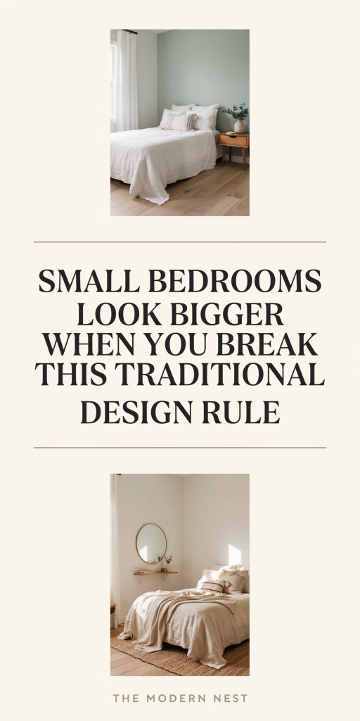
Step 3, Float key pieces strategically: Instead of pushing everything to the wall, pull the bed slightly away (even 6–12 inches) to create a defined walkway and allow for bedside tables on both sides. Floating creates a sense of depth because the floor plane extends under and around the furniture.
Step 4, Layer vertical elements: Add one taller piece (a narrow tallboy or vertical shelving) opposite the bed to balance verticality. The contrast between low and tall forms gives the eye multiple planes to read, increasing perceived depth.
Step 5, Optimize light and reflectivity: Maximize window exposure, use a mirror opposite or adjacent to windows, and add ambient plus task lighting so surfaces read with depth at night.
Step 6, Limit competing small items: Remove several small, disconnected pieces (excess chairs, tiny accent tables) that fragment the space. Replace them with one or two multipurpose items like a storage bench or wall-mounted shelf.
Step 7, Define circulation: Leave a clear path from the door to the bed and to the closet. If circulation requires stepping around furniture, that motion becomes part of the room’s rhythm rather than a sign of poor layout.
If you follow these steps, you’ll notice a qualitative shift: the room will feel cohesive, purposeful, and visually larger even though the footprint is unchanged.
Layouts That Open Sight Lines And Improve Flow
Small bedrooms usually fall into two shape categories: narrow (long and thin) or compact (roughly square). Each responds differently to layout strategies.
Narrow rooms: Place the bed across the short wall rather than along the length. A headboard that reaches eye level creates an end-piece that the eye reads as a destination, shortening the perceived depth but widening the visual field. Alternatively, if the door and window alignment allow, pull the bed slightly into the room to create a central anchor: this opens diagonal sight lines from the doorway to the opposite corner, which makes the room feel larger.
Compact rooms: Consider a centered bed with matching bedside tables and a low bench at the foot. Centering provides symmetry and clear sight lines to the window. If you want an alternative, float the bed to one side and create a small reading nook opposite: this asymmetry can paradoxically make the space feel more dynamic and spacious by dividing it into readable zones.
Corner-friendly layouts: In tiny footprints, orienting the bed in a corner (at a 45-degree angle or tight L-shape against two walls) can free up the longest single stretch of uninterrupted floor, which helps when you need space for a dresser or workspace.
Circulation tips: Keep the path from the door to the bed under 30–40 inches where possible. If that’s not feasible, use a rug to mark a route: visual definition substitutes for physical width and guides the eye along the intended path.
Choosing A Larger‑Scale Bed And Where To Place It
The bed dominates a bedroom, so its scale and placement determine much of what follows. We recommend favoring a slightly larger bed than you think you can “fit”, a queen in a small room often reads better than a twin because it fills the visual field with a deliberate mass rather than an apologetic gap.
Headboard choice matters: a tall, upholstered headboard creates vertical presence and anchors the bed as a primary element. A low, wide platform bed creates horizontality and can make the room feel broader. Choose the headboard type to reinforce the axis you want to emphasize.
Placement options:
- Centered on the main wall: Creates symmetry and clear sight lines to the window: good for square footprints.
- Against but not flush to the wall: Pulling the bed 6–12 inches from the wall adds shadow and depth behind the piece and allows for slim bedside tables to tuck in without blocking flow.
- Floating with storage beneath: A platform bed with drawers or a storage base lets you keep bulkier storage under the bed so you can eliminate extra furniture, keeping the floor plane more continuous.
Weighing scale vs. circulation: If a queen compromises a usable walking path, choose a smaller mattress but maintain a proportionate headboard and bedside tables that visually balance it. The goal is proportionality, not literal maximal size. When done right, the right-sized bed becomes a purposeful anchor that organizes the room and increases perceived spaciousness.
Styling Tips That Reinforce Spaciousness Without Sacrificing Comfort
Once the layout and scale are resolved, styling decisions lock in the perception of space. These are practical, repeatable tactics we use to keep a small bedroom feeling open and inviting.
Color and contrast: Use a restrained palette with a dominant mid-tone on walls and deeper accents to create depth. Pure white everywhere can make surfaces flat: a warm or cool mid-tone gives dimension. Reserve darker hues for anchor pieces (headboard, rug) to ground the room.
Layered lighting: Combine ambient ceiling light, wall-mounted reading lights, and a floor or table lamp. Multiple sources create shadows and texture, which read as depth. Dimmable fixtures let you change the room’s perceived scale after dark.
Textural hierarchy: Mix soft textiles (linen, wool) with a single reflective surface (mirror, metallic lamp) to balance warmth and visual expansion. Large-scale patterns read better than small, busy prints: a subtle large-scale pattern on a duvet or rug supports perception of space.
Curtain strategy: Hang curtains close to the ceiling and let them puddle slightly or skim the floor. This draws the eye upward and elongates the wall, increasing perceived height. Use light, translucent fabrics to maintain daylight while adding softness.
Declutter with intent: We’re not advocating sterile minimalism, we want curated objects. Keep flat surfaces relatively clear but display a few larger, meaningful pieces rather than many tiny items. A single art piece above the bed or a statement lamp tells the eye where to rest.
Storage choreography: Hidden storage (under-bed drawers, built-in shelving) lets you remove visual clutter. Open shelving should be organized with grouped objects and negative space between them: overcrowded shelves shrink a room more than they help.
Final touches: Add a single full-length mirror or a multi-panel mirror composition to reflect light and create depth. Place rugs to define zones and to lead the eye along the principal sight lines. These small styling choices compound to create the overall effect of a larger room without sacrificing coziness.
Conclusion
In 2026, making small bedrooms look bigger is less about minimizing every object and more about designing with scale, continuity, and light in mind. By breaking the reflex to always choose smaller furniture and push it to the walls, we gain the freedom to create purposeful anchors, open sight lines, and layered depth. If we pick a bed that commands the room, float pieces strategically, and use lighting and texture to define planes, the space will feel larger and more livable. We encourage you to try one reconfiguration this week, you might be surprised how quickly a small bedroom can transform into a calm, spacious-feeling retreat.