The Decor Trend Shrinking Your Apartment (And How To Stop It In 2026)
We’ve all seen the glossy photos: cozy apartments that look curated, stylish, and livable. But sometimes that curated look comes with a hidden cost, our spaces feel, well, smaller than they should. In 2026 a subtle decor trend has been quietly making compact apartments feel cramped, and because it’s stylish and ubiquitous, many of us don’t notice it until the sense of openness is gone.
In this text we’ll identify the trend that’s shrinking your apartment, explain the visual principles behind why rooms feel smaller, call out the most common decor culprits, and give practical, room-by-room fixes you can apply immediately. Our aim is to help you keep the style you love while reclaiming the perception of space, without expensive renovations.
The Decor Trend That Sneaks Up On Small Spaces — What It Is And Why It Matters
There’s a look that rose to prominence across Instagram and shelter magazines over the past few years: layered furnishings, heavy textured rugs, oversized art, deep mid-tone paint colors, and sculptural, statement furniture. We’ll call it the “maximal cozy” trend. It’s attractive and tactile, it signals comfort and personality, but when applied indiscriminately in small apartments it reduces visual breathing room and compresses perceived volume.
Why does this matter? Perception of space shapes daily comfort. A cramped-feeling apartment affects mood, productivity, and how often we host friends. More subtly, shrinking design choices make storage solutions less effective because they hide sightlines and create visual clutter: the brain reads clutter as less space, even when square footage hasn’t changed.
The trend succeeds because it taps into two needs: to make small homes feel personal, and to justify investing in fewer, more impactful pieces. But the same hallmarks that make the trend desirable, heavy textures, multiple focal points, and low negative space, are exactly what make rooms feel smaller. If we want the warmth without the squeeze, we have to learn how to translate those tactile cues into layouts and finishes that preserve openness.
Visual Principles That Make Rooms Feel Smaller
To fix the problem we need to be precise about the visual mechanisms at work. Here are the core principles that determine whether a room feels expansive or constricted.
The Most Common Decor Culprits In Small Apartments
Now let’s call out the specific items and habits that most often cause shrinkage. These are the things we see repeatedly: obvious, fixable, and often stylistically defensible.
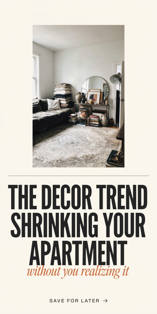
- Oversized Rugs and Layering Excess: A large, heavy rug can anchor a living room, but when it consumes most of the floor, it eliminates visible boundary between furniture and walls. Layering another rug or using a dark, dense rug across the entire footprint compounds the effect.
- Low Lighting and Too Many Lamps in Clusters: Warm ambient lighting is cozy, but insufficient overhead light plus multiple table lamps creates pockets of illumination and shadow. These pockets break up the plane of the room and make ceilings feel lower.
- Deep, Overscaled Sofas or Sectionals: Sectionals are wonderful, but in small rooms they often need to be strapped to walls and block flow. Very deep seating pushes sightlines to the front of the room, compressing visual depth.
- Heavy Window Treatments: Layered, floor-length drapery in dark tones can swallow window mullions and the light that would otherwise extend the visual field to the outdoors.
- Too Many Focal Points: An oversized TV, large framed art, a gallery wall, and a sculptural lamp all demanding attention at once create competing anchors. Instead of one clear focus, the eye bounces around and perceives less space.
- Bulky, Low Coffee Tables and Multiples of Small Tables: Low tables that are dense or multiple little tables create horizontal clutter at eye level when seated, interrupting the flow and shortening sightlines.
- Dark Paint on Multiple Planes: Painting walls and ceilings in dark, saturated hues, or even using high-contrast trims, brings planes inward. On a small footprint, that inward pull is very noticeable.
- Oversized Plants in Corners: Plants are great for life and texture, but a few giant pots can eat up visual breathing room and look like furniture rather than greenery.
The common thread is not that these elements are bad: they become problems when they dominate relative to room size. The remedy is not to avoid them entirely but to scale, place, or balance them so they contribute without consuming.
Practical Fixes To Make Your Apartment Feel Bigger
We prefer solutions that preserve personality and comfort while maximizing perceived space. Below are actionable strategies that address the culprits above and are easy to carry out without a remodel.
Room-By-Room Styling Checklist: Living Room, Bedroom, Kitchen, And Entry
Living Room
- Scale: Choose a sofa that’s proportionate to the room depth (depths of 32–36 inches often work better than 42+ inch deep seats in small living rooms).
- Layout: Float the sofa off the walls when possible. Maintain a 14–18 inch pathway between sofa and coffee table for flow.
- Flooring: Use a rug that leaves 10–20 inches of bare floor visible around the perimeter: this visual border enlarges the floor plane.
- Lighting & Walls: Mount a mirror opposite natural light and prefer wall sconces over multiple floor lamps. If you want a gallery wall, keep frames uniform and align their centerline at eye height to reduce visual clutter.
Bedroom
- Scale: Opt for a platform bed with exposed legs to increase visible floor. If we can’t part with a statement headboard, balance it with lighter bedding and a single, narrow nightstand rather than two bulky ones.
- Storage: Use underbed drawers or integrated storage beds. Keep wardrobes streamlined, mirrored sliding doors are a double win for storage and increasing perceived depth.
- Color & Pattern: Keep the ceiling and trim lighter than the walls or the same shade to keep planes continuous.
Kitchen
- Visual Continuity: Use backsplash materials that reflect light, and keep upper cabinets to a minimum. If we must have upper cabinets, prefer glass-front or open shelving in select spots to avoid a continuous dark strip.
- Countertops & Islands: If an island is too large, replace it with a narrow console with seating that tucks in. Clear or glass stools reduce visual bulk.
- Floor-to-Ceiling Unity: Painting tall cabinets the same color as the walls or adding continuous vertical panels helps cabinetry recede.
Entry & Hallways
- Keep it bright and shallow. A thin console with a mirror above gives function without visual mass.
- Avoid large shoe piles or oversized furniture in the entry: they immediately shorten perceived depth. Use vertical hooks and hidden storage benches.
Across Rooms, Quick Rules
- One focal point at a time: decide whether it’s the art, the window, or the fireplace: design other elements to support it rather than compete.
- Limit dark, heavy textures to single intentional accents.
- Keep at least some continuous flooring between rooms: breaks in material or high-contrast thresholds visually shrink spaces.
Conclusion
We can love the tactile, collected look of current decor trends without surrendering the sense of space in our apartments. By understanding scale, contrast, and sightlines, and by applying a few targeted fixes (better lighting, proportional furniture, selective reflection, and disciplined patterning), we reclaim openness while keeping personality.
The goal isn’t minimalism for its own sake: it’s thoughtful editing. When we edit with intention, our small apartments can feel cozy and spacious at once. Start with one change, lighten a rug, move a sofa, add a mirror, and you’ll see how quickly the room breathes.