15 Apartment Decor Trends That Instantly Eat Up Visual Space (And How To Reverse Them Fast)
In small apartments every inch of perceived space matters. We often focus on square footage, but what eats up our sense of openness is visual clutter and design choices that make rooms feel boxed in. In this piece we’ll pinpoint 15 common apartment decor trends that shrink a space, from heavy curtains to oversized furniture, and give fast, practical fixes you can apply this weekend. Think of this as a quick triage: identify the problem, make a simple change, and immediately notice a room breathe. We’ll keep advice realistic for renters and apartment dwellers: no major renovations, no demolition, just smarter styling, better proportions, and a handful of inexpensive swaps that reclaim visual space. Ready to see how small changes create big effects? Let’s dig in.
Why Visual Space Matters In Small Apartments
We often underestimate how much visual space, the perception of openness, shapes our comfort. Two rooms with identical dimensions can feel wildly different depending on color, scale, and sightlines. Visual space affects mood, function, and how we use a room: cramped spaces limit activity and make us feel restless, while airy ones invite relaxation and productivity. For renters, maximizing perceived room size is more practical than chasing extra square footage. Small apartments have constraints, so our job is to stretch the eye. That means prioritizing continuous sightlines, consistent flooring, and balanced negative space. When we remove visual barriers, furniture and decor become features rather than obstacles. Also, maintaining a clear center path in living and sleeping areas boosts movement and creates instant breathing room. Throughout the article we’ll reference the specific decor choices that most commonly reduce visual space and offer targeted reversals, strategies that deliver visible improvement fast, without expensive remodeling.
Color And Pattern Choices That Shrink Rooms
Dark, saturated colors and heavy patterns can cocoon a room. While moody palettes have their place, when used excessively they absorb light and compress walls. Similarly, competing patterns, mismatched rugs, busy wallpaper, and textured bedding, splinter the eye and create visual noise. We see this a lot: multiple focal points fighting for attention, leaving the space feeling smaller. The quick reversals are straightforward. First, choose a restrained base palette: light neutrals or soft pastels reflect light and unify surfaces. If you love pattern, limit it to one area, a single accent wall, a throw pillow cluster, or a small rug, and keep scale in mind. Large-scale patterns can make furniture feel bulky: small, subtle prints read quieter. We also recommend tonal layering: different shades of the same hue create depth without breaking continuity. Finally, avoid abrupt color boundaries (for example, a dark-painted doorway against a light wall): instead, use transitional tones or trim that matches walls to keep sightlines flowing.
Furniture Scale Mistakes That Overwhelm
Oversized sofas, chunky coffee tables, and tall, deep armchairs are common culprits. We instinctively buy pieces that feel luxurious in a store but dominate a small living room. Wrong scale not only consumes floor space but also blocks sightlines, making rooms feel cramped. To reverse this, we prioritize proportional furniture: sofas with exposed legs appear lighter, narrower armrests save a few inches, and low-profile coffee tables keep the visual center open. Multi-functional, scaled-down pieces, a loveseat instead of a full sofa, nesting tables rather than a single large tray table, give us flexibility without bulk. When shopping, measure twice and visualize width and depth in place: tape out the footprint on the floor and walk around the room. We also recommend choosing furniture with negative space (open frames, slender legs) to let light pass under pieces, which tricks the eye into believing there’s more room. Finally, pick one statement piece and keep the rest understated so the eye has a place to rest.
Layout, Zoning, And Clutter Habits That Break Flow
Poor layouts and cluttered zones do more damage to perceived space than elaborate decor mistakes. We often create visual obstacles by blocking walkways with furniture, piling surfaces with stuff, or trying to fit too many functions into one area. For example, a couch perpendicular to a window can interrupt light and view, while a dining table in the traffic path fragments flow. Quick fixes include defining clear zones and leaving a dominant path unblocked, aim for at least 2–3 feet of clearance in high-traffic routes. Use rugs and lighting to anchor zones rather than furniture barricades. Decluttering is crucial: keep surfaces low and eliminate single-purpose items that don’t serve daily life. Adopt a “one in, one out” rule for decor and accessories. For multifunctional spaces, choose furniture that signals intent without building walls: an open shelving unit, a narrow console, or a folding table can zone without choking sightlines. Routinely edit, we’ll often rearrange one or two pieces and see the room open up immediately.
Window Treatments And Lighting Choices That Block Depth
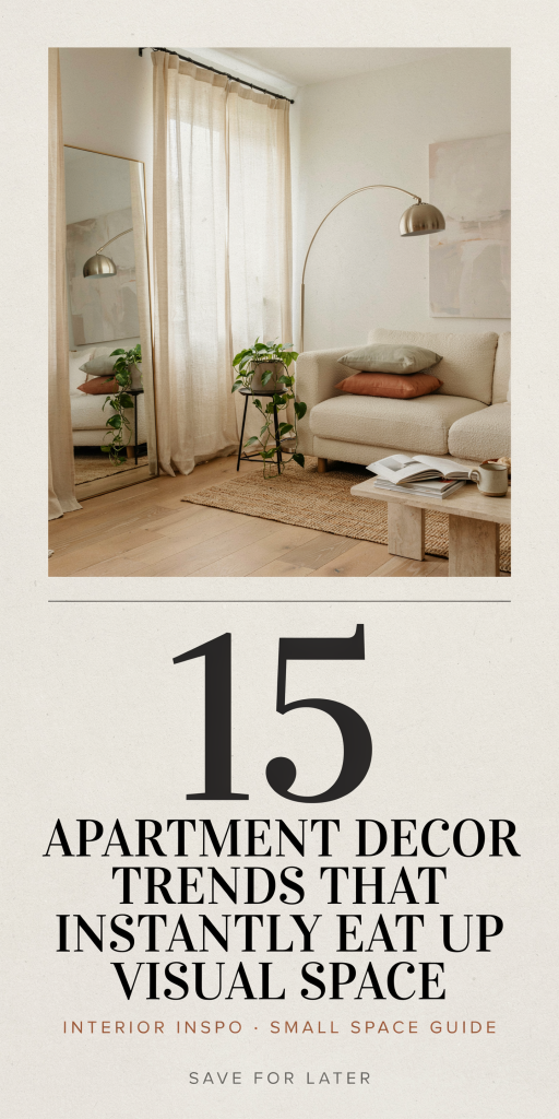
Bulky curtains, low-mounted rods, and lamps that create pools rather than layers of light reduce depth. Heavy drapery that hangs mid-window hides the view and makes walls feel shorter. Similarly, relying on a single overhead fixture creates flat lighting that accentuates shadows and closes the room. We recommend lifting rods near the ceiling to give the illusion of higher windows and to lengthen walls visually: hang curtains just above the frame and let them skim the floor. Choose airy fabrics or semi-sheer panels to let daylight in while maintaining privacy. For layered lighting, combine ambient (ceiling), task (reading lamps), and accent (floor uplights, picture lights) to create depth. Reflective surfaces, mirrors placed across from windows, bounce natural light and double perspectives. Swap corded, bulky lamps for slimmer silhouettes or clamp lights when floor space is tight. Small changes to how we treat windows and light return large perceptual dividends.
Flooring, Rugs, And Borders That Cut Up A Room
Visual breaks in flooring and ill-sized rugs can make a space feel chopped into fragments. Multiple rug patterns, mismatched tile transitions, or carpets that stop abruptly in doorways interrupt continuity and reduce perceived size. To maximize visual space, we advocate for continuous flooring where possible, a single material or closely matched tones throughout adjacent rooms creates an illusion of extension. When using rugs, pick sizes that allow front legs of furniture to sit on them: a rug that floats in the middle of a seating area can make zones feel disproportionate. Avoid high-contrast borders or bold-edge rugs that act like lines on a map, closing off zones. If replacing flooring isn’t an option, use large, low-contrast rugs and align their grain or pile direction with the room’s longest axis to elongate the space. Even temporary solutions, a well-sized indoor/outdoor rug or seamless runner, can unify the floor plane and open sightlines quickly.
Finishes, Frames, And Heavy Visual Weight
Shiny, ornate finishes and densely framed art can make a room feel visually heavy. We love things with character, but gold leaf frames, oversized mirrors with thick borders, or glossy furniture faces can pull attention and add perceived density. The antidote is to simplify and unify finishes. Choose a dominant finish (matte brass, black iron, or satin nickel) and use it sparingly as an accent so the eye isn’t constantly interrupted. For wall art, remember scale and spacing: large pieces should have room to breathe, and gallery walls need consistent matting or thin frames to avoid clutter. Swap out bulky frames for slimmer profiles or float your art on simple rails to reduce edge weight. On cabinetry, favor flat panels or recessed pulls over ornate moldings that read heavy at a glance. These small finish decisions cumulatively reduce visual weight and allow surfaces to read as more open.
Styling Details And Accessory Overload That Crowd Sightlines
We all have sentimental objects and decorative items we love, but when every shelf and ledge is maximized, sightlines suffer. Accessory overload creates visual competition: the eye can’t prioritize, and rooms feel claustrophobic. Our approach is edit-heavy. Treat styling like a curated exhibit: pick three to five meaningful objects per shelf and give each room a dominant accent color or texture. Negative space matters, empty spots on shelving communicate calm and allow the eye to move. Use transparent or open furniture (acrylic chairs, glass-top tables) to make accessories seem lighter. For display-heavy zones, consider rotating items seasonally: store half of your collection and swap every few months. We also recommend organizing by scale and color rather than theme alone: a consistent scale keeps shelves from looking like a jumble. Finally, reduce visual clutter on horizontal surfaces, coffee and dining tables should be mostly clear with one anchor item instead of many competing pieces.
Quick Practical Fixes To Reclaim Visual Space
Here are rapid, high-impact fixes we can carry out in a single weekend to reclaim visual space. 1) Lift curtains and choose lighter fabrics, move rods up near the ceiling and swap heavy drapes for sheers. 2) Swap a bulky coffee table for nesting tables or a slim bench to open circulation. 3) Declutter surfaces with a 15‑minute purge: remove items not used weekly. 4) Reposition sofas parallel to longest walls and tape out furniture footprints before shopping. 5) Use a single flooring tone or large rug aligned with the room’s longest axis. 6) Choose furniture with exposed legs to let light flow underneath. 7) Replace thick frames with simple, thin profiles and limit artwork to one or two focal pieces. 8) Add a mirror opposite a window to double daylight. 9) Reduce pattern competition by keeping one patterned element per room. These changes require little money but dramatically improve perceived space. We recommend tackling one room at a time and photographing before/after, the visual difference is often surprising.
Conclusion
Visual space is a design outcome we can control with deliberate choices. By addressing color, scale, sightlines, and clutter, we reclaim openness without moving or renovating. Start with the quick fixes, lift rods, edit accessories, and adjust furniture, then tackle bigger swaps like rugs and finishes. Small apartments reward thoughtful restraint: fewer, better-chosen pieces and uninterrupted sightlines create a sense of flow and calm. If we approach decor like sculpting negative space rather than filling it, our homes will feel larger, more functional, and more inviting. Try one change this weekend and notice how much room for life appears.