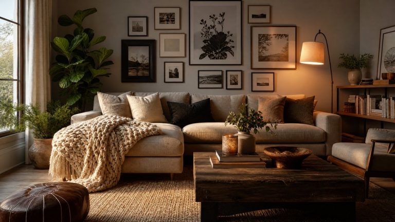
10 Common Interior Design Mistakes That Ruin a Beautiful Home
A beautiful home is rarely the result of one expensive purchase or a matched furniture set. More often, it comes from thoughtful decisions about proportion, movement, light, and everyday life. Even a well-decorated space can feel unsettled when choices compete with one another.
Fortunately, most design missteps are fixable without starting over. A room may need editing, better measurements, or a clearer point of view rather than more accessories. These ten issues can make a home feel less polished, along with practical ways to restore balance and comfort.
1. Choosing Furniture Before Measuring the Room
Furniture that looks graceful in a showroom can overwhelm a living room, leave awkward gaps, or block a walkway at home. Before shopping, measure the room, doors, windows, vents, and built-ins. Mark the footprint on the floor with painter’s tape to test scale before delivery.
Allow clearance for movement and daily use, not just for a piece to technically fit. Dining chairs need room to pull out, and a sofa should not force people to squeeze past a coffee table. If a favorite item is large, use fewer surrounding pieces instead of crowding the room.
2. Pushing Every Piece Against the Walls
Placing all furniture around the perimeter can leave the center strangely empty and make conversation areas feel disconnected. Bringing a sofa or pair of chairs slightly inward often creates a more welcoming arrangement and gives the room a social center.
Use the architecture as a guide, but do not treat the walls as mandatory parking spaces. Float furniture when possible, define the arrangement with a rug, and keep a clear path between entrances and important destinations. The goal is not maximum floor space; it is a layout that feels natural to navigate.
3. Using a Rug That Is Too Small
A small rug can visually chop up a seating area. When only a sofa’s front legs barely touch it, chairs may appear detached and the room can feel less grounded. Choose a size that connects the main furniture, or place a smaller rug fully beneath a compact arrangement so it reads as an intentional zone.
If replacing the rug is not practical, reposition the furniture so its proportions look purposeful. A smaller rug can work beneath a coffee table with floor exposed around it, or under a reading chair and side table. The key is a clear relationship between the rug and the objects it anchors.
4. Relying on One Overhead Light
A single ceiling fixture often creates harsh shadows while leaving corners dim. Overhead lighting is useful for general visibility, but it should not perform every job. Rooms used for several activities feel more comfortable when light comes from several heights.
Layer illumination with ambient, task, and accent sources. Add a table lamp near seating, a floor lamp beside a reading chair, or under-cabinet lighting in a work area. Warm-toned bulbs and dimmers make the room adaptable from morning through evening.
5. Hanging Artwork at an Uncomfortable Height
Artwork placed too high can feel disconnected from the furniture beneath it, while an overcrowded gallery wall can make every piece difficult to appreciate. Relate art to eye level and nearby furnishings rather than measuring from the ceiling. Art should feel connected to the sofa, console, or bed it accompanies.
Lay out a gallery arrangement on the floor before making holes. Keep spacing consistent enough to create rhythm, but let varied sizes add interest. Treat the art and furniture as one composition, leaving enough breathing room so neither feels pressed against the other.
6. Buying Matching Sets for Every Room
A room filled with identical finishes may appear coordinated but lack depth and personality. Matching furniture, lamps, accessories, and fabrics can remove the subtle contrast that makes a space feel collected. Coordination is helpful, but exact repetition is not the only route to harmony.
Create variation through shape, texture, and material while repeating a few colors or tones. A wood nightstand can sit beside an upholstered bed, or different lamps can share a similar scale. Related pieces that are not twins make a home feel personal and able to evolve.
7. Selecting Paint Without Testing the Light
Paint can look different in morning sun, afternoon shade, and evening lamplight. Choosing from a tiny chip or digital image may produce a result that feels colder, brighter, or darker than expected. Orientation, flooring, and window coverings affect the final impression.
Test large samples on more than one wall, or use removable boards that can move around the room. Observe them at several times of day beside the finishes that will remain. If a color feels almost right, compare its undertones before committing to the entire room.
8. Adding Accessories Without Editing
Accessories add warmth, but too many small objects create visual noise and make meaningful pieces disappear. When every surface is occupied, the eye has nowhere to pause, and a room can seem unfinished despite containing plenty of decoration.
Clear one surface completely, then return only objects that are useful, beautiful, or personally significant. Vary heights with a lamp, low bowl, and taller vase, while leaving intentional open space. Storing some seasonal items and rotating them keeps displays fresh without constant shopping.
9. Ignoring How the Household Lives
A room may photograph well yet frustrate the people who use it if delicate materials, narrow paths, or inaccessible storage conflict with daily routines. Pets, children, mobility needs, remote work, entertaining, and the habit of dropping keys near the door are useful design information, not obstacles to style.
Choose durable finishes where wear is likely, put storage near the point of use, and keep frequently used controls within reach. A washable cover, basket, or wall hook can preserve order better than an unrealistic system. A successful room looks good because it functions well.
10. Treating Every Room as Separate
When every room has a completely different color story, era, or level of formality, moving through the home can feel disjointed. Spaces do not need to match, but a gentle thread should connect them. That thread might be a recurring wood tone, trim color, metal finish, or palette that shifts gradually.
Walk through the home and notice abrupt transitions. Repeat one or two elements in nearby spaces, such as a fabric color or mirror shape, then allow each room its own purpose. Continuity works best when it supports variety instead of erasing it.
A More Intentional Home, One Edit at a Time
Interior design becomes easier when every concern is not treated as a shopping problem. Begin with the issue that affects a room most: an obstructed path, poor lighting, incorrect scale, or a crowded surface. Make one change, live with it for a few days, and notice how the space feels during ordinary routines.
A thoughtful home is not defined by perfection or one decorating style. It is shaped by proportion, comfort, light, and details that reflect the people who live there. With patient editing and a willingness to test ideas, even a troubled room can become calmer, more useful, and distinctly your own.