Bring Coastal Calm Home: A Practical Guide to Choosing, Styling, and Caring for Tropical Beach Paintings

Tropical beach paintings are an easy way to introduce a sense of openness and gentle color into everyday rooms. When chosen and placed thoughtfully, these artworks can complement existing décor, add a restful focal point, and make busy spaces feel more intentional.
This guide walks through the essentials: how to pick a style and palette that suits each room, straightforward sizing and hanging rules, framing and lighting choices that protect color and reduce glare, and family-friendly styling and care. Practical tips and a simple kid-friendly project are included so the whole household can enjoy the ocean-inspired vibe without fuss.
1. How Beach Imagery Influences Perception of Space

Visual elements such as wide horizons, muted contrasts, and cool-to-warm color transitions affect how a room reads. Paintings that include generous sky or long water planes create a sense of depth and openness; softer contrasts and limited detail reduce visual ‘noise’ so eyes can rest. Rather than promising a specific emotional outcome, view these features as design tools: a wide horizon can make a small room feel less cramped, while a limited palette helps the eye move smoothly across a wall. Consider composition as you would furniture layout—its scale and rhythm guide attention and shape how the room is experienced.
2. Choosing a Style and Medium That Fits Your Home

Different artistic techniques deliver distinct textures and maintenance needs. Watercolor and soft washes feel delicate and ethereal, often best in protected spots away from direct sun or steam. Oil paintings offer rich color depth and surface texture, but typically require sturdier frames and professional handling. Acrylics dry quickly and resist minor scuffs, making them practical in family rooms. High-quality digital prints (giclée) reproduce color faithfully and are easy to source in custom sizes, though they lack original impasto texture. Match the medium to the room’s activity level and the display’s exposure to light and humidity.
3. Selecting Colors and Moods for Each Room
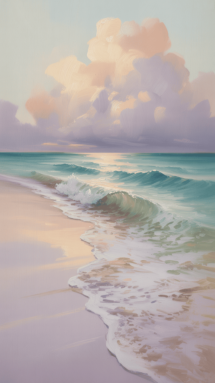
Color choices determine the energy a painting contributes. Pale blues, soft aquas, and sandy neutrals read as calming and pair well with bedrooms and reading nooks. Brighter turquoise or coral accents introduce freshness for kitchens and casual dining spaces. Deep teals or sunset oranges create drama and work well in entryways or stair landings where a bold focal point is desirable. Pick two or three dominant hues from existing textiles or furniture to ensure cohesion. Test a swatch in the space at different times of day; natural and artificial light can shift tones significantly.
4. Sizing, Grouping, and Hanging: Rules That Make Walls Look Intentional

A few simple proportions take the guesswork out of placement. For art above sofas or console tables, aim for a width about two-thirds of the furniture’s length so the piece appears anchored. Keep the bottom edge roughly 6 to 8 inches above furniture tops to create a visual connection. When creating groupings, choose one dominant piece and arrange smaller works around it with consistent gaps—2 to 3 inches between frames is a common, balanced choice. For general eye-level viewing, place the geometric center of the artwork near 57–60 inches from the floor for most home interiors.
5. Frames, Glazing, and Light: Protecting Color and Reducing Glare

Frame material and glass selection both influence preservation and appearance. Light wood or white frames complement coastal palettes without overpowering the image; textured materials like rattan or bamboo add subtle tactile warmth. For works on paper, choose UV-filtering glazing and a mat to protect edges from sunlight and humidity. To avoid distracting reflections, use museum or anti-glare glass if the piece sits across from a bright window. At night, a warm-tone bulb (around 2700–3000K) in a nearby lamp or a low-profile picture light highlights colors without creating harsh hotspots.
6. Styling Around Your Painting: Textures, Accessories, and Color Echoes

Support the painting with complementary textures and selective color repeats rather than matching everything exactly. Linen throws, woven jute rugs, and ceramic vessels introduce organic tones that echo sandy beiges and driftwood. Pull a single color from the painting into a pillow or small accessory to create visual continuity; two repeated touches are usually enough. Keep surfaces easy to clear for daily life—removable covers and tidy trays help maintain an uncluttered look. Grouping natural elements like shells or a small vase of clipped greens reinforces the coastal suggestion without turning the space into a themed vignette.
7. Family-Friendly Care and a Simple DIY Ocean Project

Select display methods that suit household traffic: sealed frames, acrylic glazing, and durable varnishes reduce the need for delicate handling. Dust frames and canvas gently with a soft brush or microfiber; for glass, wipe with a damp cloth applied to the cloth rather than spraying directly. For a quick family craft that complements more formal art, set up washable tempera paints, sponges, and painter’s tape so kids can create horizon-stripe panels. Use heavy paper or canvas panels, remove tape while paint is tacky for clean lines, and label the back with date and a brief note—these pieces make meaningful, casual additions to hallway or playroom walls.
Final Thoughts
A thoughtfully chosen tropical beach painting can tie a room together by introducing a clear focal point, harmonious color accents, and a sense of depth. Focus on medium, scale, and lighting that match your household’s needs, and keep styling simple with one or two echoed colors and natural textures. With careful placement and basic care, ocean-inspired art can enhance daily life—making rooms feel composed, approachable, and ready for whatever the day brings.