Why “All White” Kitchens Are Not Timeless (They’re Boring): A Designer’s Case For Color, Texture, And Contrast
White kitchens have been sold to homeowners for decades as the safe, “timeless” choice, a blank canvas that will never date and always appeal to buyers. We get why that argument stuck: white reads clean, it photographs well, and it doesn’t clash with art or appliances. But as designers who’ve renovated hundreds of kitchens and lived through cycles of trends, we’ve seen the other side. An all-white room can feel flat, impersonal, and, frankly, forgettable. This article looks beneath the surface of the all-white myth, explains the practical and aesthetic downsides, and shows how thoughtful use of color, texture, and contrast creates kitchens that age with personality, and still keep resale value intact.
The All-White Myth: Why People Call It Timeless
White’s reputation as “timeless” comes from a few real strengths: it maximizes perceived space, reflects light, and provides a neutral backdrop that lets fixtures and furnishings stand out. Historically, designers leaned on white in kitchens because it concealed nothing, countertops, cabinetry, and backsplash could be switched over time without requiring a full repainting of walls. Photographers and staging professionals favored white because it simplifies color correction and helps images read well online and in brochures.
But the myth stretches beyond practical benefits into a marketing shorthand: white = safe, modern = desirable. Builders, designers, and retailers amplified this message because a single neutral palette is cheaper and easier to spec at scale. White cabinetry became a default option on model homes, then a perceived norm for “good” kitchens.
That history explains why many buyers insist on white. They’ve been conditioned to equate white with value. Yet “timeless” is not the same as “meaningful.” Timeless implies a design that remains interesting and relevant across decades: white often remains neutral but not distinctive. We need to separate durability from dullness. A palette that resists fads may still lack character, and that’s the difference we want to explore.
Why White Kitchens Often Read As Boring — Not Elegant
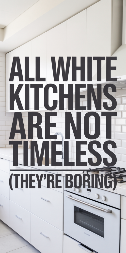
There’s a subtle difference between elegant restraint and visual absence. Elegant kitchens use negative space, proportion, and layered materials to create a composed look. All-white kitchens too often rely on absence alone: everything recedes so nothing anchors the eye. When cabinetry, countertops, trim, and backsplash are all within the same narrow value range, our eyes struggle to find focal points. The result is a room that feels sterile rather than serene.
Another reason white reads as boring: the human brain responds to variation. We notice texture, hue shifts, and contrast more than flat brightness. In an all-white kitchen, small variations like a different sheen on trim or a subtle warm tone in cabinetry aren’t enough to create depth. Without contrast, between dark and light, matte and glossy, warm and cool, the space can feel monotonous.
Finally, trends matter. When a single look becomes ubiquitous in magazines, showrooms, and Instagram feeds, it loses the uniqueness that once felt aspirational. White kitchens were once a clean, modern statement: now they often read as a default. For homeowners who want a kitchen that reflects lifestyle rather than conformity, white can feel like a compromise.
Practical Drawbacks Of An All-White Kitchen
Beyond aesthetics, all-white kitchens carry practical challenges that surprise many homeowners. First: maintenance. White surfaces, whether painted cabinets, white grout, or pale countertops, show wear more obviously. Food splatters, oil residue, and everyday scuffs are immediately visible on light finishes, and some stains (think turmeric, beet juice, wine) create long-term discoloration if not treated quickly.
Second: material limitations. Porcelain tile and cheap solid-surface counters can look uniformly white at first, but they can yellow with age or become dingy from detergent buildup. High-quality materials resist this, but they come at a premium. So the “safe” white kitchen can either force higher upfront costs or leave owners with finishes that age poorly.
Third: lighting dependence. White does reflect light, but it also reveals variations in lighting more readily. Poorly placed fixtures produce shadows and glare on glossy white surfaces, making the space feel stark or uneven. Finally: thermal feel. White can read cold, which is often undesirable in a room intended for gathering and cooking. These drawbacks don’t doom white kitchens, but they’re reasons to think beyond “white = maintenance-free and timeless.”
Design Principles To Replace The Timeless Myth
If we reject the simplistic ‘all-white’ doctrine, what do we replace it with? We propose three guiding principles: layered contrast, material honesty, and context-driven color. Layered contrast means using value shifts and texture to create focal points and visual movement. Material honesty is selecting materials for the character they bring, natural veining, rich grain, or tactile finishes, rather than forcing them into a neutral mask. Context-driven color means choosing palettes that respond to architecture, light, and the home’s neighborhood, not a national trend.
These principles help us design kitchens that feel deliberate and lived-in, yet flexible enough for changes over time. They also safeguard resale value: buyers still appreciate a clean, well-executed kitchen, but they increasingly notice thoughtful design choices that add perceived quality. In the next two subsections we’ll get practical, how to introduce color without hurting resale, and how to use texture and contrast to add depth.
How To Use Color Without Sacrificing Resale Or Cohesion
We’ve learned that adding color doesn’t mean bold, polarizing hues that limit buyers. Instead, we recommend incremental and reversible strategies. Start with islands, lower cabinets, or open shelving in a muted but distinct tone, think warm navy, sage, or a soft charcoal. These choices create contrast and personality while leaving upper cabinets or walls neutral, preserving broad appeal.
Use color in components that are relatively easy to update: paintable islands, furniture-style pieces, or tile backsplashes. Hardware and lighting are small, high-impact elements where color and finish make a significant difference without permanent commitment. Another tactic: layer color through textiles and accessories, stools, rugs, dishware, which lets homeowners refresh the look seasonally or before resale.
When specifying paint, choose colors with clear undertones and test them in the actual kitchen light across the day. Colors that photograph poorly or clash with stainless steel can undermine perceived quality. Finally, document your color story in listings or brochures: buyers respond to confident design decisions. A thoughtfully chosen accent color can signal intention and increase perceived value compared with an anonymous all-white envelope.
Using Texture, Tone, And Contrast To Add Depth
Texture is our most reliable tool for making a kitchen feel rich. Matte painted cabinetry contrasts beautifully with polished stone, and a honed concrete countertop offsets a brushed brass faucet. We like mixing finishes, matte wood, textured tile, and soft leather or woven seating, to engage touch as well as sight.
Tone and contrast are about controlled differences. Introduce a mid-tone, a warm greige or muted blue, to break up the extremes of white and black. Use darker toe kicks, island bases, or open shelving to anchor the room and create visual weight. Even small shifts in sheen (flat cabinet paint vs semi-gloss trim) can delineate planes without adding color.
Practical details matter: grout lines in a slightly darker shade, rattan or butcher-block accents, and visible joinery or millwork profiles all add layers. Contrast doesn’t have to be loud: it just needs to be intentional. When we set up these layers, the kitchen reads as composed and collected instead of anonymous.
Real-World Alternatives That Age Better Than All White
We recommend looking at whole-kitchen strategies rather than single tweaks. Successful alternatives combine durability with personality and require only modest concessions for resale. Three themes keep coming up in our projects: two-tone cabinetry, statement islands, and palettes that tolerate wear. These approaches create focal points and help the kitchen feel curated rather than catalog-driven.
Two-tone cabinetry allows homeowners to keep upper cabinets bright for a sense of openness while giving the lower plane more visual heft. Statement islands change the room’s center of gravity and allow for bolder color or material choices in a contained, high-impact way. Finally, selecting palettes that hide wear, warm tones, mid-value woods, and textured surfaces, reduces the visibility of daily use and helps the kitchen look good for longer.
Below we jump into practical examples and reasons these strategies perform better than an all-white approach in real homes.
Two-Tone Cabinets, Statement Islands, And Accent Walls
Two-tone cabinets are a smart compromise: upper cabinets in a soft white or cream preserve lightness, while lower cabinets or the island in a deeper hue introduce contrast and hide scuffs. We often specify a warm navy or graphite for lower runs, these colors read sophisticated across styles and pair well with brass or black hardware.
Statement islands function as the room’s centerpiece. Because they’re a single piece, they’re ideal for experimenting: waterfall stone, fluted wood, or a hand-painted finish. An island also absorbs the visual weight of appliances, bar seating, and prep space, making it easier to keep the surrounding cabinetry calm and neutral.
Accent walls, whether tiled, painted, or clad in wood, give the eye a destination. A vertical shiplap behind open shelving or a textured tile behind the range adds personality without risking the entire palette. These accents can be updated more easily than full cabinetry overhauls, panels can be painted, tiles re-grouted, or cladding replaced, so they’re a pragmatic way to inject long-lasting character.
Dark Or Warm Palettes That Hide Wear And Add Character
Dark and warm palettes have become a favorite among designers because they age well. Dark cabinetry, when executed thoughtfully, reads luxurious rather than oppressive. Deep greens, rich charcoals, and espresso woods conceal marks and contrast beautifully with lighter countertops and warm metals.
Warm palettes, incorporating honeyed woods, terracotta accents, and warm grays, add the sense of age and history that white often lacks. These hues absorb light in a comforting way and pair naturally with brass, bronze, and leather, creating a cohesive, lived-in look.
From a maintenance perspective, mid-to-dark tones are forgiving. They show fewer fingerprints than glossy white and mask minor staining more effectively. That reduces the pressure for constant upkeep and helps kitchens feel authentic. When buyers tour homes, they increasingly appreciate finishes that suggest durability rather than fragile perfection.
Conclusion
We’re not saying white belongs nowhere, it has a place in well-considered schemes. But treating all-white as the default “timeless” choice is a missed opportunity. By introducing restrained color, thoughtful texture, and balanced contrast, we create kitchens that feel intentional, practical, and full of personality. Those kitchens age better visually and functionally, and they tend to attract buyers who value design rather than conformity. If you’re planning a remodel, think in layers: pick a durable foundation, add a distinctive anchor, and let materials do the storytelling for you.