Why Matching Furniture Sets Look Worse Than You Think — How To Make Rooms Feel Intentional, Not Ikea-Uniform
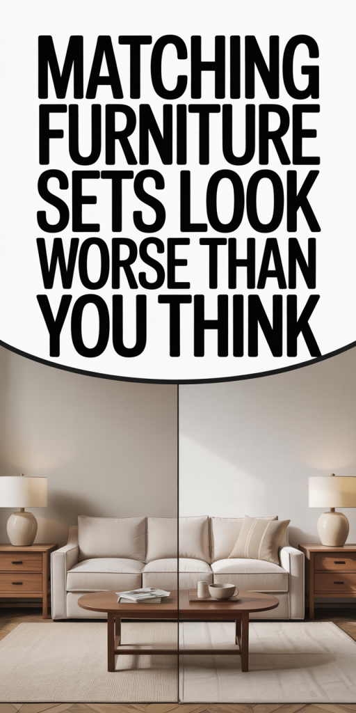
We’ve all seen the appeal: a matching living room set that promises cohesion, simplicity, and a fast route to a polished home. For decades, matching furniture sets were the easiest way to furnish a space and feel instantly done. But increasingly we notice the problem: those uniform suites often leave rooms looking bland, generic, or worse, like a showroom or an Ikea catalog page come to life. In this text we’ll explain why matching furniture sets look worse than you think, how retail and historical forces pushed them into our homes, the specific design mistakes they create, and practical, low-cost ways to move toward a more thoughtful, layered look without replacing everything. By the end we’ll have concrete strategies so our rooms read intentional, personal, and balanced, not just “matching.”
Why Matching Sets Once Dominated Living Rooms And Bedrooms
There’s a reason matching furniture sets dominated households for most of the 20th century: they solved problems efficiently. After World War II, mass production and growing suburban living created a surge in demand for affordable, coordinated furnishings. Manufacturers capitalized on this by selling suites, sofa, loveseat, armchair, and tables, that shared finishes and silhouettes. For busy families and first-time homeowners, buying a set removed the guesswork. Suddenly, a room could look “finished” without hiring a decorator or learning about scale.
Beyond convenience, social signaling mattered. A coordinated parlor or den suggested order and respectability. Department stores displayed matching roomsets as aspirational vignettes: tidy, unified, and modern. That display mentality carried over into how homes were photographed in magazines and catalogs, reinforcing the idea that harmony equals matching.
We also can’t ignore economics. Stores offered discounts for bundled pieces, and credit plans made large purchases accessible. For salespeople, moving inventory in sets simplified logistics and increased average sale value. All those incentives, production, marketing, pricing, meant matching sets became the default choice for a generation.
But defaults become habits. As tastes evolved and design literacy expanded, people started noticing the downsides of a “complete” look: lost personality, awkward scale, and an overabundance of identical finishes that mute a room’s character. That realization is what brings us here: matching sets once dominated because they solved real needs, but those same attributes now explain why they can look worse than we think.
The Design Problems With Matching Sets
At first glance, matching furniture seems like a safe bet. But the theory behind harmony isn’t the same as identical repetition. We’ll unpack two core problems: predictability and visual flatness, and scale and proportion mistakes that break a room.
Predictability And Visual Flatness
When every major piece mirrors the others in color, finish, and silhouette, the room loses contrast, and contrast is what gives spaces life. Predictability makes a space readable at a glance, but it also removes curiosity. Without moments that surprise or anchor the eye, a room becomes visually flat: light bounces without stops, patterns blur, and textures mute.
We can think of a room like a playlist. If every track is the same tempo and same key, nothing stands out. A single vinyl record or an acoustic interlude, in decor terms, a throw, an art piece, or a contrasting armchair, gives the room rhythm. Matching sets remove those pauses. They tell the eye “there’s nothing else here,” which is often perceived as unfinished or, paradoxically, overdone.
Another issue is finish fatigue. When wood tones, metal accents, and upholstery fabrics are repeated ad nauseam, small but meaningful elements, a lamp base, a picture frame, a woven basket, struggle to register. The room reads as a homogeneous block, and because humans crave variety (to a point), we often register that homogeneous block as boring or even cheap-looking, regardless of the pieces’ quality.
Scale And Proportion Mistakes That Break A Room
Matching sets are often designed to fit a wide range of spaces, which means they default to average proportions. Those ‘one-size-fits-most’ dimensions can easily undermine rooms with unique layouts. A large, overstuffed sofa designed to match an equally chunky loveseat might overwhelm a modest living room, choking traffic flow and making the space feel cluttered.
Conversely, in larger rooms the same matchy pieces can feel dwarfed and insignificant. Because sets were created to pair visually rather than to be tailored to a room’s dimensions, we end up with misplaced visual weight: too many identical pieces competing for attention, none acting as a true focal point.
Scale issues also emerge vertically. Matching bedroom furniture sometimes stacks identical heights, bed, two nightstands, dresser, leaving little variation in silhouette. That flat skyline removes the vertical movement our eyes need. We notice it unconsciously as discomfort or awkwardness: it might not be that the pieces are bad, but that they don’t respond to our room’s proportions or sightlines. The result: a space that feels assembled rather than designed.
Retail And Trend Forces That Keep You Buying Sets
It’s helpful to remember that matching sets didn’t just arise from taste, they were engineered. Retail psychology and industry practices keep sets in rotation. Stores build displays around complete room packages because it simplifies decision-making for shoppers. When a display shows a sofa, two chairs, coffee table, and lamp, it creates a story: you can recreate this scene in your home with one purchase.
Marketing and merchandising play a role too. Bundles are priced to feel like a deal, and limited-time sales, think ‘living room set’ discounts, nudge buyers toward bulk decisions. Retailers know that buying a set increases customer satisfaction in the short term: the room looks coherent immediately. That short-term satisfaction is valuable when decision fatigue is high.
Trend cycles also push sets. When a particular finish or silhouette becomes fashionable, manufacturers churn out matching suites to meet demand. Social media and lifestyle influencers amplify this: a cohesive vignette photographs well and becomes aspirational content. That visibility feeds demand back into production. Meanwhile, financing options and white-glove delivery make acquiring large multiples easier, so consumers who want the quickest route to a magazine-ready room default to sets.
Finally, supply chain economics matter. It’s cheaper for manufacturers to streamline production around a single design language. Fewer SKUs, standardized tooling, and predictable distribution create economies of scale, savings that suppliers pass to retailers in the form of aggressive set pricing. So even when shoppers want variety, the market nudges them toward sameness.
Practical Alternatives To Matching Sets
If we accept that matching sets often undercut a room’s potential, the next question becomes: what are realistic alternatives? We want approaches that preserve coherence without surrendering personality. Below are practical strategies that scale from beginner-friendly to more adventurous.
Mix-And-Match Strategies That Still Read Cohesive
Mixing doesn’t mean chaos. There are simple rules that make varied pieces read as a deliberate group:
- Choose an organizing element. Anchor the palette with one repeated attribute, color, material, or finish. For example, pick two different sofas in complementary hues but repeat a warm wood tone across side tables to create a through-line.
- Balance styles by weight. If you choose a mid-century sofa, pair it with a contemporary coffee table and a traditional armchair, but keep visual weight similar. Low-profile pieces work well with other low-profile pieces: chunky works with chunky.
- Repeat small accents. Use textiles, metal finishes, or a pattern to echo across the room. A brass lamp, brass picture frames, and a brass coffee-table inlay will knit disparate furniture together.
- Mind the rhythm. Vary shapes and heights so the eye can move: a tall bookcase, a low sofa, a round ottoman, alternating vertical and horizontal elements create a pleasing cadence.
These tactics let us layer personality while maintaining a sense of purpose. We avoid the one-pattern-fits-all trap by being intentional about what we repeat and what we vary.
Anchor With One Statement Piece Instead Of Full Sets
A single statement piece can transform a room and render the need for matching sets obsolete. When we invest in one compelling item, an oversized sofa in a saturated color, a sculptural sideboard, an antique chest, the rest of the room can be more subdued and flexible.
The strategy is simple: let one piece do the heavy lifting and coordinate around it. If we have a bold blue sofa, pick neutral chairs that pick up undertones from the sofa’s fabric, and use an area rug to delineate the seating area. The sofa becomes the focal point: other pieces support it rather than compete.
Statement pieces also help hide mismatches. If the anchor dominates the composition, smaller differences in wood tone or style matter less. That’s why mixing a vintage coffee table with a contemporary sofa often feels right, the eye is drawn to the anchor first.
Finally, a statement-first approach is budget-friendly. We can save for one higher-quality item and fill in the rest with thrifted or lower-cost pieces that still feel intentional. Over time, as we collect items that resonate with the anchor, the room gains a curated, layered look without ever defaulting to a uniform set.
How To Transition Away From Matching Sets Without Replacing Everything
Replacing a full matching set is expensive and wasteful. Fortunately, we can change the feel of a room in stages. Here’s a practical, step-by-step transition plan that minimizes cost and maximizes impact.
- Audit with intent. Start by photographing the room and making a short list: what feels heavy? What’s redundant? Identify one or two pieces that are easiest to replace or refinish.
- Add texture and textiles. Pillows, throws, and rugs are high-impact, low-cost ways to break uniformity. Swap a matching sofa pillow for one with a pattern or different fabric weight. Layer a rug under the seating area to ground the composition and introduce color.
- Refinish or paint accents. If all the wood tones match and you want contrast, refinish a side table or paint a cabinet. A sprayed paint or new stain can change an item’s character in an afternoon.
- Introduce one contrasting piece. This could be an armchair in a complementary color, a different-style coffee table, or a floor lamp with a distinct silhouette. We don’t need to replace the largest items immediately: smaller focal pieces often shift perception enough.
- Rearrange for flow. Sometimes simply changing placement frees sightlines and improves scale. Pull the sofa slightly away from the wall, angle a chair, or float the seating area on a rug to create a clear conversation zone.
- Edit accessories. Remove duplicate accessories or matching sets of decor objects. Instead, display a curated mix: a stack of books, a plant, a single decorative bowl. We’re aiming for collected-not-matched.
- Layer art and wall treatments. A gallery wall or an oversized piece of art provides focal energy so the furniture becomes a backdrop. Even swapping frames to a consistent finish while varying artwork can tie elements together without more furniture purchases.
By phasing changes, we avoid waste and create momentum. Each small step compounds: a new rug plus one contrasting chair will make the existing matching set feel more intentional rather than obsolete.
Conclusion
Matching furniture sets solved real problems: convenience, price, and immediate cohesion. But as we’ve explored, they often produce predictability, scale issues, and a loss of personality. The good news is we don’t need a complete overhaul to fix that. With a few strategic edits, introducing texture, choosing an anchor piece, repeating select finishes, and minding proportion, we can make rooms feel intentional, layered, and uniquely ours. Let’s prioritize contrast over cloning, craft over convenience, and design that reads lived-in, not just matched.