A Visual Style Guide for a Cohesive Halloween Phone Aesthetic
Dressing your phone for the season is an exercise in mood-making: it’s less about technical tweaks and more about composing a tiny, moving canvas that reflects autumn evenings, playful spooks, or quiet mystery. This guide focuses on the visual choices that give a home screen a unified personality—color palettes, subject matter, textures, and the small supporting elements that keep everything feeling intentional.
Rather than a step-by-step device walkthrough, you’ll find creative direction for distinct Halloween vibes—cozy and leafy, spare and graphic, soft-and-playful, noir-retro, and quietly gothic—plus guidance on matching widgets and respecting image creators. Use these notes as inspiration to mix and match elements, keeping your phone aesthetic consistent and striking all season long.
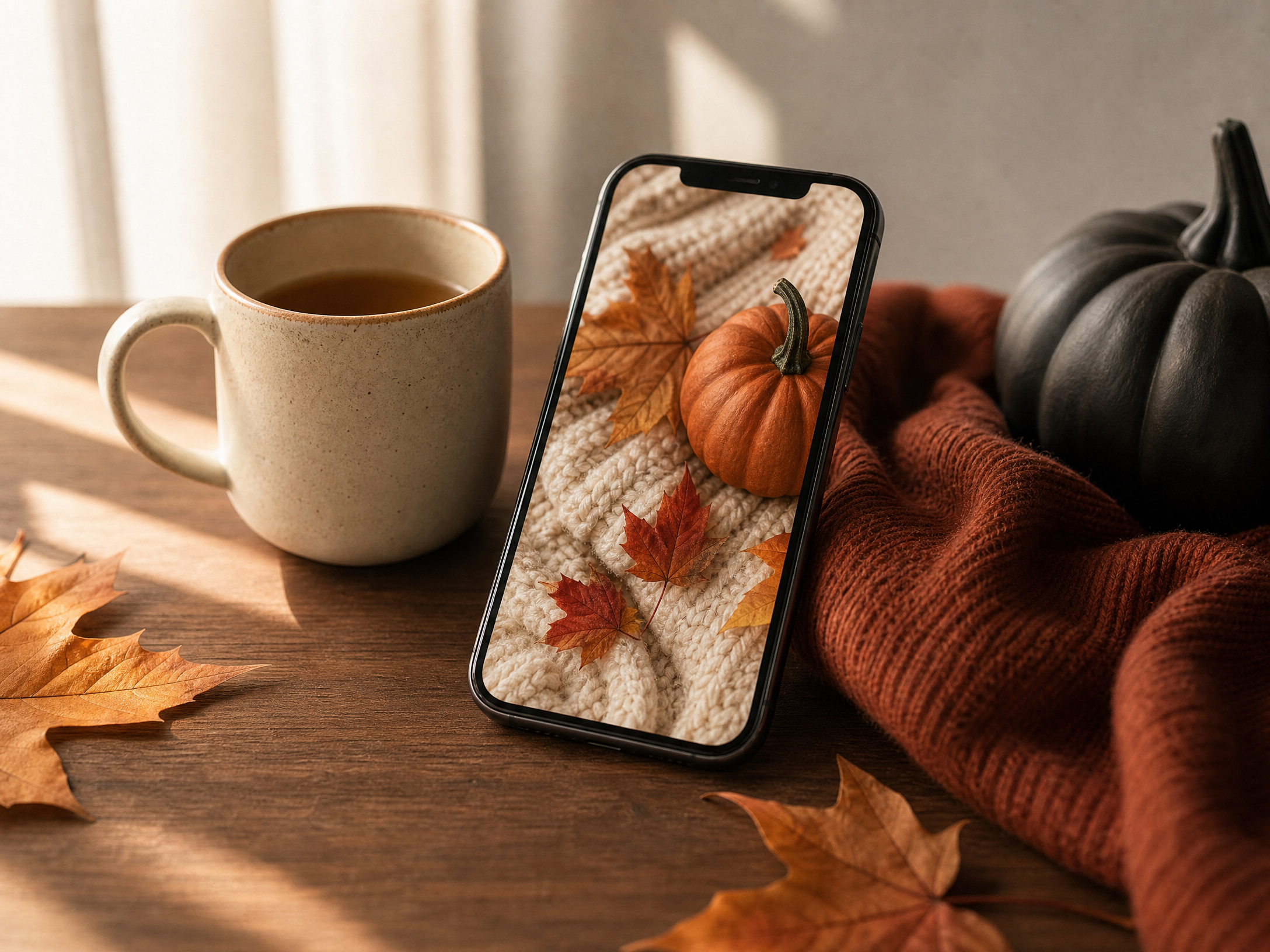
1. Cozy Autumn: Warm Layers and Harvest Charm
For a cozy autumn look, prioritize warm, muted tones: toasted orange, walnut brown, and soft cream form a base that reads as comforting rather than loud. Choose imagery that implies a lived-in season—close-ups of knit textures, stylized pumpkins, fallen leaves, or steam rising from a mug—framed with generous negative space so home-screen elements don’t compete with the background.
Complement these visuals with rounded, soft-edged widgets and icons in cream or off-white to maintain warmth. Keep contrast low-to-medium so the overall impression is gentle; reserve small, brighter accents (a single burnt-sienna calendar icon or a deep-amber unread badge) to draw attention without breaking the calm.
2. Minimal Monochrome: Crisp Shapes, Quiet Impact
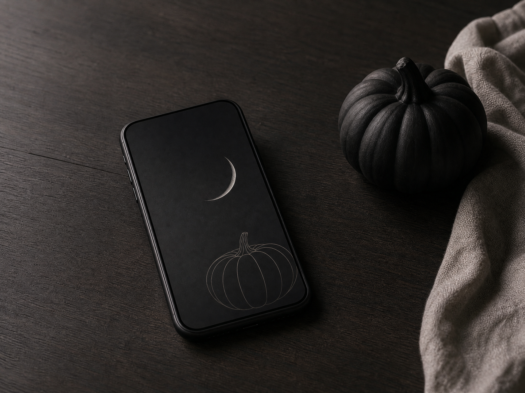
A monochrome scheme leans on shape and negative space rather than color to create mood. Pick a single dominating hue—deep charcoal, rich midnight, or an ash-gray—and use tints and shades of that color so the visual language reads unified. Simple silhouettes (a single pumpkin outline, a crescent moon, or a stylized leaf) make strong focal points without clutter.
For widget styling, use transparent or semi-transparent backgrounds and thin, geometric iconography to preserve the minimal feel. Typography should be clean and unobtrusive; choose a slender sans-serif and keep text short so functionality blends into the aesthetic rather than shouting over it.
3. Soft-and-Playful: Pastel Spooks and Gentle Whimsy
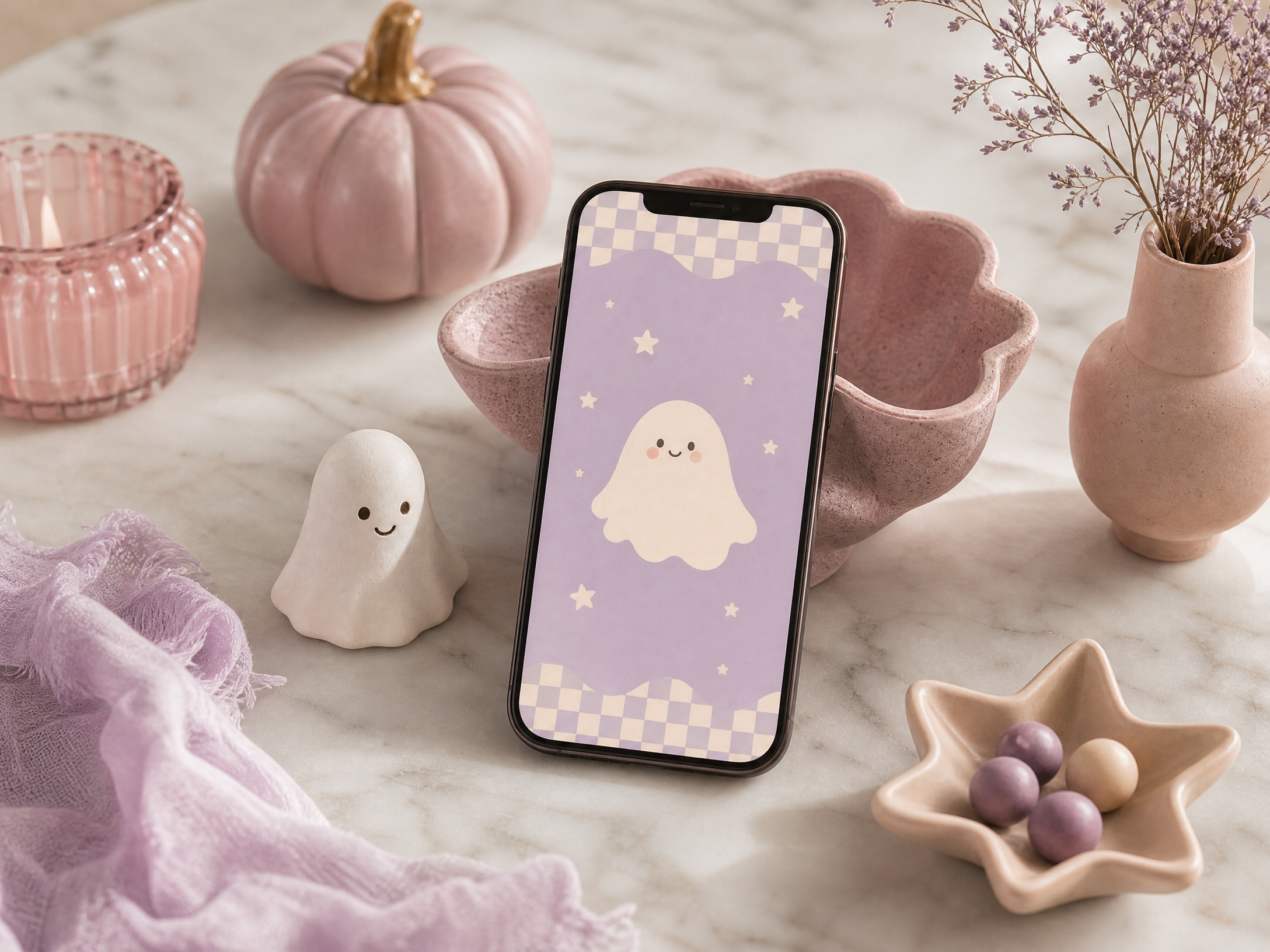
If you prefer a friendly, lighthearted take on the season, work with soft pastels—muted pinks, minty greens, and warm lavender—to soften traditionally spooky motifs. Subjects can include cheerful, rounded characters (cute ghosts, smiling pumpkins, or friendly black cats) depicted with hand-drawn lines and subtle texture so they feel tactile rather than flat.
Layer small playful details—like a string of tiny stars or a delicate checker pattern—behind widgets for depth, and select icon shapes that echo the rounded forms in your background art. Keep contrast sufficient for legibility but avoid harsh blacks; charcoal-gray text and icons will maintain readability without disrupting the pastel mood.
4. Vintage Night: Film Grain, Moonlight, and Retro Motifs
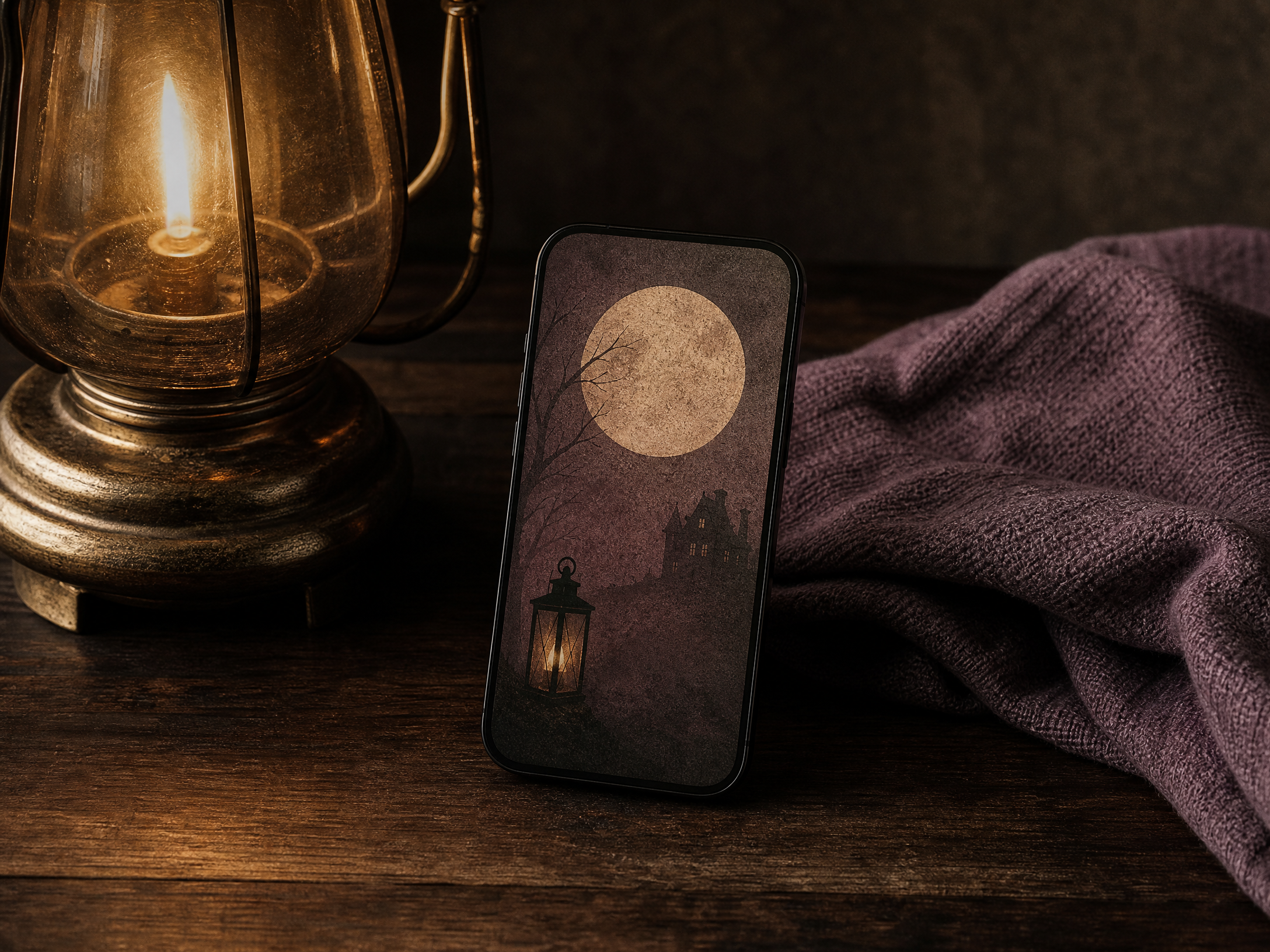
A vintage-night aesthetic channels old photographs and classic horror posters: think desaturated color, warm sepia tints, and subtle film grain. Select subjects that feel slightly aged—silhouetted castles, old lanterns, or a hand-drawn moon—composed with strong lighting contrasts that mimic lamplight and shadow.
Texture is key here: add a thin overlay of grain, faint vignette at the edges, or delicate paper creases to evoke age. Companion widgets should follow a muted palette and vintage typography—serif or condensed letterforms—to harmonize with the retro imagery without competing for attention.
5. Subtle Gothic: Quiet Darkness with Elegant Details
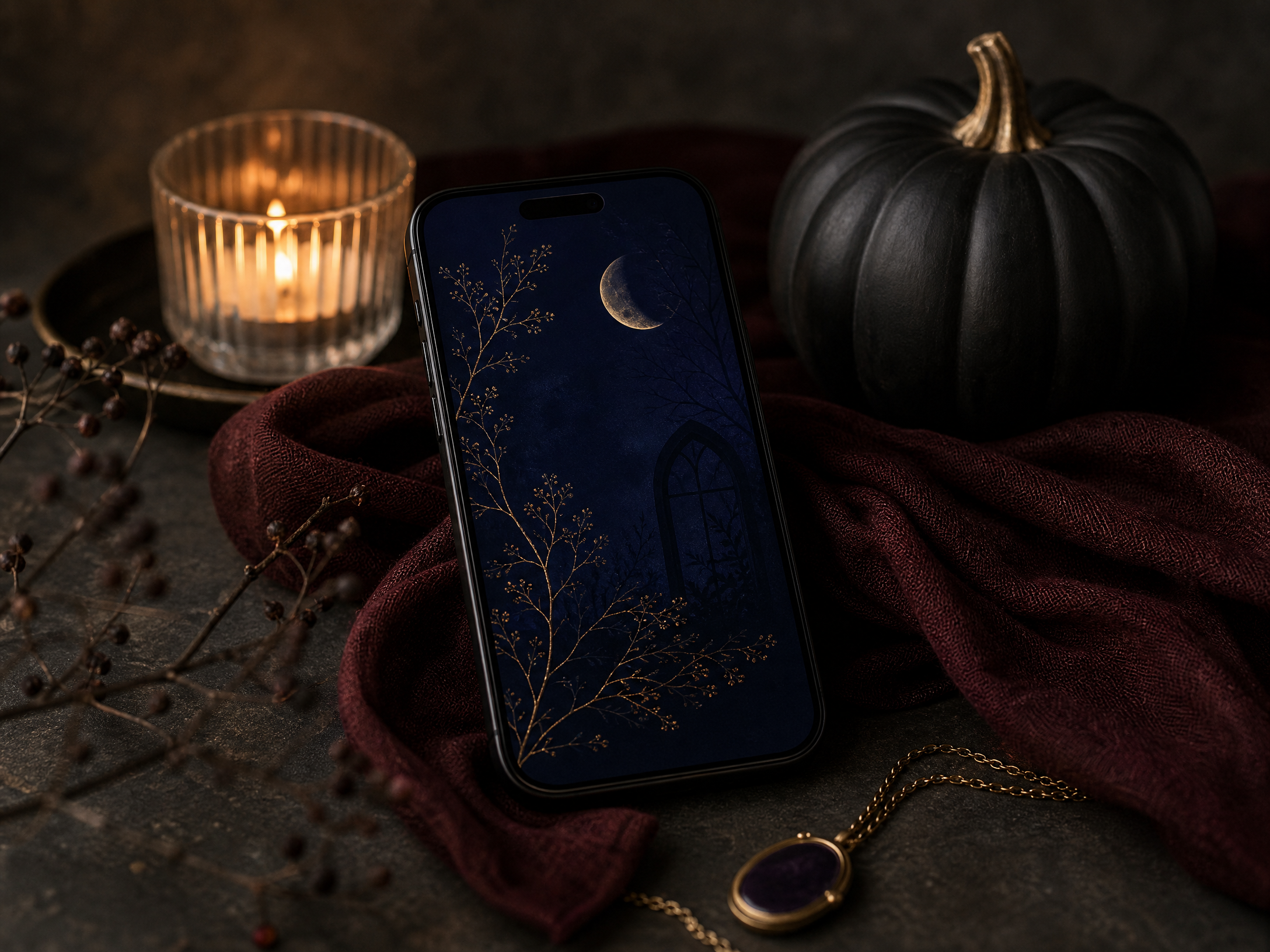
Subtle gothic isn’t about shock; it’s about refined darkness. Use a limited palette of deep indigo, oxblood, and matte black paired with touches of antique gold or bone-white for accents. Favor subjects that suggest mystery—arched windows, moonlit branches, and delicate ornamental flourishes—rendered with clean lines and restrained ornamentation.
To keep the look elegant, choose narrow, high-contrast widgets and minimal chrome. Avoid excessive textures; a faint lace or filigree border is often enough. Let negative space breathe so each dark element holds weight and the overall composition feels deliberate, not cluttered.
6. Texture & Layering: How to Build Depth Without Noise
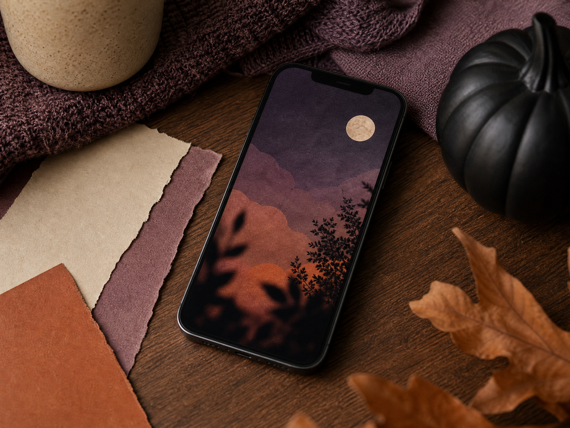
Layering textures—paper fibers, soft fabric knits, light grain—adds tactile interest that reads well on a small screen. Apply these effects subtly: a low-opacity grain layer, a gentle shadow behind a central motif, or a slightly blurred foreground element to create perceived depth. Respect readability by keeping the central area where widgets sit relatively calm and low-contrast.
Concise tips:
- Use one dominant texture and one secondary texture to avoid visual muddiness.
- Keep widget backgrounds translucent rather than opaque so textures peek through.
- Apply shadows sparingly to anchor icons and avoid a flat look.
- Test with typical on-screen elements (time, notifications) to ensure legibility.
7. Companion Elements: Icons, Widgets, and Lock/Home Pairing
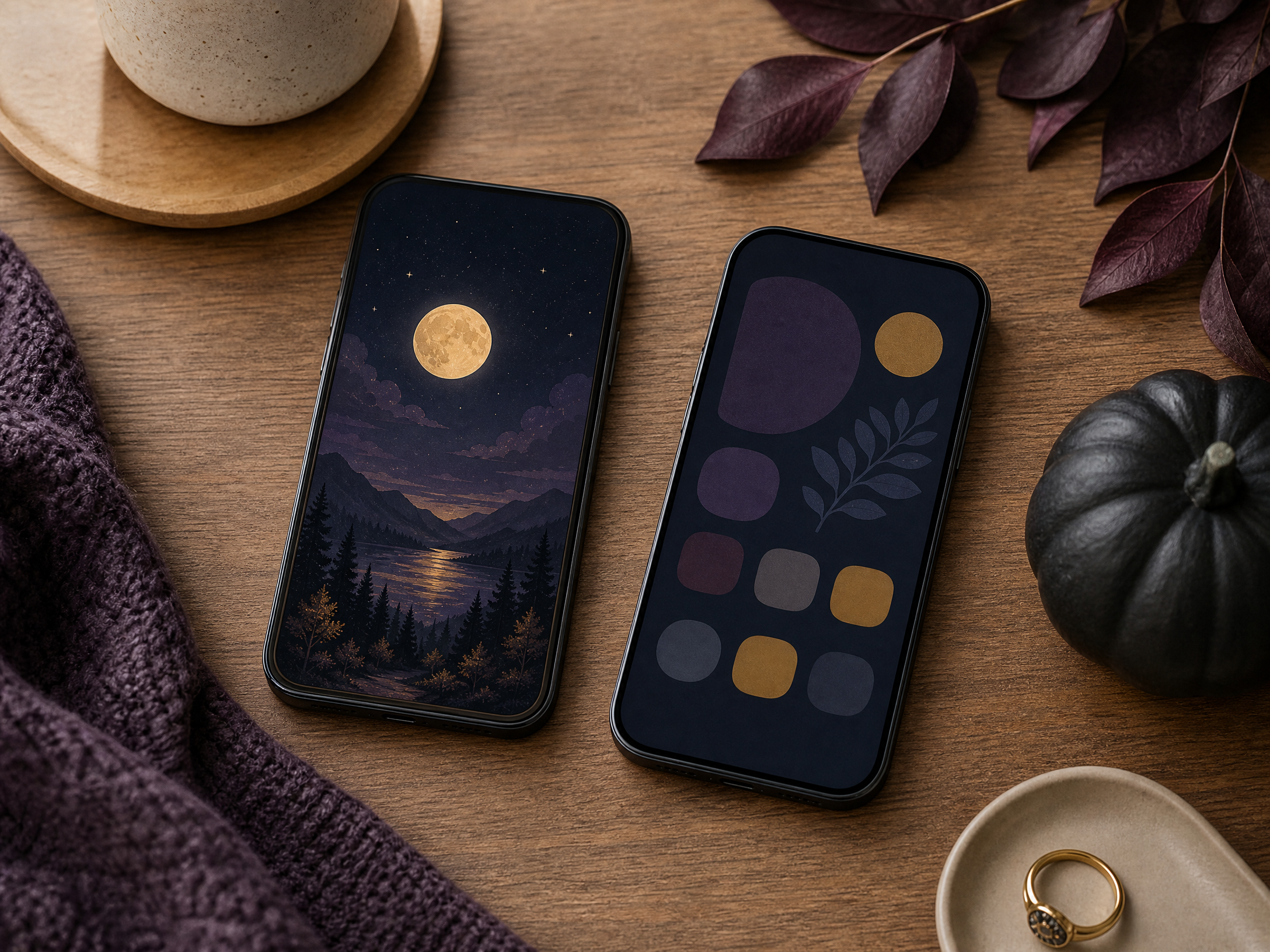
Companion elements are what glue your wallpaper to the rest of the phone experience. Choose an icon shape family—rounded, square, or minimalist line—and stick with it so the home screen feels curated. Widgets can echo the mood of your wallpaper through color and opacity: a semi-opaque calendar in a matching hue or a weather widget with a subtle background motif strengthens cohesion.
When creating a lock and home pairing, think of the lock screen as a poster and the home screen as a room. Use the lock image for a bold, single focal point and the home image for a calmer, repeatable pattern or softer composition. Make sure crucial information (time, notifications) sits on areas of the image with sufficient contrast for quick legibility.
8. Creators’ Rights and Using Imagery Responsibly
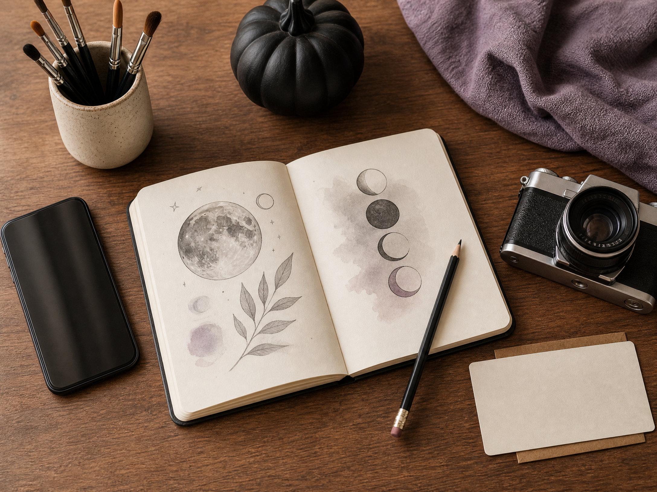
Using artwork, photos, or illustrations requires attention to creators’ rights. Prefer original photography or graphics you create yourself; when you use another artist’s work, obtain explicit permission or a license that covers personal-device display. Look for clear attribution guidelines and retain records of permission or license terms so you can confirm lawful use later.
If you modify someone else’s image, check whether the license allows derivative works and follow any required crediting. When in doubt, reach out to the creator to ask—many artists welcome requests and can grant reasonable terms. Respecting usage rights honors the creative community and keeps your personal aesthetic both beautiful and ethical.
Final Thoughts
Building a cohesive Halloween phone aesthetic is about deliberate visual decisions: pick a mood, limit your palette, choose consistent shapes and textures, and let small accents guide the eye. When your background, icons, and widgets speak the same visual language, the result feels intentional rather than seasonal clutter.
Above all, create with respect—both for your own design instincts and for the creators whose work you might borrow. A thoughtful, well-composed screen can be a tiny piece of art that brightens your daily routine all through the season.