Halloween Wallpaper Guide: Make Your Phone Look Spooky — and Still Be Readable
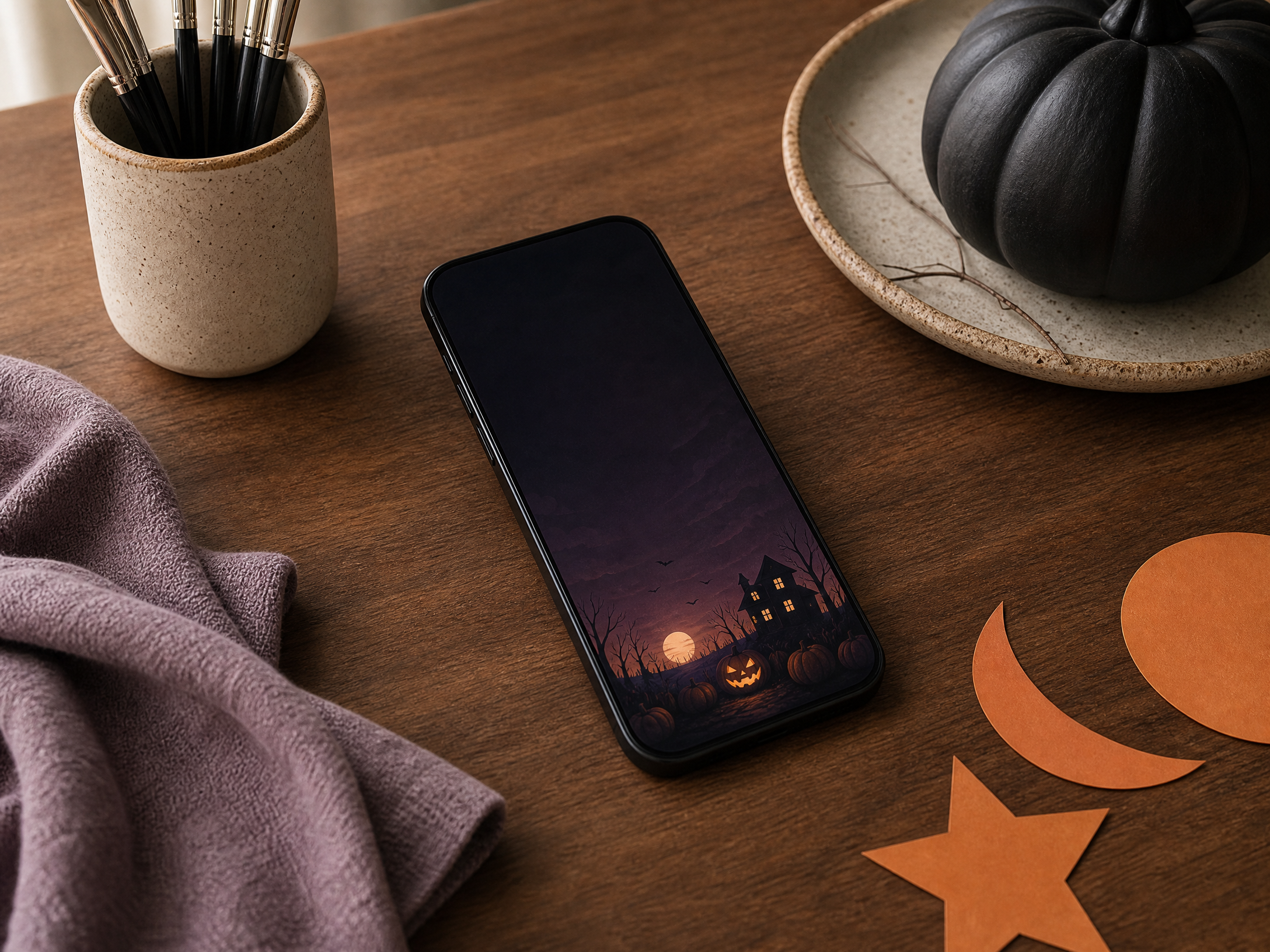
A seasonal wallpaper can be the simplest way to give your phone Halloween spirit, but a dazzling background that clashes with the clock, app icons and notifications quickly becomes more frustrating than festive. The best Halloween wallpapers let the artwork shine while keeping essential information clear at a glance.
This guide covers visual priorities and practical choices — from placing your central motif away from overlayed elements, to choosing contrast, building a small library of usable images, and rotating moods through the season. You’ll get straightforward design rules that work on any phone without relying on model-specific instructions.
1. Design with visual hierarchy in mind
Start by deciding what should draw the eye first: the clock and notifications, an illustration, or an atmospheric texture. Visual hierarchy is simply the order in which elements appear to a viewer. If the phone’s information needs to be readable at a glance, the background should support that order rather than compete with it.
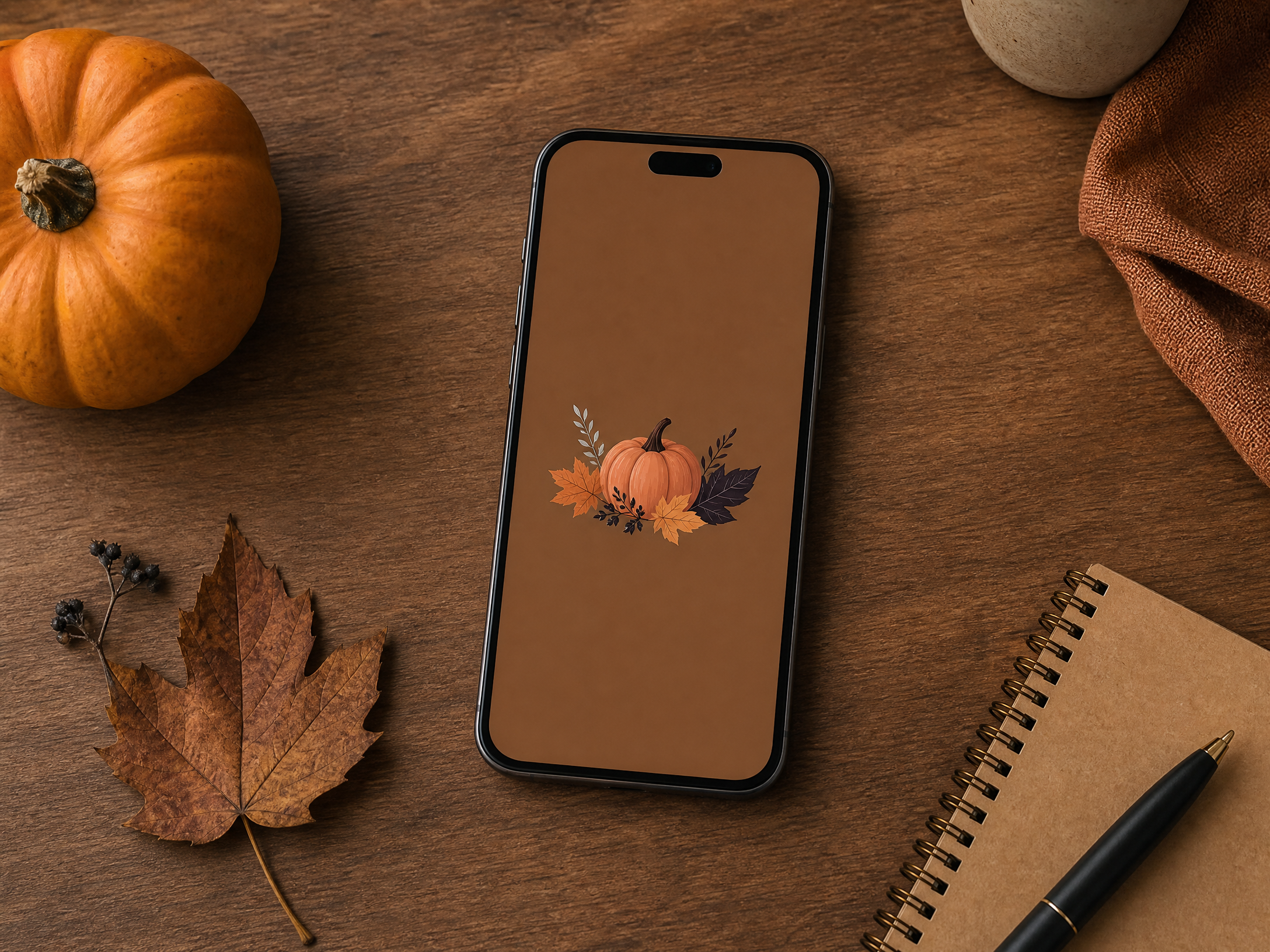
Place primary visual elements so that they complement the system overlays. For example, a bold moon or pumpkin can become a secondary focal point if it sits away from where your clock typically appears. Use layers of depth — a subtle foreground motif, a midground subject, and a soft background texture — to keep the scene interesting without overwhelming functional elements.
2. Keep top and bottom clear zones
Phones reserve space at the top for the clock and status icons, and at the bottom for the dock or navigation area. Treat those areas as “clear zones”: avoid placing tiny details, faces, or important text where those overlays sit. A clean top zone preserves clock legibility, and a quiet bottom zone prevents icons from obscuring your main subject.
Try these practical checks when editing an image:
- Preview the wallpaper with a mockup or by placing temporary shapes where your clock and dock sit.
- Move or crop your subject so its key features avoid the top and bottom bands.
- If an image feels cramped, add extra negative space to the top or bottom instead of shrinking the subject.
3. Use contrast and value to preserve legibility
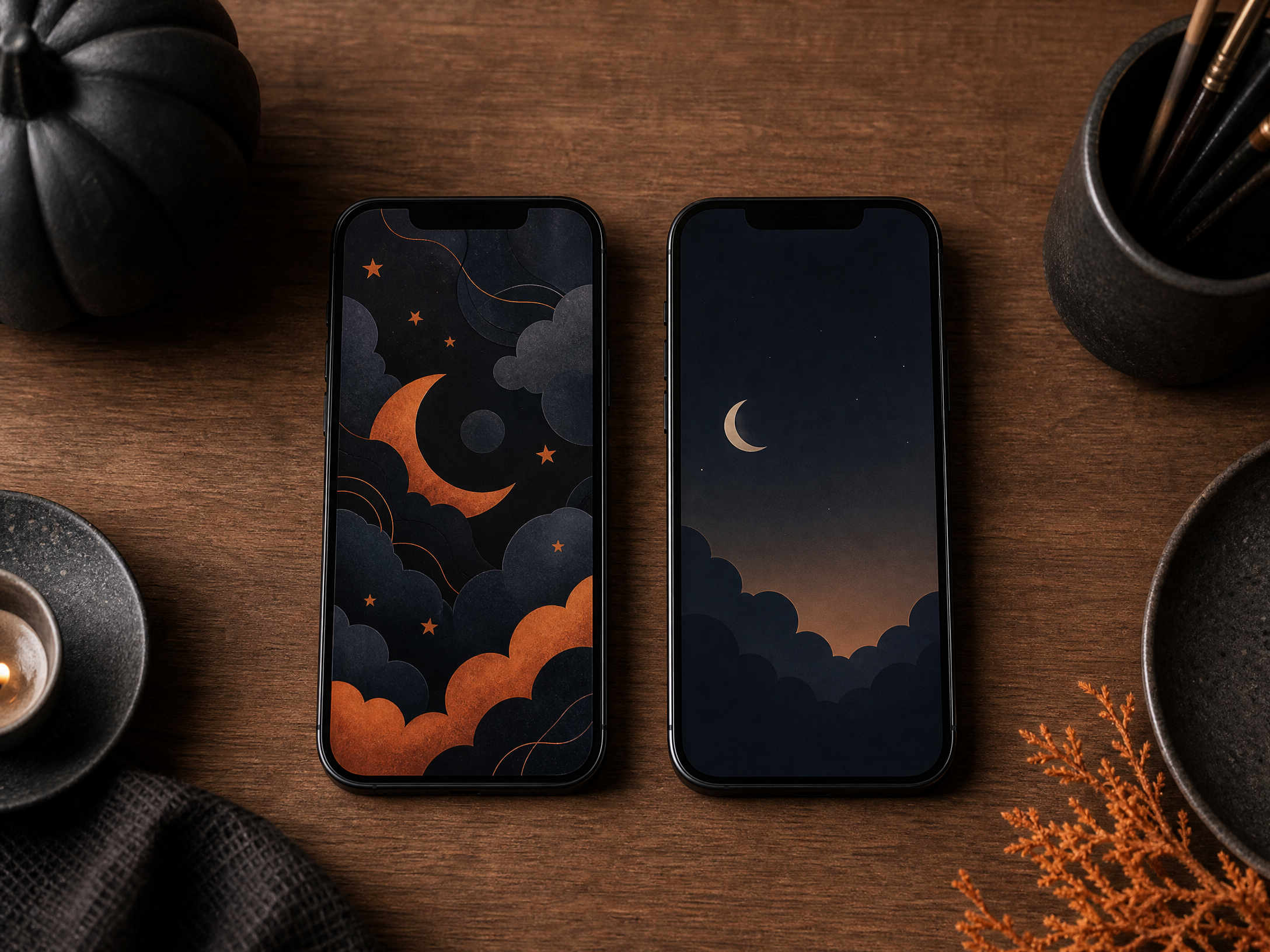
Contrast — the difference in brightness and color between your wallpaper and interface elements — determines whether clock text and app icons remain readable. A bright, busy image behind white UI text will make the numbers vanish; conversely, a very dark background can hide notification badges. Aim for distinct separation between the wallpaper’s busy areas and places where text appears.
If the artwork is too similar to UI colors, subtle fixes can help: add a soft vignette behind the clock, lower the background’s saturation around high-traffic areas, or apply a gentle blur layer where icons appear. These adjustments preserve the image’s atmosphere while ensuring function comes first.
4. Choose a theme that matches your apps and mood
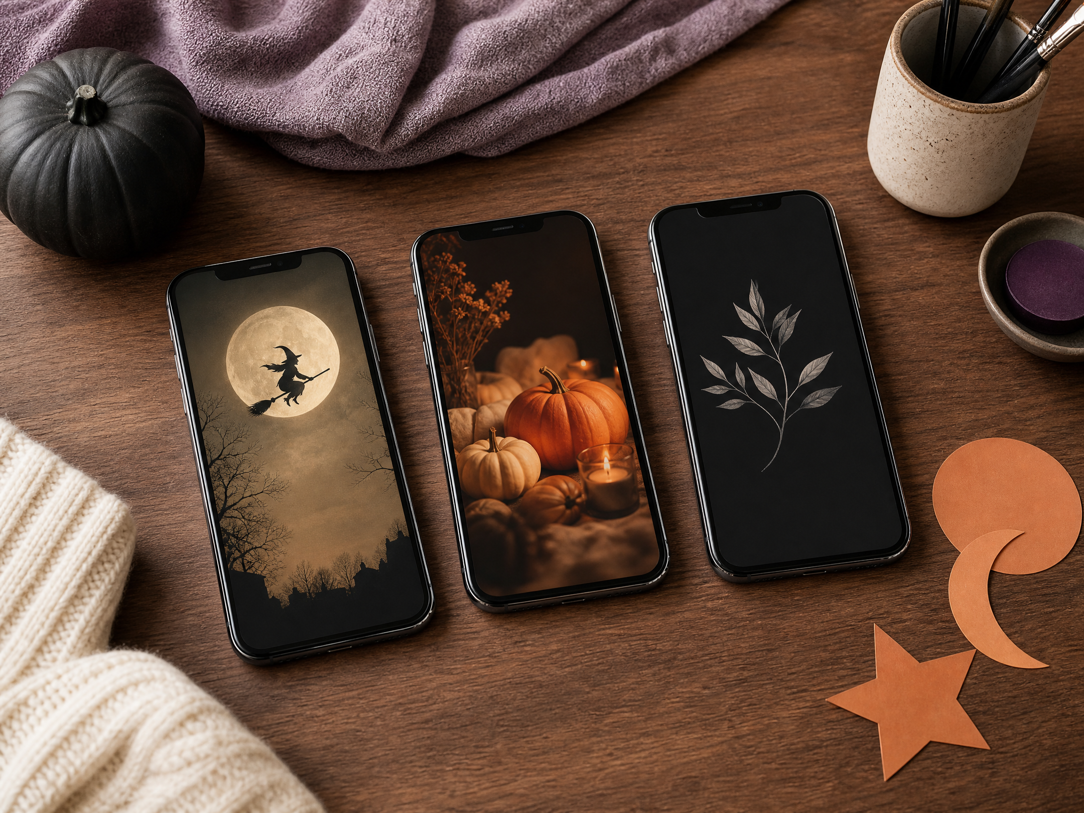
Think about the overall vibe you want — vintage horror silhouettes, whimsical pumpkins, misty graveyards, or autumnal foliage — and pick one direction rather than mixing too many competing motifs. Matching the wallpaper to your app icon aesthetic (colorful, monochrome, flat, or skeuomorphic) helps the whole screen feel cohesive.
Also consider color family and saturation. Muted, monochrome wallpapers pair well with colorful icon sets, while bright, playful illustrations can be balanced by choosing simpler widgets and folders. The simpler the motif, the easier it will be to maintain legibility and visual calm.
5. Test your wallpaper at a glance
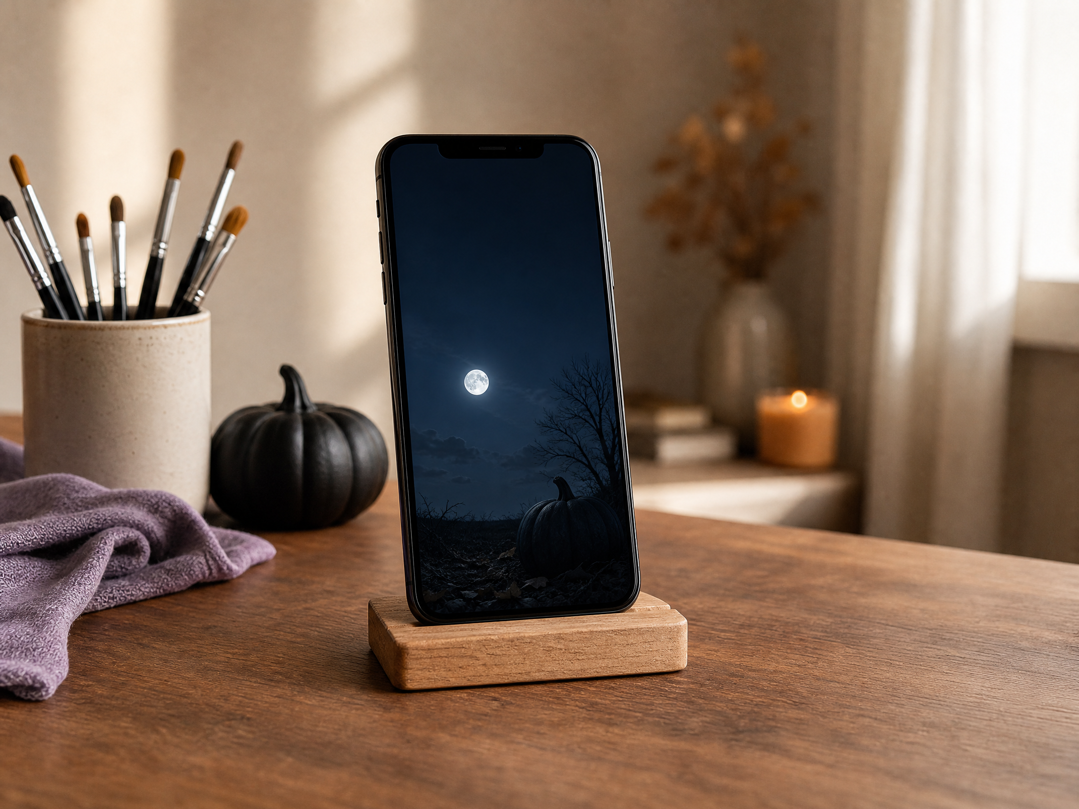
A quick, honest test is the simplest way to know if a wallpaper works. Lock your phone and look at the screen from a few feet away: can you read the time? Do notification banners and badges stand out? Does the main subject remain visible behind the icons?
Use this short checklist when evaluating potential images:
- Can you read the clock immediately from across the room?
- Are app icons easy to find against the background?
- Do incoming notifications remain clearly visible?
- Does the image still feel like Halloween without distracting from function?
If any answer is no, tweak the crop, add a faint overlay, or choose a different image.
6. Assign different roles to lock screen and home screen
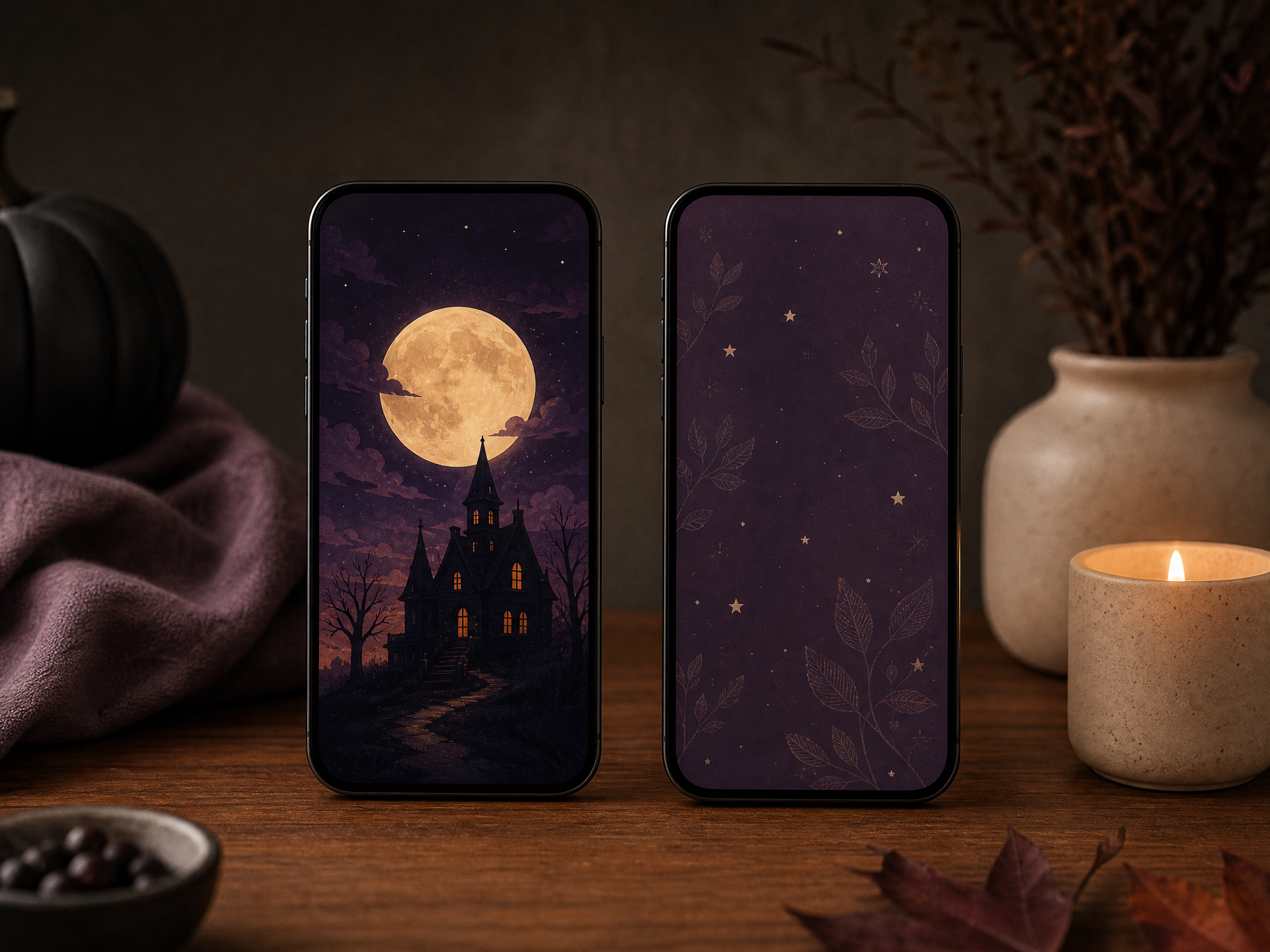
Treat the lock screen as your showpiece: this is where dramatic, detailed artwork and bold compositions can shine because there are fewer icons to compete with. A richly textured haunted house or a detailed illustration of a witch can make a striking lock-screen image.
For the home screen, choose a calmer companion image or an edited version of the lock-screen art. Simplify the home-screen background by lowering contrast, desaturating a busy pattern, or cropping to emphasize a quiet area so app icons and widgets remain easy to use. Paired images let you enjoy ornamentation without sacrificing usability.
7. Rotate moods through the season
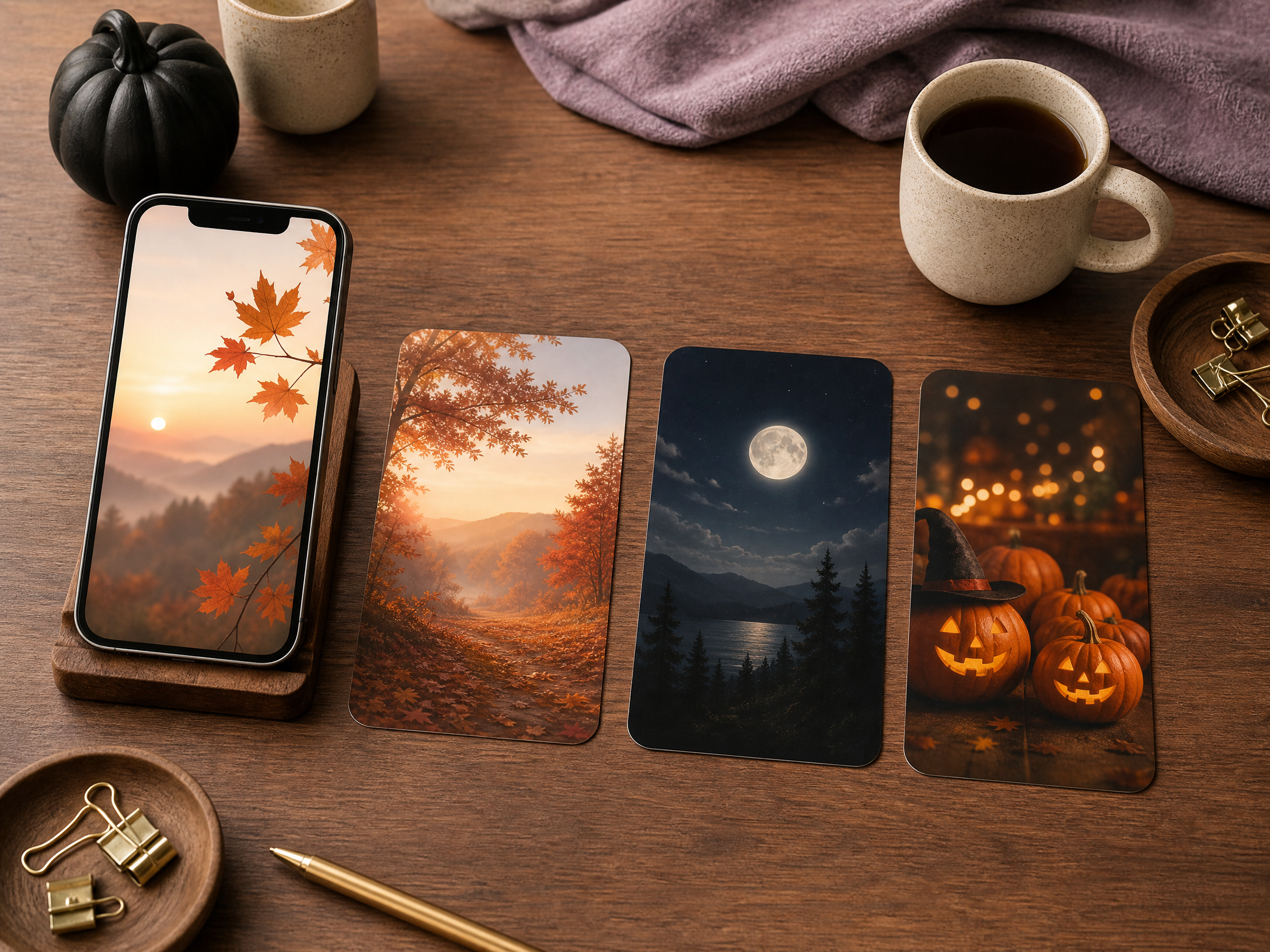
Rather than one permanent wallpaper, consider a short rotation to fit different Halloween moods: gentle autumn mornings during the day, more dramatic scenes for evenings, then a playful or spooky option for the week of Halloween. Changing wallpapers keeps your phone feeling fresh and lets you match visuals to activities and lighting.
If you like automation, schedule swaps or keep a small, organized album for quick manual changes. A curated rotation also helps you test what works in daylight vs. dim light, revealing which images remain functional across different viewing conditions.
8. Build and maintain a personal image library
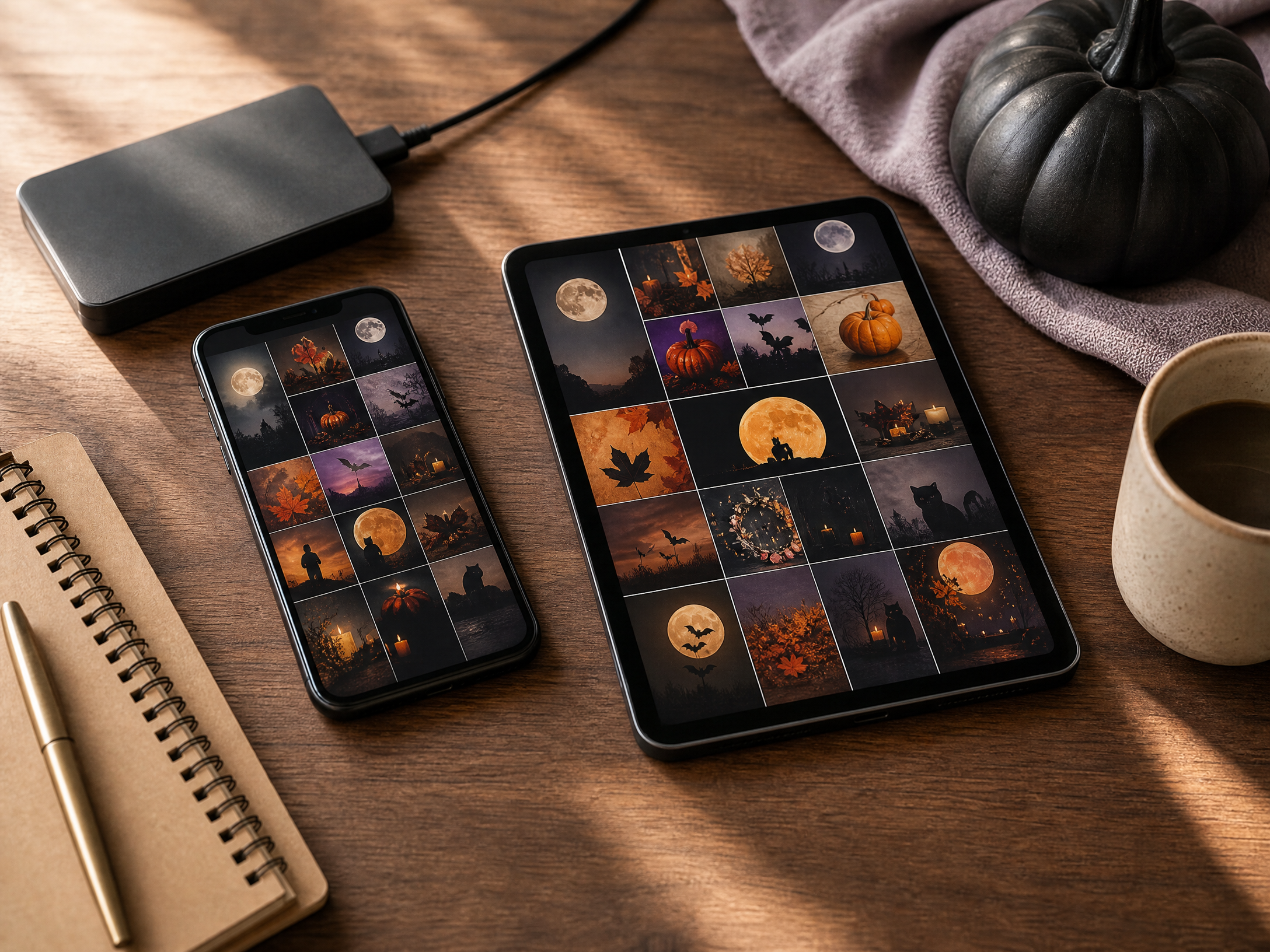
Spend a little time collecting and preparing a handful of go-to images. Keep originals plus edited versions sized and cropped for both lock and home roles, and name or tag them by mood (e.g., “spooky_silhouette_day”, “pumpkin_cozy_night”) so you can find the right image quickly. Back up this library to cloud storage or an external drive so you don’t lose edits or favorite files.
Respect image rights: save images you have permission to use or that are free for personal use, and note the source if you plan to share. Over time you’ll build a compact, well-organized gallery of Halloween wallpapers that adapt to your phone’s display and your seasonal taste.
Final Thoughts
A great Halloween wallpaper balances atmosphere with practicality: strong but gentle visuals, reserved clear zones, and good contrast keep the clock, icons and notifications readable. With a small library, a simple testing routine, and paired lock/home choices, you can enjoy festive backgrounds that work as hard as they look.