Christmas Color Ideas for 2026: 9 Fresh Palettes That Make Holiday Decorating Feel Personal
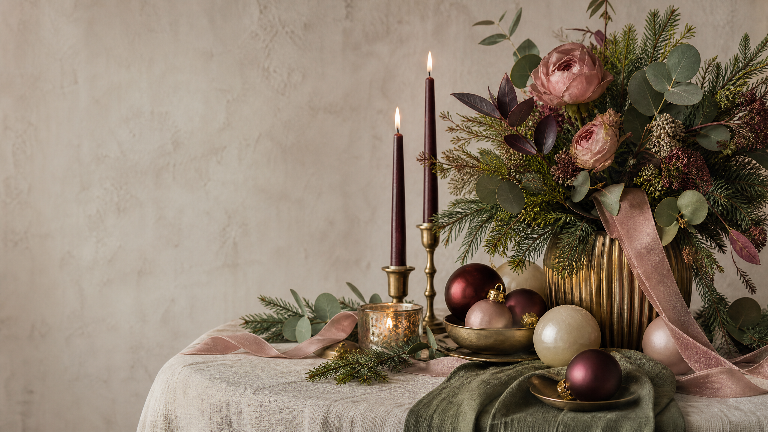
Christmas decorating does not have to begin with a trip to the store or a decision between bright red and traditional green. A more inviting approach is to decide how you want the season to feel, then choose colors, materials, and lighting that support that feeling throughout your home.
For 2026, holiday style is moving toward palettes that are easier to live with after the ornaments come out of the boxes. Some combinations are deep and dramatic; others are soft, sun-washed, or inspired by the outdoors. The common thread is intention: a small group of compatible shades, repeated thoughtfully, can make a room feel festive without making it feel crowded.
Below are nine original directions to consider, followed by a practical method for turning one of them into a cohesive look.
1. Cocoa, Clay, and Olive for a Warm Gathering Place
If you want your home to feel relaxed and welcoming, start with the colors of a well-loved kitchen: cocoa brown, olive, clay, and a modest touch of antique gold. This combination feels especially comfortable in rooms with wood furniture, woven baskets, leather, or creamy upholstery.
Use olive on the tree or mantel, then bring in clay through ribbons, paper ornaments, or a few ceramic pieces. Brown can remain in the background as an anchor rather than becoming the dominant decoration. A handful of warm-metal accents will catch the glow from lamps and candles without turning the room into a glitter display.
The key is restraint. Choose one finish for most of the ornaments, such as matte or lightly textured surfaces, and let the gold appear only in small moments. The result is festive, but still suitable for a quiet breakfast or an ordinary winter evening.
2. Plum, Ink, and Silver for an Evening-Dinner Mood
A holiday table can feel sophisticated without relying on a large amount of sparkle. Pair plum or wine-colored accents with inky charcoal, soft white, and brushed silver for a look that feels made for dinner parties and late-night conversation.
Try a dark runner on the table, ivory napkins, and low arrangements of greenery or bare branches. Silver can appear in candleholders, flatware, or a few ornaments rather than across every surface. If the room already has dark furniture, keep the lightest shade visible at eye level so the palette does not become heavy.
This is a useful choice for an apartment, dining room, or entryway where one strong arrangement can do most of the decorating. A narrow console with a silver bowl, a deep-toned ribbon, and warm lights may be all you need.
3. Misty Blue and Eucalyptus for a Quiet Winter Look
Cool colors can be just as cozy as warm ones when they are softened with natural textures. Misty blue, eucalyptus green, pale gray, and creamy white create a calm winter palette that works well in bedrooms, reading corners, and uncluttered living rooms.
Instead of highly reflective decorations, look for linen, felt, unfinished wood, frosted glass, and knitted details. A blue ribbon on the tree can be repeated in a throw pillow or table napkin, while eucalyptus-colored accents connect the display to houseplants and greenery already in the room.
To keep this palette from looking too cold, use warm bulbs and a few honey-colored wood accents. The contrast between cool color and warm light gives the room dimension and keeps the atmosphere comfortable.
4. Cranberry, Rose, and Cream for a Soft Traditional Update
Cranberry offers the familiarity of a classic holiday red, but its deeper, less-bright quality makes it easier to combine with modern neutrals. Add dusty rose, cream, and a small amount of copper for a palette that is cheerful without feeling overly formal.
This direction works beautifully with simple handmade details. Consider folded paper stars, fabric bows, dried flowers, or personalized gift tags in the same family of shades. On a table, cranberry napkins can provide the strongest color while cream dishes and natural wood keep the setting grounded.
If you already own red decorations, do not replace everything. Place the brightest pieces farther from the main focal point and use cranberry, cream, and rose near the center. Grouping older and newer items by tone will make the collection feel deliberately edited.
5. Pine, Moss, and Natural Linen for an Outdoor-Inspired Home
For a look that feels connected to the season beyond the walls, combine several greens with linen, bark brown, and warm white. Pine supplies depth, moss adds softness, and linen prevents the display from becoming visually dense.
This palette is ideal for garlands, wreaths, stair rails, and table arrangements because it does not depend on a large number of ornaments. Layer branches with fabric ribbon, wooden shapes, pinecones, or simple paper decorations. A few brass or amber details can add warmth, but the greens should remain the focus.
The practical advantage is that the foundation can stay in place beyond Christmas. Greenery, neutral textiles, and wood accents can carry a room into the rest of winter, with only the most obviously seasonal pieces needing to be packed away.
6. Frosted White, Sand, and Soft Gold for a Light-Filled Space
A neutral holiday scheme can be festive when its interest comes from variation rather than strong contrast. Combine frosted white with sand, pale beige, soft gold, and clear glass. The palette suits modern interiors, small rooms, and homes that receive plenty of natural light.
To avoid a flat or washed-out result, mix surfaces deliberately. Pair a nubby textile with smooth glass, a matte ornament with a satin ribbon, and a lightly metallic piece with unfinished wood. These small differences are what make a limited color range feel rich.
Use the palette in layers: a neutral base on the mantel or table, transparent accents in the middle, and a few gold details near the top or center. When everything is pale, spacing matters. Leave room around each group so the decorations look airy instead of unfinished.
7. Navy, Evergreen, and Brass for a Rich but Livable Contrast
Navy and evergreen make a striking pair, particularly when the surrounding room is filled with warm neutrals. Add brass rather than bright yellow gold for a more relaxed finish, and soften the combination with oatmeal, cream, or natural wood.
A navy tree skirt, evergreen branches, and brass bells can create a strong foundation without requiring every ornament to match. In a kitchen or family room, repeat navy in just two or three places—perhaps a ribbon, a vase, and a set of napkins. Repetition creates connection, while leaving other surfaces quiet prevents the palette from becoming too coordinated.
This color story also works for holiday outfits and hosting details. A navy sweater, evergreen table runner, and brass-colored place cards can make a gathering feel pulled together without asking guests to dress formally.
8. Lavender, Rosewood, and Pearl for a Gentle Holiday Accent
Lavender is an unexpected choice for Christmas, but it becomes more seasonal when paired with rosewood, pearl, ivory, and a little muted metallic color. The combination is softly romantic and can suit a guest room, dressing area, or smaller decorating moment.
Keep the lavender diluted rather than neon or candy-bright. A faded ribbon, pale ornament, or painted paper detail is enough to establish the color. Rosewood supplies depth, while pearl and ivory make the arrangement feel wintery instead of springlike.
Rather than decorating an entire room in this palette, use it for a single vignette. A sideboard, bar cart, or tabletop tree can become the home for the unusual colors, while the rest of the room remains neutral.
9. Black, Snow, and Ice Blue for a Modern Statement
For a crisp, contemporary look, try matte black with snow white, ice blue, and a small amount of reflective silver. The contrast is bold, so it benefits from a simple arrangement and plenty of open space.
Choose black for a few substantial shapes—ribbon, candleholders, ornaments, or a planter—rather than scattering tiny black accents everywhere. White provides visual breathing room, and ice blue adds a cooler seasonal note. Silver can be limited to glass-like or polished details that catch the lights.
This palette is especially effective in an entryway or home office where a single display can make an impression. It also pairs naturally with existing black hardware, framed art, or dark furniture, which means the decorations can feel integrated rather than temporary.
A Simple Way to Choose Among the Palettes
When several ideas appeal to you, use the following short process before buying anything.
Start with the room, not the trend
Look at the colors that are already doing the most work in the space. Notice the walls, rugs, upholstery, wood tones, and metal finishes. A palette that complements those features will usually look more convincing than one chosen only because it photographs well.
Warm rooms tend to welcome clay, cocoa, cranberry, brass, and olive. Cooler rooms may make more sense with misty blue, lavender, silver, white, or navy. This is not a strict rule; it is simply a way to narrow the field.
Choose a feeling in three words
Write down three words that describe the atmosphere you want. “Cozy, natural, calm” points in a different direction from “dramatic, polished, festive.” Those words become a useful filter whenever you are deciding whether an item belongs.
If you cannot describe the mood, the decorating process may turn into collecting unrelated objects. A clear emotional goal helps you edit.
Build a small color formula
Use one main color, one supporting color, and one neutral. Then decide whether your optional accent will be a metal, a darker shade, or a lighter shade. For example:
| Main color | Supporting color | Neutral | Optional accent |
|---|---|---|---|
| Pine | Moss | Linen | Brass |
| Navy | Evergreen | Oatmeal | Soft gold |
| Cranberry | Dusty rose | Cream | Copper |
| Misty blue | Eucalyptus | Pale gray | Warm wood |
This formula keeps the collection manageable. It also makes it easier to decorate gradually, because every new piece has a clear place in the overall plan.
Decorate in descending order of importance
Begin with the largest visual element, such as the tree, mantel, dining table, or entryway. Add the main lights and larger pieces first. Next, repeat the supporting color in a few smaller areas. Finish with the neutral and accent details.
After each layer, step back from the room. If the eye moves comfortably from one area to another, continue. If every surface is competing for attention, remove something before adding more.
Let lighting decide the final version
Color can change dramatically under different bulbs and at different times of day. Test ribbons, ornaments, or textiles in the actual room before committing to a large purchase. Warm lighting tends to make browns, reds, greens, and golds feel deeper. Cooler lighting can emphasize blue, white, gray, and silver.
You do not need to replace every light in the house. Simply observe when the room looks best and place the strongest color moments where they will be visible during those hours.
Make the Theme Feel Like Yours
The most polished holiday homes are not necessarily the ones with the most decorations. They are the ones where the choices feel connected to the people who live there. Include a family ornament, a handmade detail, a favorite textile, or a piece that has been used for years. A personal object can keep even a carefully styled palette from feeling like a showroom.
It is also worth planning for real life. If children, pets, or frequent guests share the space, put fragile or top-heavy pieces higher up and use sturdy materials in busy areas. If you host often, leave enough table space for serving dishes and conversation. Good style should make the season easier to enjoy, not create another chore list.
A Final Editing Pass Before Guests Arrive
Walk through the home as if you were seeing it for the first time. Is there a clear focal point? Do the colors repeat without appearing copied from room to room? Are there enough quiet surfaces for the eye to rest? Does the lighting flatter the colors after sunset?
Remove anything that feels disconnected, overly delicate, or difficult to maintain. Then add one small element that could not belong to anyone else: a handwritten label, a favorite ornament, a memory-filled photograph, or a simple craft made at home.
The strongest Christmas color scheme is not the one that follows every forecast. It is the one that gives your home a coherent mood while leaving room for ordinary life. Choose a palette that makes you happy to come downstairs, repeat it with a light touch, and let the details tell the story of your own holiday season.