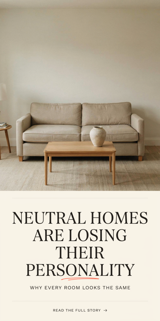
Neutral Homes Are Losing Their Personality: How To Reclaim Character In 2026
Neutral interiors dominated the last decade: quiet greys, creamy whites, and muted beiges promised a blank canvas and broad appeal. But as we move through 2026, that very neutrality increasingly reads as anonymity. The trend that once felt timeless now risks turning homes into indistinguishable showrooms. In this text we’ll examine why neutrals won the design war, how they became bland, the subtle signs your space has lost its voice, and, most importantly, practical, low-friction ways to bring back personality. We’re not suggesting a return to chaotic maximalism: instead, we’ll show how small shifts in color, texture, finish, and styling can transform a neutral foundation into a space that feels purposeful, layered, and unmistakably yours. Read on for actionable tweaks you can carry out this weekend and ideas to inform longer-term updates, all tuned to contemporary sensibilities in 2026.
Why Neutrals Took Over Interior Design
Neutrals rose to prominence for several converging reasons, and understanding that context helps us reclaim personality without rejecting the strengths of a neutral base. First: the influence of social media and staging for resale. Clean, neutral rooms photograph predictably well and appeal to broad buyer pools: that made neutral palettes a default choice for builders, developers, and real-estate stylists. Second: the minimalist aesthetic and wellness movement favored uncluttered, calming environments. Soft beiges and warm greys were marketed as tranquil backdrops to busy modern lives. Third: globalization of taste, fast furniture and influencer-driven trends, standardized a small palette of “safe” hues that retailers stocked endlessly, reinforcing a feedback loop.
There’s also a pragmatic side: neutrals are flexible. They let homeowners layer seasonal accents and are forgiving when mixing styles. For many, choosing neutral felt like buying time, a sensible, low-risk decision. But what began as a practical compromise became an aesthetic default. As more of us leaned into the same muted tones, the variety that once carried personal expression diminished. The result? A widespread visual sameness that’s now prompting designers and homeowners to ask: how do we keep neutrality’s benefits but restore individuality?
How Neutral Palettes Ended Up Feeling Anonymous
Neutral palettes became anonymous through repetition, homogeneity of materials, and a flattening of personal narratives. When every sofa is the same mid-grey linen, every rug is a low-contrast jute, and every wall is ‘‘white with warm undertones,” rooms stop telling distinct stories. We see three main dynamics at work.
One: homogenized sourcing. Large retailers and big-box manufacturers sell millions of the same finishes and pieces. That ubiquity makes it easy to match but hard to differentiate. Two: texture avoidance. Early neutral trends emphasized smooth, matte surfaces and minimal ornamentation, great for a sleek look but poor at creating sensory richness. Without tactile contrast, walls and furnishings blur into a single plane. Three: risk aversion. Homeowners often dial back color and pattern to avoid commitment or to maintain resale value. Over time, small safety choices add up to a loss of identity.
The psychological effect is subtle: rather than acting as a calm backdrop that highlights personal objects, overused neutrals compete with them, making curated items look like afterthoughts. In short, neutrality can be powerful, but only when it’s employed intentionally, not by default.
Visual Clues That Your Neutral Home Lacks Personality
Spotting anonymity is easier than you’d think: it’s often a matter of proportion and layering. Here are visual cues that tell us a neutral space needs personality work.
Flat foreground: If everything, walls, sofa, rug, curtains, sits in a tight range of value (lightness) and chroma (color intensity), the room looks flat. Without contrast, the eye has nowhere to rest. Copycat furniture: When multiple surfaces share identical shapes, finishes, and scale (think matching coffee tables, end tables, and media consoles from the same retail collection), the space feels mass-produced. Missing focal point: A room that lacks a distinct focal point, artwork, a statement light, or an architectural detail, will read as generic, even if every item is high-quality.
Lack of storytelling: Walk through and ask whether the items on display tell a story about the inhabitants. If decor reads like catalogue staging, neatly arranged but emotionally neutral, that’s a sign. Tactile monotony: If textiles and materials are all smooth and similar in temperature (cold, cool), the sensory experience is one-note. Finally, timing mismatch: Rooms that look current but give no hint of personal history, no travel artifacts, no family touches, feel temporary. These clues aren’t failures: they’re opportunities. Once we can see the problem, we can prioritize targeted interventions that add character without undoing the calm we value.
The Psychological Impact Of Over‑Neutral Spaces
Our environments shape mood, behavior, and social interaction. Over-neutral spaces can subtly influence how we feel and how we use our homes. At best, a neutral palette reduces visual stress and can support focus. At worst, it erodes stimulation and emotional connection.
Cognitive blandness: Environments with limited color variance offer fewer cues for memory and emotional recall. We’re less likely to form strong attachments to rooms that don’t register distinct impressions. Social signaling: Homes are social tools: they communicate tastes, values, and life rhythms. When a living room reads as a model home, guests may feel less invited to linger or contribute their own personality. Emotional temperature: Colors and textures trigger visceral responses. Warm hues and tactile materials can foster comfort and sociability: an overabundance of cool, muted tones may produce restraint or quietness that borders on aloofness.
Productivity and wellbeing: For home offices and creative spaces, a complete lack of stimulating color can stunt creativity. Conversely, cluttered color overload is distracting, so it’s about balance. We need spaces that both soothe and stimulate. Restoring personality isn’t merely about aesthetics: it’s about aligning interior cues with how we want to live, relate, and remember our spaces.
Simple Color And Texture Tweaks That Instantly Add Character
We can reclaim personality with small, intentional interventions that honor the neutral base rather than replace it. Below are practical tweaks, easy to execute and high-impact, that add warmth, depth, and narrative to an otherwise anonymous space.
Add Layered Textiles For Depth And Warmth
Textiles are the fastest way to alter a room’s emotional temperature. Layering creates depth through contrast in scale, weave, and pattern without demanding a complete palette overhaul. Start with a base neutral rug, then add a smaller patterned rug, a wool kilim, or a sheepskin to anchor seating areas. Swap a thin throw for a chunky knit blanket: the difference in scale shifts perception immediately. Introduce pillows in mixed materials: a linen base pillow, a velvet accent, and a leather lumbar piece. The interplay of matte and sheen, coarse and soft, introduces tactile variety that photographs as richness and reads in real life as comfort.
We recommend a rule of three for textiles: maintain at least three distinct textures in a room (for example, woven rug, velvet pillow, wooden tray) and vary pattern scales, one large, one medium, one small. This approach keeps the feeling curated rather than random. Small investment, immediate payoff: a few well-chosen throws and pillows can transform a neutral room from sterile to layered.
Introduce Small Pops Of Color With Purpose
Punctuating neutrals with targeted color anchors a space and communicates taste without overwhelming the calm. The trick is to be deliberate: choose a few accent hues that complement your neutrals rather than clash.
Start with accessories: ceramic vases, books, small art prints, and plant pots are low-commitment ways to test color. Consider a single saturated hue (deep teal, terracotta, or mustard) and repeat it in two or three places to create visual rhythm, on a shelf, in a framed print, and in a textile. Another strategy: embrace tonal color instead of loud contrasts. A warm terracotta pillow against a beige sofa reads cohesive: a bright neon pillow does not.
We also like the idea of “borrowed color.” Pull a shade from an existing object, an heirloom rug, a piece of pottery, or a framed photograph, and echo it subtly elsewhere. That creates a sense of provenance and story. Finally, remember scale. Large swaths of color are bolder, think an accent wall or painted bookcase, while small pops keep the room grounded. Both work: the choice depends on whether you want a quiet touch or a focal statement.
Use Finishes And Materials That Bring Warmth And Contrast
Finishes and materials speak to quality and time, and they’re one of the most effective ways to move a neutral schema from showroom to lived-in. Warm metals, aged woods, and matte ceramics introduce patina and visual complexity that neutral paint alone can’t achieve.
Mix metals with restraint: Pair a warm brass lamp with a satin black frame and a brushed nickel bowl. The contrast feels intentional and layered. Prioritize natural woods with visible grain for shelving, coffee tables, or picture frames, grain patterns and knots add hero moments that break uniformity. Introduce artisanal surfaces: hand-thrown pottery, woven baskets, and hammered metal trays have tiny imperfections that signal craft and story.
Surface finish matters. Swap high-sheen chrome for soft, hand-finished brass or oil-rubbed bronze. Choose plaster or limewash for an accent wall rather than a flat latex, those finishes catch light differently and create life in the surface. Even small changes, replacing cabinet hardware or swapping a laminate top for butcher block, can make a room feel warmer and more distinct without massive renovation.
Introduce Small Pops Of Color With Purpose
Note: This heading intentionally duplicates the “Introduce Small Pops Of Color With Purpose” concept to emphasize tactics we can carry out immediately. Beyond accessories, consider these tactical moves for quick wins.
Swap art and frames. Rotating a single piece of colorful art changes the emotional center of a room. Choose works that contain one or two accent hues you want to promote. Curate bookshelves with spines grouped by tone: it’s a simple styling trick with outsized impact. Add plants with colorful foliage, variegated pothos, calatheas, or a burgundy rubber plant deliver organic color that evolves over time.
Use textiles seasonally. We can introduce deeper tones in winter (burnt orange, olive) and brighter pastels in spring. Seasonal rotation keeps the space feeling fresh and gives color a purpose tied to the rhythms of our lives. Finally, test color with removable options: peel-and-stick wallpaper, throw pillows, and seat cushions let us experiment without long-term commitment.
Add Layered Textiles For Depth And Warmth
Note: We include a brief reprise of layered textiles with additional, hands-on suggestions for integrating them into different rooms. In living rooms, create a trio: base rug, accent rug, and area near seating with a tactile mat or sheepskin. In bedrooms, combine a woven bedthrow, linen duvet, and small velvet cushions to create a layered silhouette. For dining, seat cushions in a warm wool blend instantly soften the formality of clean lines.
Pay attention to scale and proportion: large- pattern textiles read best on big surfaces (area rugs, drapery), while small-scale patterns work well on cushions and lampshades. Contrast weight and weave, pair a loose, open-weave throw with a dense wool pillow, to create a tactile dialogue. Finally, think about care and longevity: choose materials that age well. Natural fibers often become more attractive with use, acquiring the patina that turns a neutral room into a space with history.
Editing And Styling Strategies To Tell Your Story
Reclaiming personality requires an editing eye. We want rooms that feel curated, not cluttered, and that means deciding what to show, where to group, and how to arrange objects so they cohere into a narrative.
Start with a purge: remove duplicates and catalogue-like accessories that don’t reflect your life. Keep objects that carry meaning or craftsmanship. Then group items into small vignettes, odd numbers (three or five) work well, mixing heights and materials to create visual interest. Use open shelving and console tables as stages: rotate objects seasonally so the space evolves.
Incorporate personal artifacts thoughtfully. A travel object paired with a framed photo and a locally made ceramic creates a micro-story that’s both intimate and accessible. Use negative space deliberately, empty areas give emphasis to objects that matter. Lighting is part of the edit: a table lamp aimed at a vignette or a picture light over art draws attention and elevates ordinary items. Finally, keep a styling budget, we recommend allocating 10–15% of your decorating spend to unique, smaller pieces that provide distinctiveness (art, vintage finds, or handmade goods). Over time, these investments create a home that belongs to us, not to the catalog.
Conclusion
Neutral homes aren’t the enemy, when used with intention, they remain powerful platforms for living. But as we’ve seen, left unchecked a neutral palette can strip a space of personality. By introducing layered textiles, purposeful color accents, warm finishes, and considered editing, we can transform neutrality from bland backdrop into an elegant stage for our lives. The goal for 2026 is nuance: preserve calm where it serves us, and add texture, color, and story where it matters. If we make a few deliberate swaps and curate with intent, our homes will stop blending in and start reflecting who we are.