Crafting a Cohesive Festive Phone Aesthetic
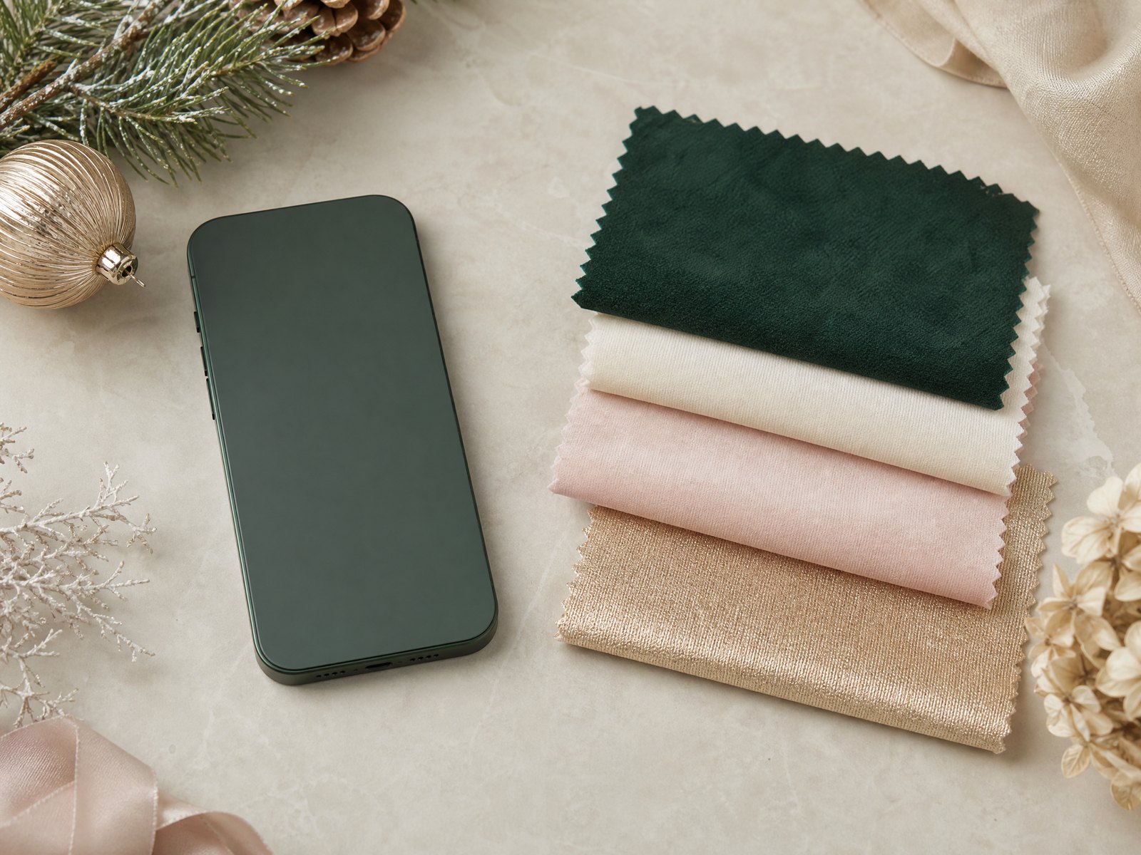
A seasonal refresh for your phone’s screens is a simple way to bring festive cheer into daily life. Rather than swapping in a single loud image, thinking intentionally about mood, space, and usability helps you create an elegant, cohesive look that feels personal and calm every time you pick up your device.
This guide walks through the visual choices and practical habits that keep a celebratory phone aesthetic attractive and functional: defining an overall mood, preserving space for time and notifications, ensuring legibility, coordinating lock and home screens, managing icons, rotating favorites, handling image rights, and retiring the look when the season passes.
1. Choose a unified visual mood
Start by deciding on a single emotional tone you want your phone to convey—warm and cozy, bright and playful, minimalist and elegant, or nostalgic and vintage. Picking a guiding mood will make it easier to select images, color palettes, and graphic elements that complement one another instead of competing. This decision will also influence the textures, lighting, and subject matter you favor, helping everything look intentional rather than haphazard.
Once you have a mood in mind, narrow your palette to two or three dominant colors and one accent. Limiting colors creates harmony between different screens and makes small adjustments—like swapping one image for another—feel consistent. If you prefer variety, choose images that share similar tones or contrast levels so the overall presentation still reads as a single curated look.
2. Give the lock screen breathing room
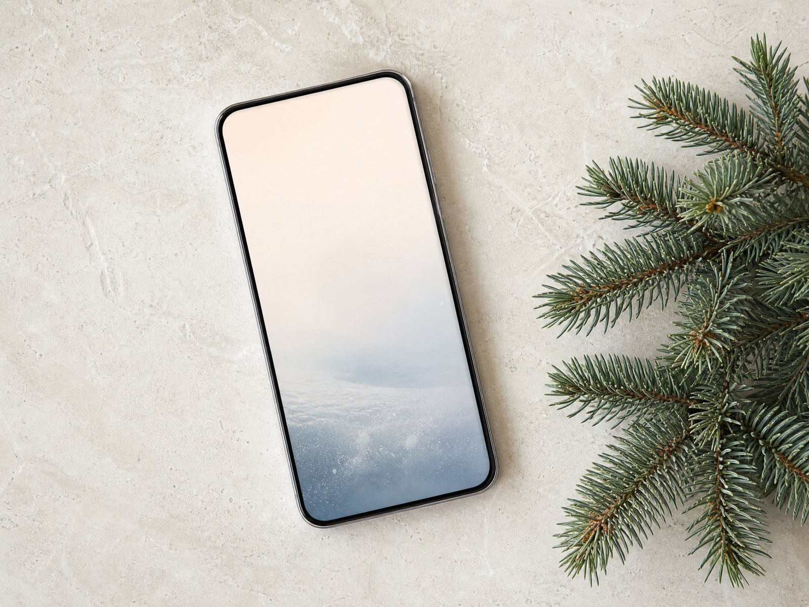
The lock screen often needs clear space for the time, date, and incoming alerts. Avoid using busy or highly detailed images where those elements sit; instead, select photos or graphics with calm negative space near the top or center. Subtle gradients, simple focal points, or images with soft skies and blurred backgrounds provide visual interest without competing with essential information.
When composing an image, imagine where dynamic elements appear and keep those zones uncluttered. If a favorite image has great details but poor negative space, consider cropping, gentle vignetting, or soft overlays to create an area for text and icons to remain legible while preserving the image’s character.
3. Prioritize contrast for readability
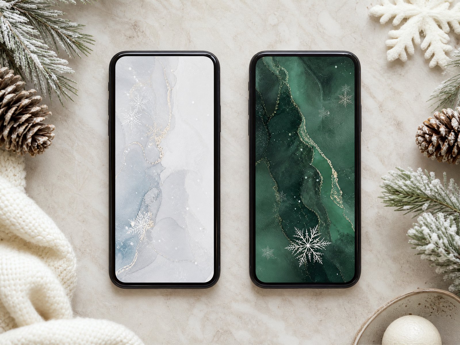
Readability should be a top concern when crafting a festive look. Ensure that the foreground elements—the time, notifications, and any widgets—stand out clearly against the background. That may mean choosing darker images if your overlays are light, or vice versa, and avoiding midtone clutter where text typically sits.
If you want a richly detailed background, apply subtle adjustments to improve contrast: lower overall brightness where text appears, add a translucent band or soft shadow behind important information, or select images with natural contrast between subject and background. Small tweaks like these keep visuals striking without sacrificing usability.
4. Coordinate lock and home screen imagery
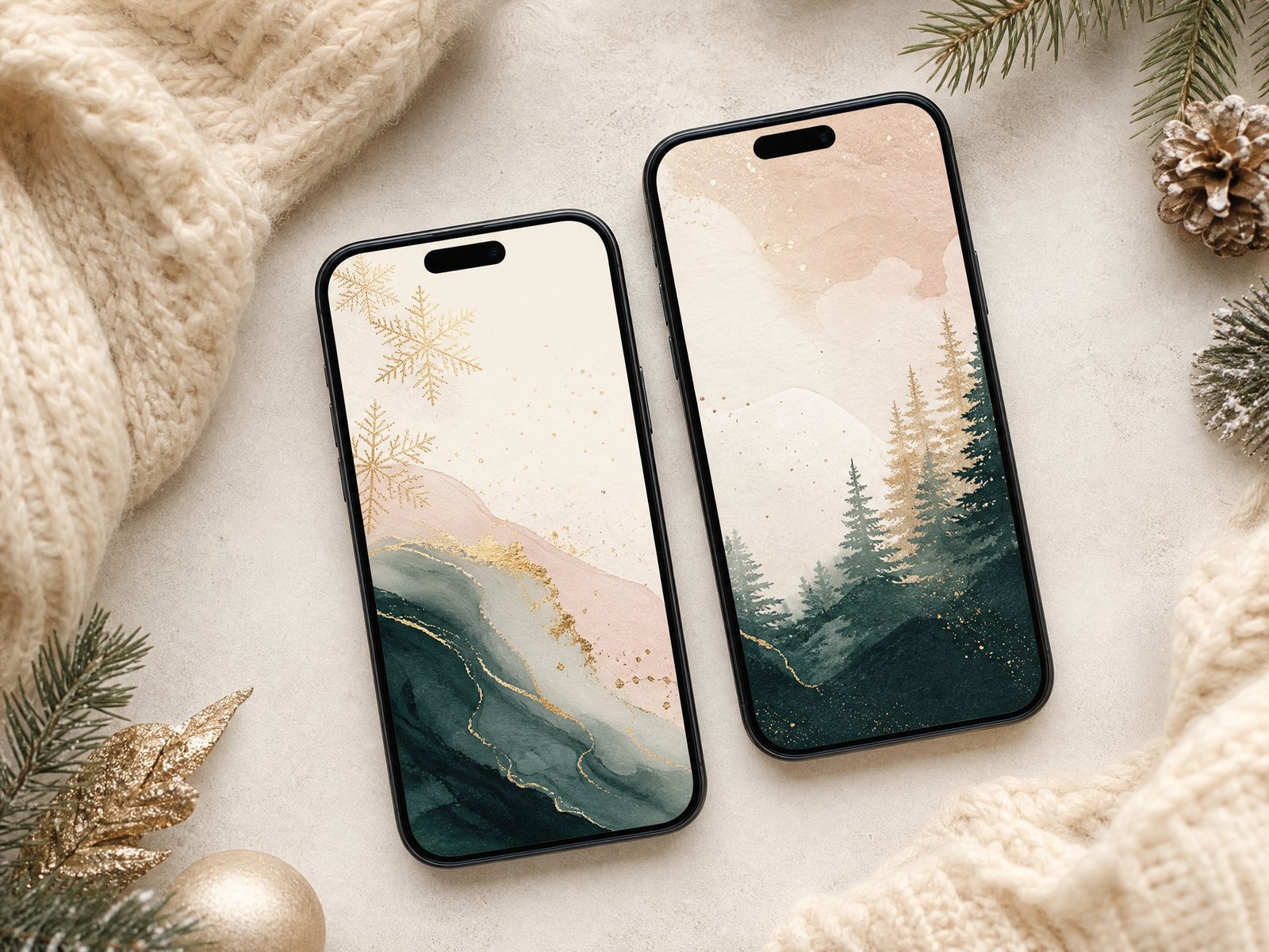
Use one of these simple approaches to create harmony between lock and home screens:
- Match palette: Choose images that share the same color family or lighting.
- Mirror composition: Use a cropped version of the lock screen image on the home screen so elements align.
- Complement rather than duplicate: Pair a detailed image on one screen with a simpler, tonal image on the other for balance.
5. Trim icon clutter for a cleaner look
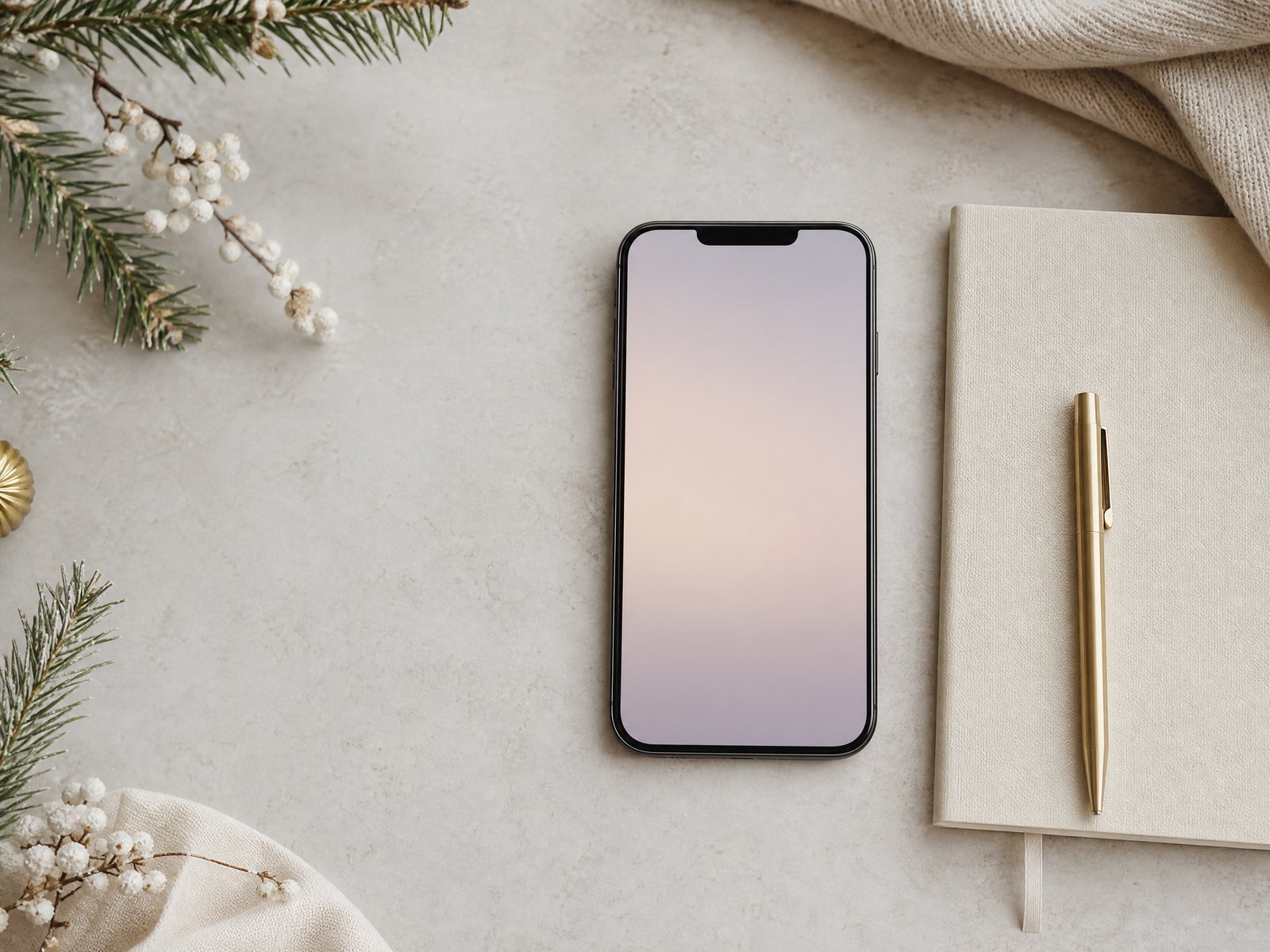
A neat, celebratory aesthetic is easier to achieve when the home screen isn’t overwhelmed by many small icons. Audit your apps and remove, archive, or relocate those you rarely use to folders or a secondary page. Fewer visible icons let your wallpaper breathe and maintain the seasonal feeling without becoming visually noisy.
For the icons that remain, think about placement: cluster essentials in predictable locations so the eye can rest on the wallpaper’s focal areas. Grouping similar apps into folders with concise labels also reduces scrolling and keeps the home screen tidy, which amplifies the impact of a carefully chosen background.
6. Keep a small rotating collection
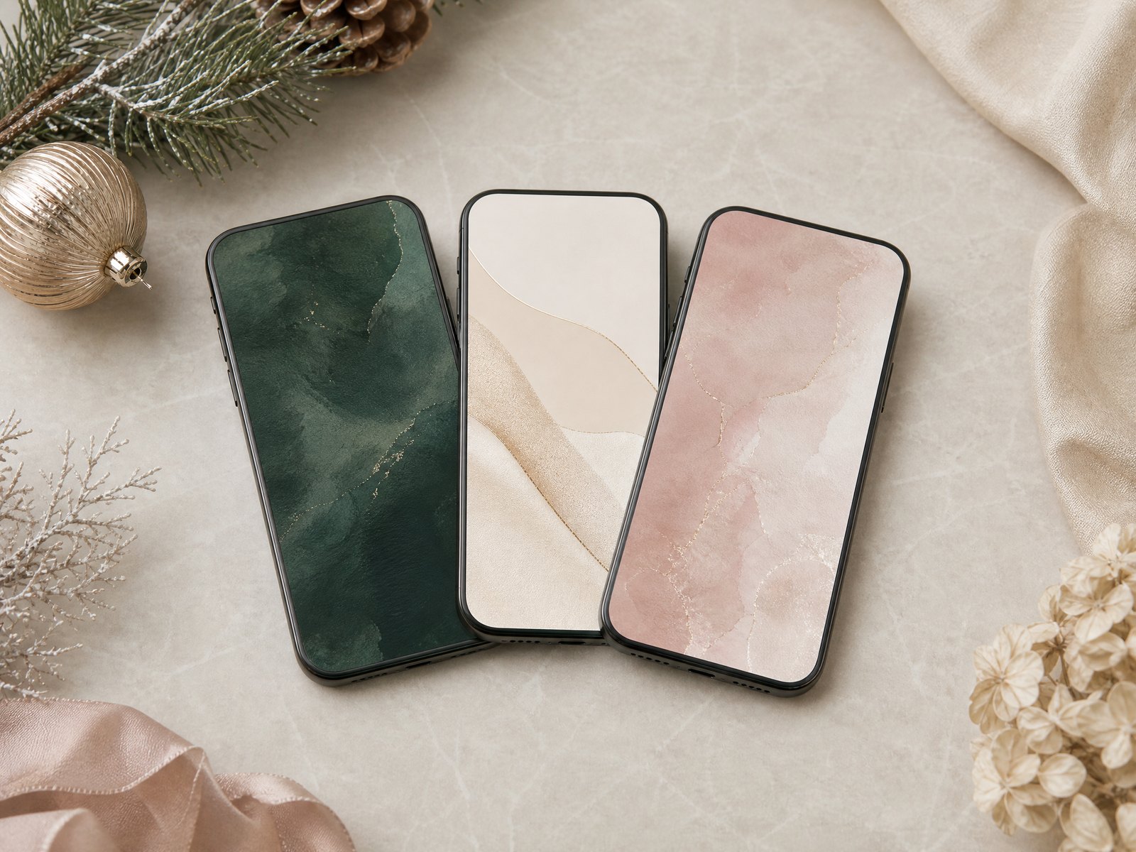
Maintain a curated set of three to six favorites to cycle through rather than constantly changing to random images. A small rotation keeps the aesthetic consistent while allowing gentle variety across the season. Choose pieces that all fit your mood and palette so swaps feel cohesive rather than jarring.
Rotation best practices:
- Limit to 3–6 images
- Swap weekly or every few days to keep things fresh
- Include at least one very simple option for days you need maximum clarity
7. Use personal and licensed images responsibly
If you use your own photos, select images with good resolution and clean composition. Personal pictures add emotional value, but be mindful of private details in the frame—avoid showing sensitive information or other people’s identifying features without permission. Editing for clarity and crop can elevate a casual snapshot into a polished background that still feels personal.
When choosing images from other creators, make sure you have the proper rights—obtain licensed content, use images marked for reuse, or purchase from reputable sources. Respecting image rights keeps your aesthetic ethical and supports the work of photographers and designers whose work you enjoy.
8. Refresh and retire the seasonal look
Plan an end-of-season refresh so the look stays meaningful rather than overstaying its welcome. As holidays wind down, gradually transition to neutral or year-round themes to avoid jarring changes and to prepare for the next seasonal cycle. Treat this refresh as an annual ritual: archive your favorites, jot down what worked, and note any new images you want to try next time.
Quick transition checklist:
- Archive seasonal images into a dedicated folder
- Replace lock screen first with a neutral option, then update the home screen
- Review and clean app folders while you refresh visuals
Final Thoughts
A thoughtful approach to mood, space, contrast, coordination, and maintenance gives you a festive phone appearance that’s both beautiful and practical. With a small, curated collection and attention to legibility and image rights, you can enjoy seasonal flair without sacrificing everyday usability.